How to Build Good Landing Pages for Google Ads
Google Ads and landing pages are somehow connected. Here’s why building good landing pages leads to better performance in Google Ads.

You’re hungry, and you would like a burrito. You leave your office and take a stroll down the street to find a place to eat a burrito.
“Mmm, burritos,” you think to yourself.
You see a sign with a burrito on it, with the words, “Delicious!” and “50% off!!” on it.
“Oh yes, burrito time!” you say, rubbing your hands in glee. You walk inside, only to find…
…It’s a sushi place.
“But…” you stammer, upset. “There was a burrito on the sign!”
No deal. They don’t do burritos. Only sushi.
Nightmare, isn’t it?
Scenarios like this harrowing offline experience can play out online, too. When your customer’s experience doesn’t match the expectation you set, there’s sad faces all around.
This is why an ad and landing page are best when they match. Creating a seamless transition and a congruent user experience is essential not just for aesthetics but also for conversions, digital marketing performance, and long-term trust.
Key Takeaways:
- A good landing page gets a high score on Google Ads. The layout should be free from distractions that dampen the entire experience.
- Concise writing makes it easy to say your point and get visitors to try your product or service.
- Fast loading on mobile devices, social proof, and brand consistency keep your landing page on top of the game.
Keep your leads with you by creating a fast-loading page!
Why Landing Page Quality Matters for Google Ads
How you create and present your landing page is a big deal for Google Ads. Here’s why it matters:
Impact on Quality Score and Ad Rank
Google Ads considers the landing page experience when determining the quality score. When the ad text and landing page content don’t align even one bit, you might get a lower ad rank, higher cost per click, and reach fewer potential customers.
Being consistent with your ad campaigns, ad groups, and dedicated landing pages is a huge win for the users and Google’s algorithm.
Better Return On Investment (ROI) Through Higher Conversion Rates
Everything has to pay off, even when creating landing pages. When your landing pages play their part well, the conversion process will be much smoother than you think.
Apply a user-friendly interface with a clear call to action (CTA) to encourage your website visitors to complete their desired action. Focus on turning clicks into conversions to lessen wasted ad spend and get a massive ROI.
Core Principles of High-Converting Google Ads Landing Pages
These are the elements that make a good landing page for Google Ads:
Relevance and Message Match
You have a great idea for an ad and a great idea for a landing page. Both are great – but they’re very different. Unfortunately, in this situation, two rights make a wrong – or rather, they have to be the same to be good.
But why is this? There are several reasons. One of the most important things is that if the customer isn’t immediately sure the page they’re seeing directly correlates with the ad they clicked on, their spam-senses will be tingling. Back in the Wild West days of the internet (and maybe even now, if you use an old browser), it was all too common to click on a link you were interested in only to be bombarded with huge red text, flashing highlights and a big unwanted ad for something you’d never be interested in. Usually, these were cases of pop-ups or adware hijacking a legitimate link, but those bad memories linger. And besides, we click on things for a reason: if that reason isn’t met, then we end up frustrated.
A second and very important factor is that multiple networks now use landing page experience to determine whether your ad gets approved and how much it gets shown. Your Google ads quality score and your Facebook ad relevance score, depends in part on your message match – in other words, your ad congruence – and how well they mesh. Put another way, if Facebook or Google don’t think your landing page matches your ad, they won’t like it – and that could impact your profits.
Common Message Matching Mistakes
Advertisers can fall short when it comes to message match for a variety of reasons. If you suspect your ad to landing page continuity is badly calibrated, one of the following may be happening:
You’re directing people to just your homepage.
A landing page is made to appeal to a particular audience interested in a specific offer you’re promoting in your ad, whereas your homepage is there for everyone. One of the biggest differences is that landing pages don’t usually contain a navigation bar, whereas homepages do, so giving your prospects more options to click on could harm your conversions.
You’re doing the ol’ bait and switch.
That’s just mean. Maybe you’re advertising a once-in-a-lifetime offer just to hook a visitor into clicking, but on the landing page, they discover the offer isn’t quite as good, or there’s a massive catch, or that you just plain lied. If you’re doing it, trying to be funny, no one’s laughing. And if you genuinely think the click is enough to keep them engaging, you’re sadly wrong. Think of your interactions with your audience as a mutual agreement of trust. If a visitor is feeling misled, that commitment (and thus the “contract”) will become null and void in their mind. They won’t trust your offer – and worse, they won’t ever trust your name if it comes up again.
You assume they see what you see.
When you’re creating an ad and landing page combo, it’s easy to get message-blind. In other words, you can’t see the wood for the trees. In other words, in an effort to create congruence and nuance, you miss something important. You’ve been staring at it for the last twelve hours, but your audience will be coming in brand new.
They also might not react the same as you do to colours, imagery, or wording. There’s a reason most corporate art is incredibly neutral: it’s good to rock the boat when qualifying your customer, as in declaring your stance on a hot-button issue, but to do so successfully takes a skilful hand.
Compelling CTAs
Your audience won’t do anything if you don’t tell them to do something. You should use a visible signup form or a CTA button in the ad text and on almost every corner of your landing page.
Try phrases like “Sign Up for Free” or “Download Now” to get a response from your website visitors.
Mobile Optimisation
More users are now accessing landing pages from their mobile devices. Use a mobile-friendly landing page builder so users can sign up on any device.
Visual Appeal and Brand Consistency
Using the same brand colours and fonts reminds the public of your business identity. Be consistent with your logos and branding materials, so that many will remember your brand.
Social Proof and Trust Signals
People often trust other people when looking for a product or service. Display your customer testimonials, case studies, and reviews near your CTA so customers will trust you.
Page Load Speed
Let’s face it—no one wants a page that loads so slowly. You’ll only scratch your head and close the entire tab.
Build your standalone web page with a user-friendly interface to make sure it loads fast when you launch it to the world.
Use our landing page templates to build your page at zero cost!
Design and Content Best Practices
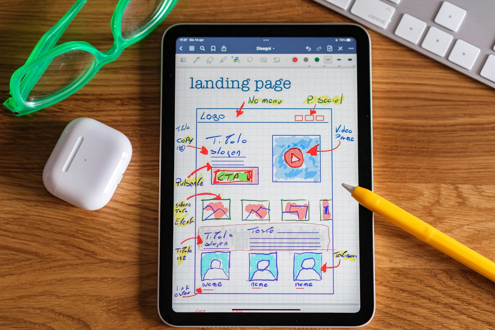
Even with landing page builders, creating landing pages can still feel like completing a jigsaw puzzle. But fret not, we have the best tips you can follow:
1. Create a Simple, Distraction-Free Layout
Your landing page looks better without too much clutter. To achieve a clean page, you should:
- Remove unimportant links and menus.
- Create a standalone web page serving a single purpose.
- Highlight the desired action you want your visitors to take.
2. Keep It Concise
Imagine seeing a landing page with too much text. Sounds pretty rubbish. It only hurts your eyes.
Apply the SCENT method, or Single Offer, Clarity, Emotion, Need, and Thank You Page. Here’s how it goes:
- You need to make sure you’re promoting just one offer.
- Make sure your sentences are clear and concise so that customers understand your point in five seconds.
- Add an emotional tone to the ad and the landing page to bring the need for your audience to take an action, including how and when to do it.
- Add a thank you page to build a good relationship with your audience and make your ad consistent. It reassures them that they didn’t send their money to some shady person behind the screen and that you are who you really say you are. Your thank you page should tell visitors what happens next, or give them another offer. That won’t hurt, right?
Avoid overwhelming the landing page with long paragraphs. Focus on what your product or service can do for your customers.
3. Use Bullet Points for Easy Scanning
Bullet points deliver the features and benefits of your products and services in a condensed format. They also improve readability so visitors can scroll quickly through your page.
4. Add High-Quality, Authentic Images and Videos
Visuals make people trust your brand. They won’t take a chance or even look at your offers if you don’t have something to back them up.
Use your original photos and videos instead of stock ones that feel too generic. Authentic content will increase conversion rates.
Conversion-Boosting Techniques
Try these ways to make your conversions hit the roof:
Keep Form Optimisation Short
The shorter, the better. Request only the essential information so users can complete the form right away. Add reassurance that their privacy and data are safe in your hands.
Remove Unnecessary Navigation Links
Too many outbound links distract your users. Add a pay-per-click (PPC) landing page to guide your users to one desired action only.
Personalise Where Possible
Create a landing page content according to a keyword or an ad group. If you’re running different campaigns, you should create many dedicated landing pages.
Testing and Iteration for Ongoing Improvement
You won’t know how your site is doing when you don’t see how it performs. It’s like keeping yourself in the dark.
Track your site’s performance with Google Analytics. Try testing different CTAs, signup placements, and high-quality images to see which one really works. Refine your strategies every now and then to get more conversions.
Build Perfectly Matched Ads and Landing Pages
Matching Google Ads and landing pages is a simple and powerful move. It leads to a seamless transition between the ad and the landing page, boosting conversions and improving quality scores.
Always create your landing pages using a landing page builder and use the SCENT method to lure people to your products and services. Aligning ad text and landing page content builds trust with your audience without jumping through hoops.
And here at Convertri, we’re all about helping you build your landing page for better performance. Try our 14-day free trial today and see what you can create with us!