Funnel #1 – The ‘No-Pitch’ Subscription Funnel
We like funnels.
So much so, we built an app that makes it easy to build them.
But even we have to admit, sometimes the tech isn’t enough. Being able to build funnels easily is great, but not much use when you don’t know what you want to build.
That’s why we’ve made it our mission to find out what funnels are being used in the wild today. Not theoretical ‘it could work like this’, but what real businesses are really using to attract prospects and get more customers.
And when you see how other people are doing it, you’ll get more ideas for your own funnels.
Our selection process? Click on ads we see and find out where they take us. This time, we’ve found a funnel designed to sell a Facebook Ads training subscription, and it threw up a couple of surprises along the way.
The Funnel
This funnel is being used by Cat Howell. Cat’s an expert on Facebook ads, and as well as her consultancy service offers a range of lower-ticket light-touch training.
In this case, the funnel is designed to sell a subscription to her training library for $47/month. It’s using a content heavy approach with some smart reuse of already-existing material – if you’re also a consultant with a product like this, you could put this funnel together very quickly.
Here’s a brief outline of what it looks like.

The lead comes in from Facebook, and opts in for content before being asked for the sale.
The fun part is that the whole thing is basically pitch-free . At no point is anyone asked directly to buy. The option to do so is given to you, but there’s none of the slightly awkward spiel that makes you think you’ve accidentally dropped in on a used-car-salesman conference. If you’re not really a ‘salesy’ person, this could be the funnel for you.
And I’ve got to admit, I expected to be sold at some point. While we don’t have any data on the effectiveness of this approach, it definitely made a nice change. Good move, Cat.
So let’s walk through it.
The Ad
This ad turned up on my Facebook newsfeed. I was targeted because I’m friends with a few people who have liked her page. Clearly, people who have liked her page are a hot audience, and it’s not unreasonable to think that their friends would be too.
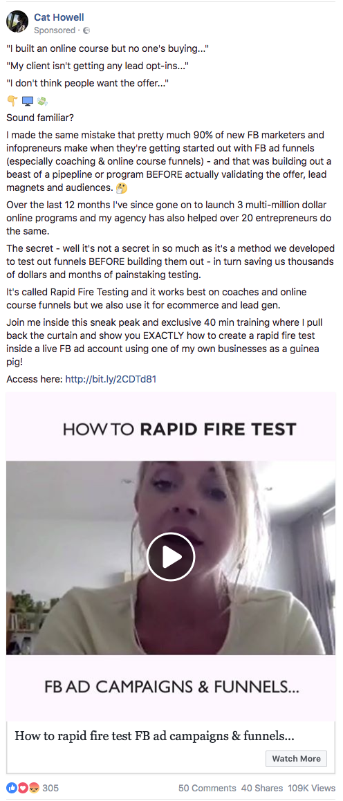
This ad uses what’s called a Problem Lead. It opens with flat statements of problems the target audience should relate to – if those phrases are familiar, they’ll be interested because they’ve had these problems and aren’t entirely sure how to solve them.
Next, it says that Cat also had this problem – showing that she was also in their position, which builds empathy with the prospect – and explains why they’re having this problem. Crucially, it’s an explanation that doesn’t entirely fix the issue. It’s designed to build curiosity; the prospect should think ‘of course I’m doing that… is there another way?’
This is followed by Cat’s own results: she’s now launched 3 multi-million online programs in 12 months. That’s one hell of a turnaround, and demonstrates that she has the solution. Copy-watchers here will see that this is a hero’s journey in miniature: there were problems, I sucked, and then I became awesome. Showing Cat taking this journey is encouragement for the prospect that they can do the same thing.
Then the ad reveals what Cat’s solution is: Rapid Fire Testing. It gives a few more details – it explains the results and that it works in multiple niches – but nothing that explains any further how it works. This builds the curiosity in the prospect and their desire to see the content.
Finally, the CTA promises what they’ll see and puts a timeframe on it: 40 minutes. 3-hour training might feel like over-delivering when you’re making it, but no-one really wants to watch it – this lets the prospect know exactly what they’re getting into.
If you’re familiar with Colin Theriot’s Viking Velociraptor formula, you might notice this ad follows his system almost to the letter. It misses the ‘villains’ component, but everything else is in there.
The video itself is an example of Cat’s content re-use. It’s not a specific pitch asking people to sign up – it’s an extract of about 2 minutes from early in the content video that restates the problem and delivers an initial ‘WOW’ moment – that it’s possible to create and test a sales funnel before you create the course it’s selling (FYI, I’m not giving anything away here – the real content comes later in the funnel). In a neat touch that I’m still not sure was intentional, the video stops mid-word, making it clear that what they’ve just seen was an extract and there’s more to come, further down the funnel.
Let’s keep going.
The Squeeze

The squeeze page follows a standard, well-understood format. The headline to grab attention, the bullets to provoke curiosity, the call-to-action to get the lead.
The video here is exactly the same one as used on the Facebook ad – more reuse of assets, because why do more work than you need to? You could argue this is losing an extra opportunity to get the click, but it also gives people who clicked without watching the video another chance to see it – and if they did watch it, it evidently persuaded them to click on the ad. Seeing the same video here isn’t likely to put anyone off.
A copy breakdown, in brief:
Headline: This headline confirms what they’re about to see. The prospect here just clicked on an ad that said ‘How to rapid-fire test FB ad campaigns and funnels’ – this headline simply tells them ‘yes, you’re in the right place’. This isn’t an unreasonable approach – obviously, everyone on this page will be interested in what the headline promises. If I was managing this funnel, I’d be split testing this headline against one that’s more results-focused (maybe using the ‘3 multi-million dollar businesses’ line) and a social-proof headline made from the best testimonial received about the training.
Bullets: These tease the content without actually revealing any details on it, similar to the middle section of the Facebook ad. Bullets like these are designed to heighten curiosity.
CTA: ‘Download’ acts as a command and the >> arrows further subtly push the prospect to click, but what’s probably having the biggest impact on conversions here is the button colour. It’s bright and stands out – when you land on this page, your eye is immediately drawn there.
About The Presenter: This section adds authority – if you didn’t know who Cat was before, maybe knowing that she’s a keynote speaker and got credits with Forbes and Inc will make you more confident that she knows what she’s talking about. This is increasingly important when some people claim to be ‘experts’ without ever having actually done what they’re talking about.
Clicking the CTA button gives an optin form:

The form asks for both a name and an e-mail. As we’ve covered before, this means the data’s going to be more expensive – which isn’t necessarily a problem, but you’ve got to make sure the numbers add up for you.
The Thank You Page
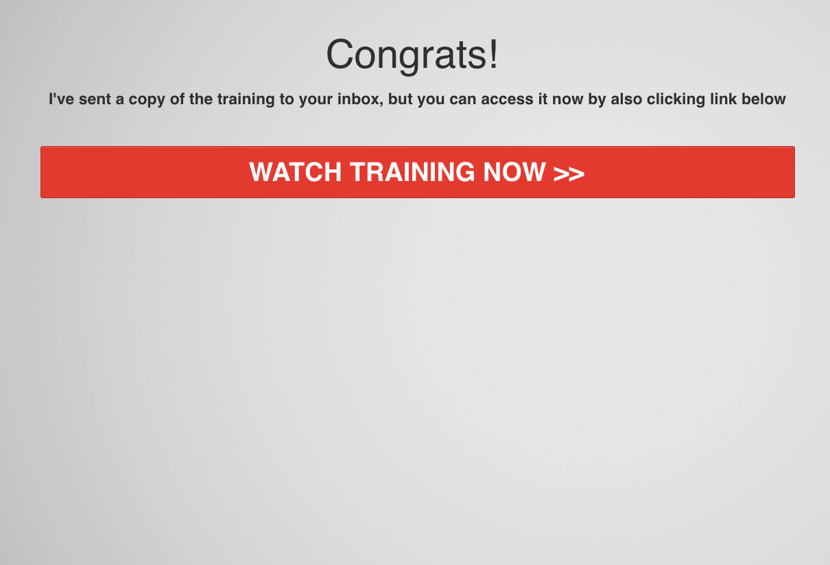
This is almost as simple as a thank you page can be.
No fancy copy – a simple congratulations message and some instructions.
No fancy design – a gradient background that allows both the text and the big CTA button to stand out.
And it’s a good job that button was there, because I never did get the promised e-mail. Possibly there was an error in the setup or the tech stack just didn’t work properly – APIs never have a perfect track record.
But thanks to the direct link I still got to watch the training – so pro tip, give your prospects instant gratification. Even if they don’t watch straight away, the choice is there.
The Delivery Page
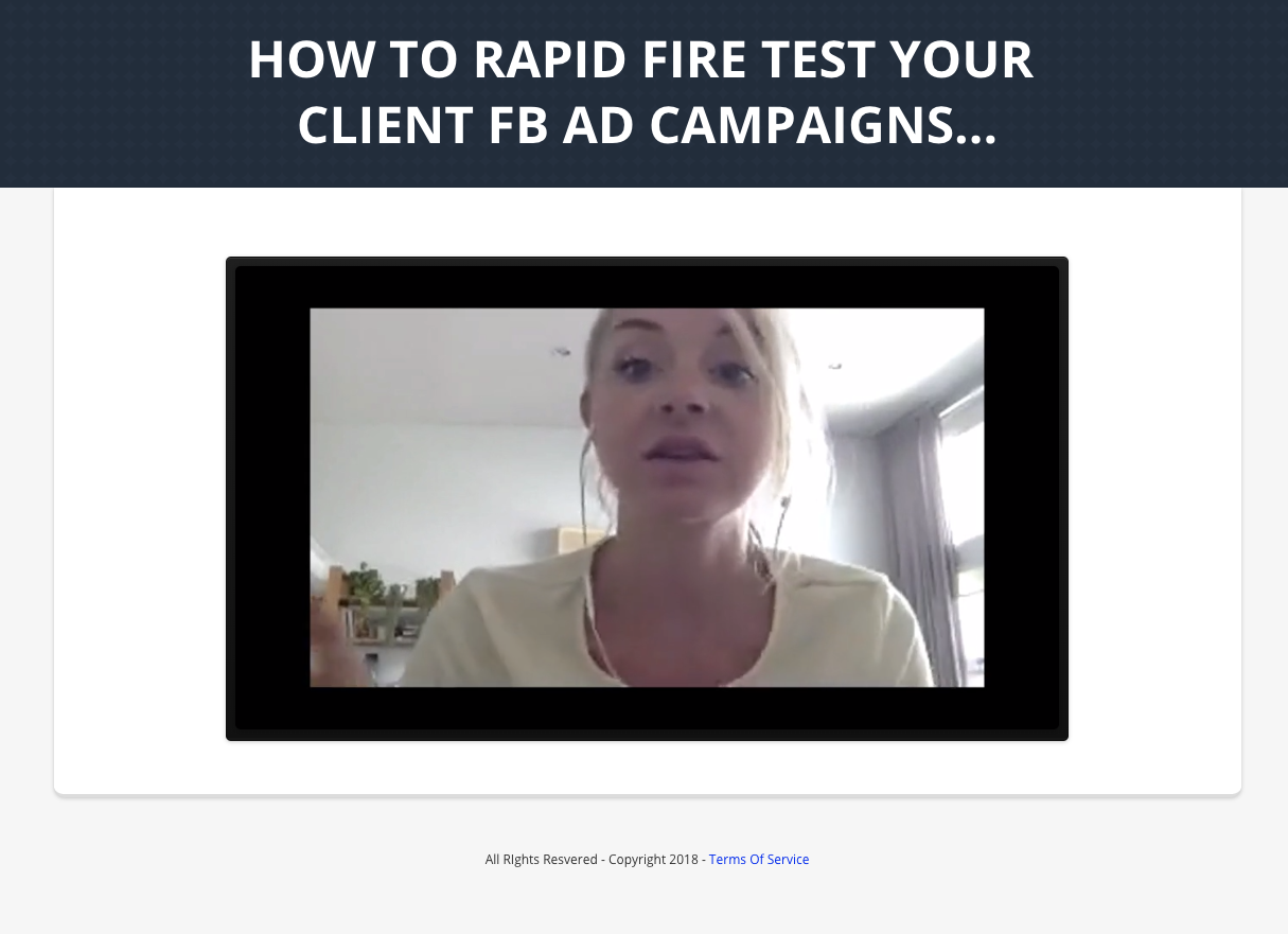
Once again, the headline remains the same. At no point can you think you’re in the wrong place.
I was pleasantly surprised by the content itself. Perhaps I’m too cynical, but I was expecting the ‘free training’ to be a bit of content that set up a pitch webinar – but that wasn’t it. It’s 40 minutes of a training call in which Cat describes her rapid-fire testing process, a useful way of generating the copy you’ll need for all the ads involved, and doesn’t hold back on the detail. To top it all off, she’s an engaging presenter. It feels like a real lesson being delivered by a real person, not a persona. I want to do tequilas with Cat.
And that’s because here, the content is the pitch.
Every week, for members of the $47/mo subscription that’s being sold, Cat does hour-long training calls – and members also have access to the archive of previous calls. This video is the first 40 minutes of one of those training calls, so you’re getting a great idea of what you’ll get for your $47/month because you’ve just seen a big example. You know the quality of information you’ll get, you know what kind of presenter she’ll be.
It means there’s no copy techniques which could up conversions – for instance, there’s no urgency – but it also means this content video would be extremely fast to produce and take basically zero effort – not to mention giving the prospect a far better idea of what they’re buying. While this is entirely speculation, I wouldn’t be surprised to find conversions here to the subscription were relatively low, but the retention on people who did buy was excellent.
About 37 minutes in to the video, the buy buttons appear below it:
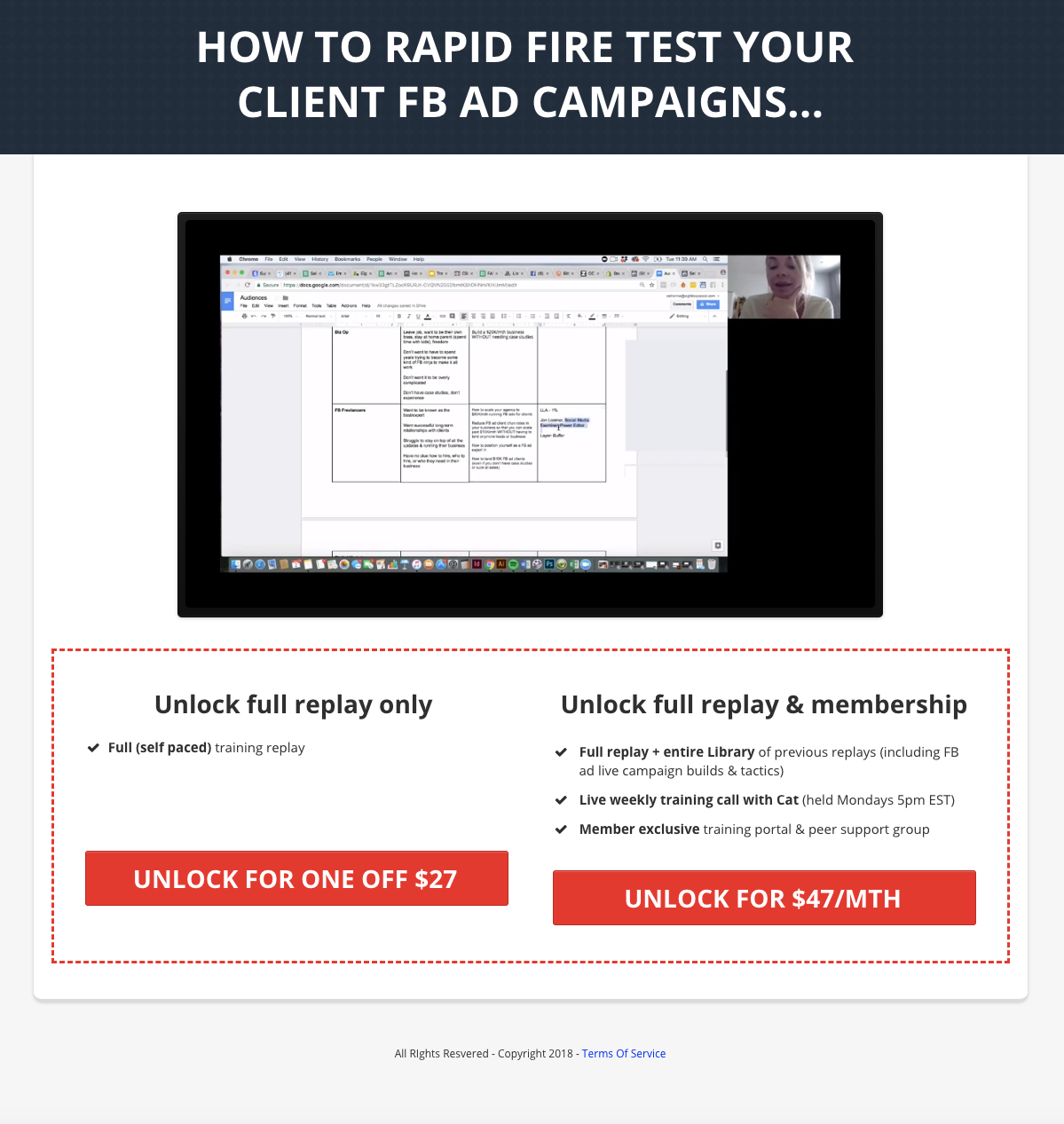
Giving us the options of buying the complete version of the above video, or the full training membership.
You might be wondering about ‘complete version of the above video’. That’s because at about 40 minutes, this happens:
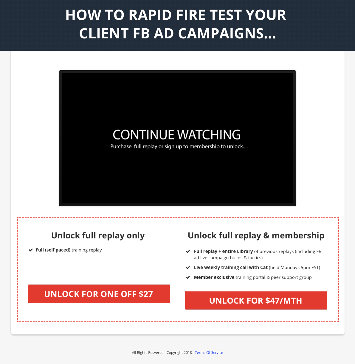
By this point, everything promised in the ad has been delivered. But the presentation itself clearly isn’t done – just like in the initial video in the ad, Cat’s cut off mid-sentence.
As previously mentioned, the full recording is a one-hour training call, so there’s about 50% again to go. There’s no pitch, it just stops, Sopranos-style.
(Full disclosure: I have never seen The Sopranos)
I was impressed with the content in this presentation – but I was left feeling a bit annoyed by the abrupt stop. I had been given everything promised, but at that point the training was moving on to extra ideas, and they were cut off mid-flow. It wasn’t a bait-and-switch, but it did feel a bit like it.
That said, I can appreciate the technique. It works well at leaving people wanting more. Generally I’m not a fan of annoying customers before asking for the purchase – my feeling is that someone you’ve just pissed off isn’t that likely to buy from you – but there’s no saying my reaction would be universal.
If you do click on a buy button, this is what you see:
The Checkout
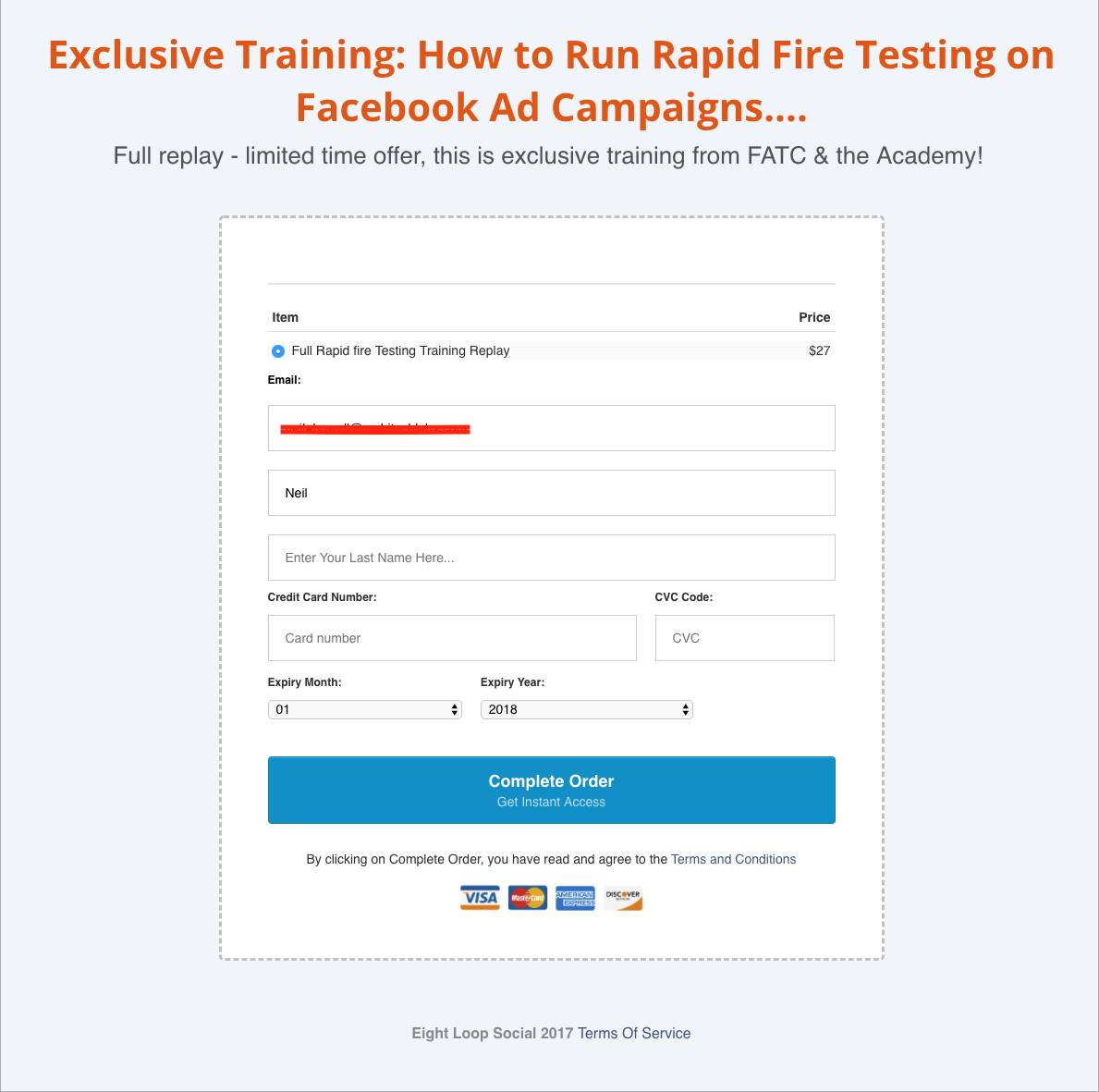
The checkout form is simple, without any flashy design. You’ll probably have noticed the consistency in design types all the way through the funnel – sometimes the colours change, but the basic ideas of no-frills, plain backgrounds and clear fonts remain.
Note the use of a blue button here rather than a red one. While this isn’t something I’ve personally tested, red is seen as a danger colour by the primal lizard-brain most of us are really making our decisions with, which means it can damage conversions when used on a button designed to take someone’s money.
The (Second) Thank You Page
On purchasing, you’re taken to this page:

This e-mail DID turn up.
The animated GIF is a nice touch. It plays in well to the kind of character Cat seems to be on her presentations, and it never hurts to raise a smile after the order’s been placed.
That’s All, Folks
It’s not, really.
The product I purchased was the $27 one-time offer for the full presentation. This was primarily to see if there were upsells, though I’m also looking forward to reviewing the presentation content again. There weren’t any direct upsells, but I’m now getting hit with retargeting ads and e-mails selling the subscription. I’m also now seeing ads on Facebook for a different, higher-priced service – but it’s unclear whether that’s designed as a specific follow-up as part of this funnel or if it’s simply a new offer being tried out. It’s seems reasonable to expect that I’m now pixelled as a previous buyer and, therefore, a pretty hot lead.
So the funnel continues, but this is as far as this path will take us.
The key ideas from this funnel you can apply to your own funnel-building:
- Fast can be better than flashy. Everyone wants the world’s most beautiful landing page, but you might get better results from putting up something more lo-fi and optimising it based on the results you get
- You don’t ‘need’ a pitch. You need to give your prospects a good reason to buy what you’re offering… but that doesn’t necessarily mean clever copy and high-intensity webinars
- Give instant gratification. Let your prospect access the content they’ve signed up for right away, as well as e-mailing the link. Sometimes, e-mails break.
- REUSE YOUR ASSETS. Don’t feel like you need to reinvent the wheel for every stage of the funnel. Here, Cat had a single training call recording – and from that got the FB ad video, the squeeze page video, the lead magnet content, AND the one-off product.
Like This Funnel?
Want to use a funnel like this yourself?
We’ve created a version in Convertri. It’s not exactly the same style, but it’s doing all the same things in all the same order, and we’ve added logo spots so you can easily brand it for your own company.
Click the link below to add it to your account:
https://app.convertri.com/import/3ad8081c-590d-11e8-88b1-066f2f7866d2
Let us know how it works for you! If we can get enough data, we’ll report back on how well this funnel type works.


