Testing Our Mettle: How 4 Split Tests Saved A Launch
“Well. Shit.”
Andy had just got off the Quizitri pre-launch webinar. He was buzzing – he always is after he’s been talking to engaged audience who are actually interested in the tech he’s made. It’d been a long call, as well. Lots of questions and lots of interest in our new platform, and since Andy is an extrovert in a company full of introverts, that’s exactly the kind of thing that gets him bouncing.
And then I had to kill the mood by telling him our hour one stats had been, as they say, sub-optimal.
Houston, We Have A Problem
We’ve all known the feeling of a launch going bad.
The constant power-refreshing of the stats page, hoping that maybe it’s just lag and you’ve actually got a ton more sales than you think.
Desperately trying to not realise that the idea you’ve slaved away on and poured so much into for the last few months may not be as good as you thought it was.
It wasn’t anywhere near as bad as it could have been. Out-of-the-gate FE conversions were 6%, on a $69 product which was paying a distinctly above-average rate of commission.
But I’d wanted double that, and we clearly weren’t getting there.
We’d been working on this launch for a long time. We had targets to hit. Just one hour in, they looked so far away they may as well have been on Mars.

So here’s a brag which is probably going to sound kinda weird, given how this post is all about conversions not being up to snuff:
I’m a very good copywriter.
I didn’t actually write much of the Quizitri copy – it was written to my spec by Luke Corden, who is also a very good copywriter. But I signed it off. I was happy with it then. Going through it, as the numbers came in, I still was. It got across the message we were trying to deliver.
And that was the problem.
We were trying to sell Quizitri on what I normally call a ‘sexy tech’ basis. That is, the app was attractive enough to the market to appeal just through what it enabled people to do.
We chose this approach because, well… it looked like it was true. An ability to create quizzes is one of the most requested Convertri features we get. It’s one of the most requested features for our competitors. The market supports several recurring-billing products just based around building quizzes. Surely, with all that, the ability to build quizzes must be in high demand?
That was our gamble. We placed the chips, rolled the dice, and it came up snake-eyes.
Turns out, the ‘sexy tech’ approach was the wrong one. Our letter focused on the wide variety of quizzes you could build with Quizitri and how easy it is. It was written for a market that wanted to build quizzes.
When your market doesn’t want to build quizzes, it doesn’t matter how ‘good’ your copy is delivering that message. It won’t connect.
And the conversions suggested that was the case. Sexy tech didn’t hold up. Maybe it would have worked at a lower price point, but dropping it mid-launch with a load of sales already in the bag wasn’t a precedent either I or Andy were comfortable with setting.
So we needed a new angle, and we weren’t going to get one. This offer was only live for a few days, so writing and designing and putting live a whole new sales letter in time to make any difference wasn’t going to happen.
But just because you can’t have the ideal solution, that doesn’t mean there aren’t things you can do.
So we pulled on our mad scientist goggles, fired up the quantum carburettor, and got to work.
So here’s what we tried, and the results.
I should start by saying that for most of these tests, I would have liked more traffic. I’m not a testing Nazi – it seems to be a fairly common opinion that you need 5000 clicks or 1000 sales per test before you can draw any conclusions, and both I and my maths degree say this is bollocks. However, even with that more laissez-faire attitude, under normal circumstances I would have run tests 2-4 for longer before making the call. But this was a launch and both time and traffic were limited, so we take what we can get.
Test 1: Tech Headline vs Results-Based Headline
Hypothesis: Customers weren’t excited simply by the idea of being able to make quizzes. Instead they needed to see what results those quizzes can give.

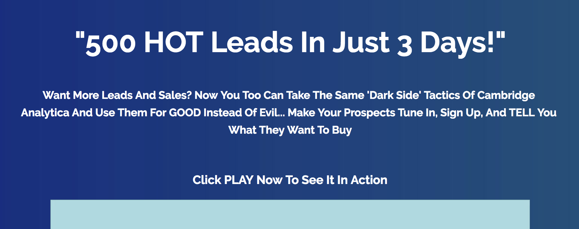
Our control headline was a classic sexy-tech headline. It was designed to appeal to people who actively wanted to build quizzes, since we thought the bulk of the market did. Our test headline instead put the main focus on what they could get from those quizzes.
The results:
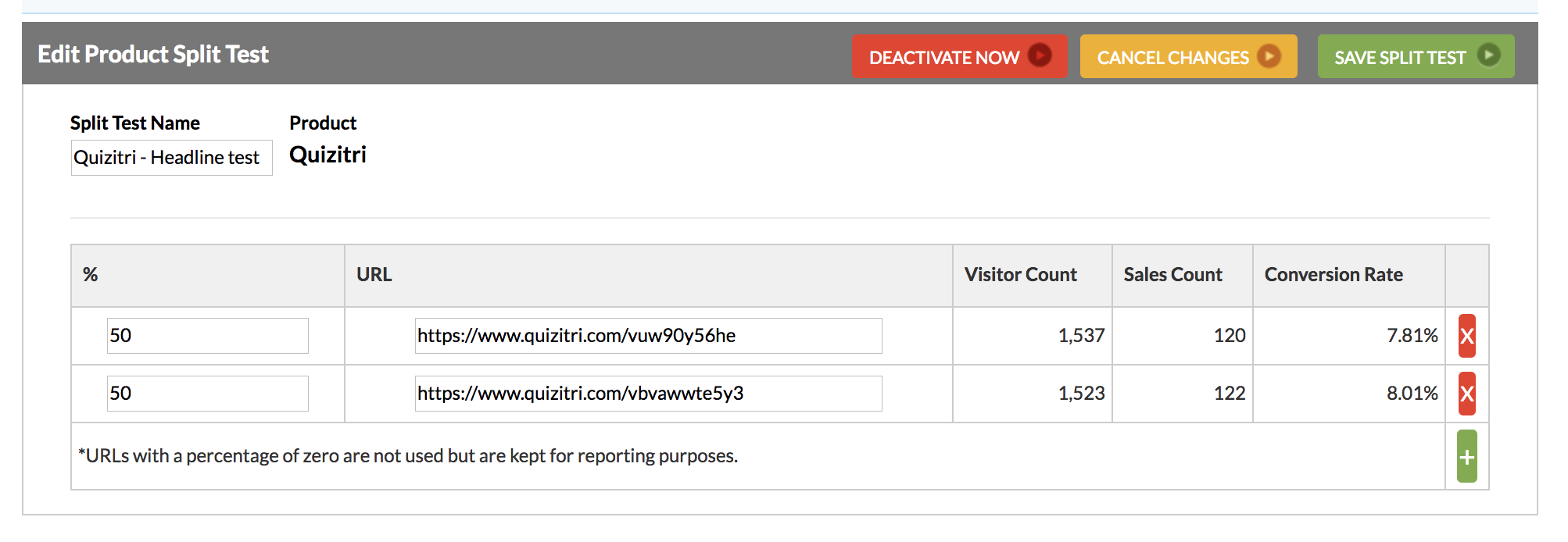
The results-based headline ‘won’, by 0.2%.
Utterly, completely insignificant.
Which is potentially an interesting result. It could imply that the initial read of the market wasn’t as far off as I first thought and there were a sizeable proportion of people who did want to build quizzes – just not enough of them to support the conversion rates we wanted. Or it could imply that at this stage of a launch, with the first urgency deadline hitting, the headline just didn’t matter and we could have put the first line of a Beatrix Potter story without impacting results.
But while it was interesting, it wasn’t really what I wanted to see.
Test 2: Results-Based Headline vs Results-Based Headline Redux
Hypothesis: Our original results-based headline was still too complicated. Quit with the words, Shakespeare. Start talking about results.


We decided to double down. The results-based headline may have only been ahead through dumb luck, but I’ll go with a lucky headline over an unlucky one any day.
Luke came up with an alternate punchier headline that focused on the same core idea, and we ran it out.
The results:

This test ran during the first part of the mid-launch lull, but Luke’s version was the clear winner.
Significance level: 85% (and what that means, for the non stats-geeks in the room, is if we threw a million clicks at each variant, based on these results we’d expect to see Luke’s headline end up ahead 85 times out of 100)
Ideally I’d be looking for 95% or better, but see above re: launches and taking what you can get. We decided something being a good call 5 times out of 6 was good enough.
Test 3: Blue ‘Buy Now’ buttons vs Orange ‘Buy Now’ buttons
Hypothesis: The blue buttons weren’t eye-grabbing enough against the page design. We needed something that clashed to make sure people noticed it.


Probably one of my biggest failings is that I focus too much on the areas I know. I’ve spent a large amount of my life writing copy, and so when I need to improve conversions on a page, the copy is where I look first.
But design matters. It’s a key part of your prospect’s experience, and it should get all the same testing efforts.
The results:

Orange beat blue so hard we almost reported it for anger-management issues. Even with the low amount of data, this was a high level of significance. Contrast matters, kids. If you want people to click your buy buttons, make sure they notice them right away.
Significance level: 95%
Test 4: Demo vs No Demo
Hypothesis: People don’t have much imagination. They see you demonstrating how to use the tool one way, and they have a hard time imagining it being used any other way – which makes it harder for them to imagine using it in their own situation.
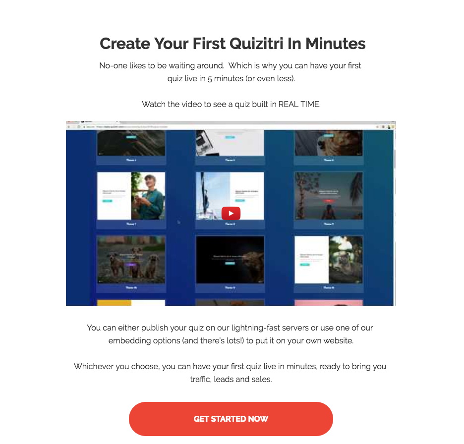

I don’t honestly think I would have come up with this concept on my own. One of our affiliates said he’d seen similar results on his pages, and since one of the strengths of Quizitri was its flexibility, it could be hurting our results.
I wasn’t convinced. But since the only way to really be wrong is to not test an idea, we tried it out.
The results:

You got me. No demo won by a large margin (admittedly, I also cheated a bit by updating some of the section copy so this wasn’t a pure test). This was probably the result that surprised me most out of everything. Given the relatively low amount of data we had, I’d like to test again on another product before jumping to firm conclusions… but this is a result I’d like to see if we can repeat. If doing less work makes your conversions higher, that’s got to be good.
Significance level: 85%
The Final Score
When the dust settled, Quizitri ended up with a 9.88% FE conversion across the launch, and an $11.09 funnel EPC.

Which is a huge improvement from where we started.
A final confession: the title of this article is a lie. (Or ‘creative perspective on truth’, as we say in marketing and politics.)
It wasn’t necessarily just these changes that made the difference. Conversions spike and dip across any launch as the period progresses – new affiliates come on board, old ones drop out, competitions pull heat and urgency works its magic.
But these optimisations do add up, and as much as anything else it’s a reminder that we don’t know everything. Not just that you won’t always pick the right angle to sell your product, but that sometimes things that you would never expect to be hurting your conversions actually are.
And that sometimes, even when things start out not so great, you can fix them.
In the end, we got a good result – and it’s given us some data to help improve our next launch.
And hopefully your next launch, too.


