14 High-Converting Landing Page Examples
Landing pages are the secret weapon for turning traffic into leads or customers. However, some landing pages frustrate visitors and underperform. You want yours to crush your conversion goals. Discover the 14 real-world high-converting landing page examples that work.
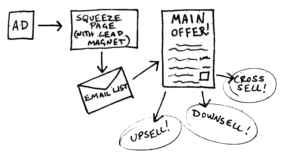
You’ve got a killer product or service, you’re driving traffic like a champ, but your conversion rate is underwhelming. Your landing page is leaking leads faster than a sieve. This is the bottleneck in most digital marketing funnels.
Imagine spending hundreds (or thousands) on ads, only to watch visitors bounce without taking action. Painful, right? Your sign-up form might be buried, your CTA button might be dull, and your landing page design could be more confusing than a tax form. Worse? Your competitors are eating your lunch with landing pages that actually work.
In this guide, we’ll show you high-converting landing page examples that are optimized, beautiful, and built to convert. You’ll see what works and how to apply proven best practices using tools like Convertri—the fastest, most flexible landing page builder made specifically for digital marketers who need results.
Key Takeaways:
- Structure, clarity, and speed matter more than complexity.
- A clear value proposition and strong CTA are non-negotiable.
- Social proof and visual appeal can instantly boost trust and clicks.
- Using a landing page builder like Convertri makes it easier to launch and optimize fast.
What Is a High-Converting Landing Page?
A high-converting landing page is a standalone webpage designed to get visitors to complete a specific action, and it succeeds at that rate above average.
Unlike engagement metrics (like time on page or scroll depth), which simply show interest, conversion is all about action. A visitor reading your page is engagement. A visitor clicking your CTA or completing your form is a conversion. That’s the difference between “nice traffic” and “real revenue.”
Typical landing page conversions include:
- Lead form submissions
- Email newsletter signups
- Free trial activations
- Webinar or event registrations
- Demo requests
- Product purchases
- Toolkit, checklist, or guide downloads
Regardless of the format, what matters for a landing page’s success is that one clear, measurable action is chosen—and that the entire landing page is optimized to drive it.
For example, if 100 people visit your webinar registration page and 20 reserve a seat, that’s a 20% conversion rate, and that page would be considered a strong performer in most industries.
What Makes a Landing Page High-Converting?
Before we look at real page examples, here are the core elements that make a high-converting landing page work:
Clear Value Proposition (Above the Fold)
The visitor should immediately understand what you’re offering. No guesswork.
- Place it at the top of the page
- Use engaging visuals or headlines
- Make it about them by solving their pain points
Pro Tip: Use bullet points to summarize the benefits, not just the features.
A Strong Call to Action (CTA)
Your CTA button should be:
- Clear, compelling, and specific (e.g., “Start Your Free Trial” vs. “Submit”)
- Front and center, repeated throughout the page
- Easy to find and easy to click (especially on mobile devices)
Visual Appeal and High Quality Images
A good landing page design is clean, mobile-optimized, and visually appealing.
- Use high-quality images and engaging visuals
- Maintain visual flow that leads the eye to the CTA
- Keep the layout user-friendly and easy to navigate
Social Proof
Testimonials, case studies, logos of trusted clients, and social media metrics can:
- Build trust
- Reduce objections
- Increase the conversion rate for landing pages
Fast Load Time and Mobile Optimization
A slow page kills conversions. The best landing page examples are:
- Built on fast platforms (like Convertri with drag and drop simplicity)
- Mobile-optimized for any screen size
- Designed to work without friction
14 High-Converting Landing Page Examples That Turn Clicks into Leads
Each of these real, tested landing page examples uses specific conversion tactics backed by psychology and data. They are proven to boost engagement, build trust, and drive real action. Whether you’re growing your email list, booking consultations, or filling your webinar seats, these examples are battle-tested and ready for inspiration.
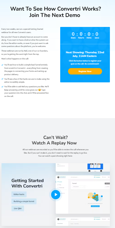
1. Webinar Registration – StealthSeminar Style
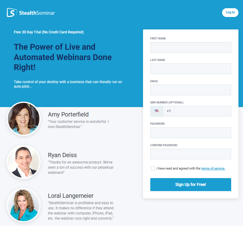
- Use case: Fill up your virtual seats fast.
- Example: StealthSeminar Automated Webinar Registration
- Key elements: Countdown timer, “what you’ll learn” bullet points, customer testimonials, trust badges, embedded video preview.
- Why it works: Combines urgency (countdown) with social proof and clear value. The copy is optimized for FOMO (Fear of Missing Out) and perceived scarcity.
- Pro tip: Use a split-test to compare “Reserve My Seat” vs. “Join Now” CTAs.
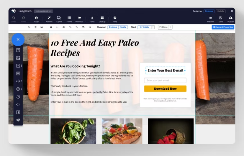
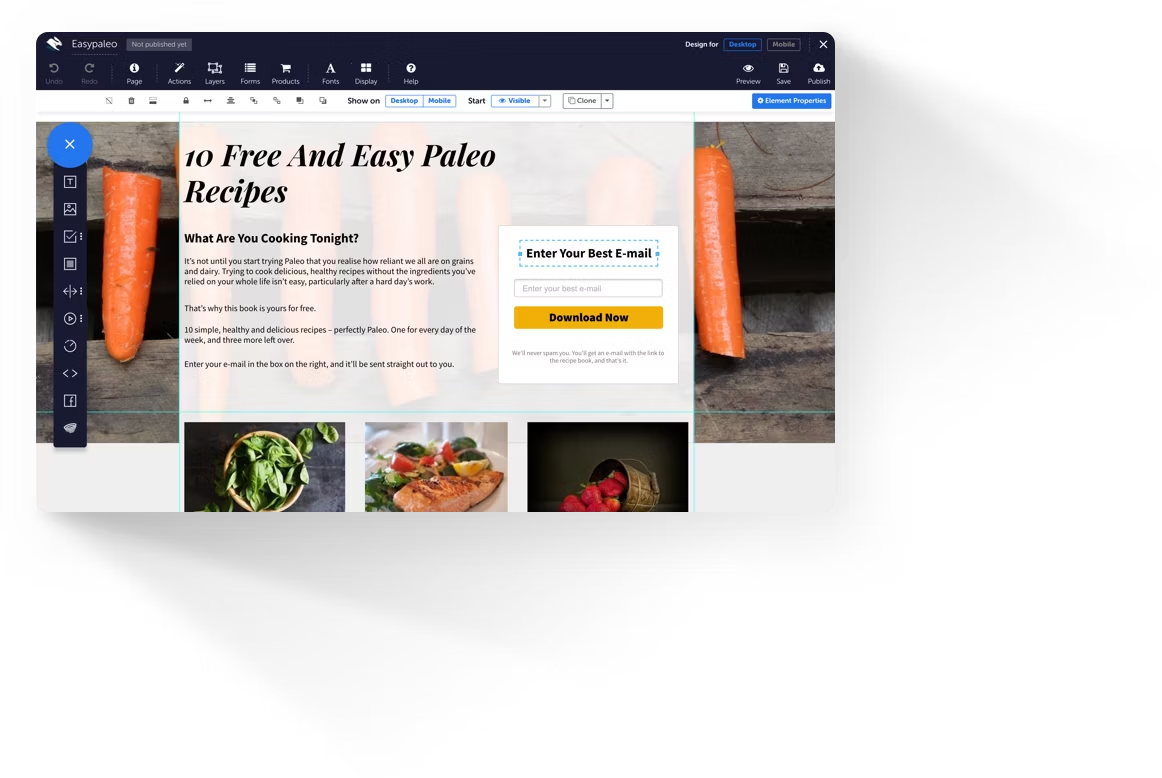
2. Checklist-Based Offer – Landing Page Template Funnel
- Use case: Share valuable design best practices.
- Example: Convertri’s Sales Funnel Checklist
- Key elements: Download CTA, breakdown of the checklist contents, link to use the template instantly.
- Why it works: Shows value and lets users implement instantly via Convertri.
- Pro tip: Add a “Preview Template” button to reduce commitment friction.
3. Consultation Booking – High-Ticket Coaching Funnel
- Use case: Attract premium leads for services or coaching.
- Example: Tony Robbins or Russell Brunson coaching funnels
- Key elements: Emotional pain-point copy, short video pitch, authority logos (e.g., Forbes, Inc.), 3-step form.
- Why it works: The messaging taps into real pain and positions the consultation as a transformation rather than a sales call.
- Pro tip: Use conditional logic in forms to qualify leads.
4. Free Trial Offer – SaaS Intro Page
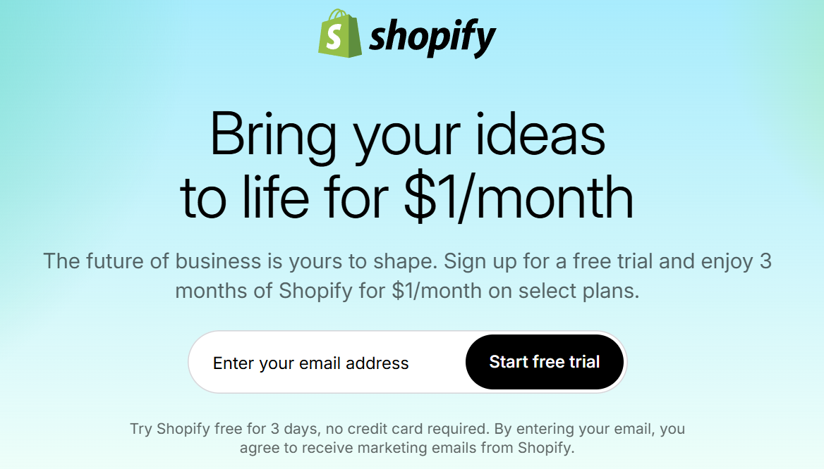
- Use case: Drive trials and onboarding for software tools.
- Example: Shopify’s Free Trial
- Key elements: Product screenshots, no credit card required, benefit-driven headlines, bold CTA.
- Why it works: The page reduces risk and highlights product visuals so users can picture success before starting.
- Pro tip: Emphasize “No Credit Card Required” for trust.
5. Case Study Download – B2B Lead Funnel
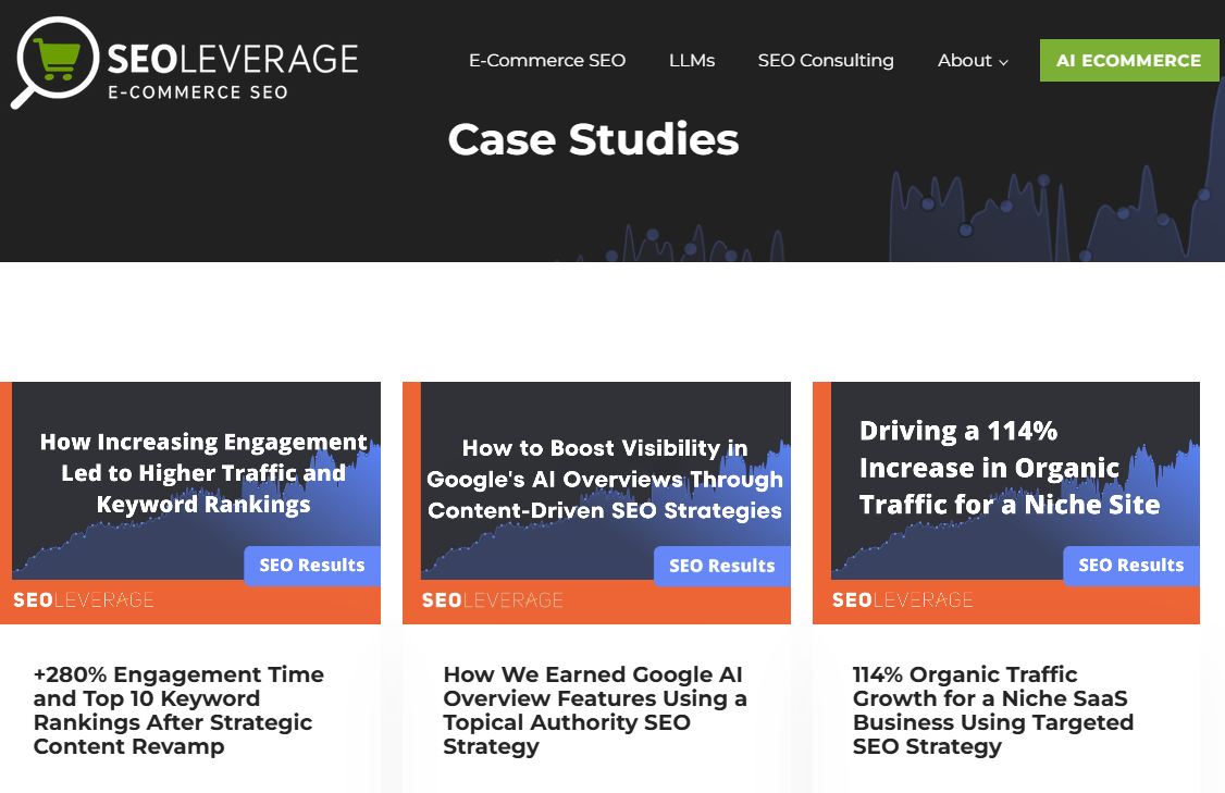
- Use case: Warm up skeptical, high-value leads.
- Example: SEOLeverage’s case study pages
- Key elements: Performance stats (e.g., “214% increase in leads”), executive quotes, simple gated form.
- Why it works: Shows ROI, not just talks about it. It’s proof without the hype.
- Pro tip: Use an exit-intent popup to recover abandoners with a summary slide.
6. Checklist Download – Productivity Resource Page
- Use case: Offer value fast with minimal design.
- Example: Trello’s Productivity Checklist
- Key elements: Sleek one-column layout, iconography, limited copy, “Download Now” button.
- Why it works: People love checklists because they’re quick, scannable, and action-oriented.
- Pro tip: Make your checklist printable or interactive.
7. Demo Scheduling – SaaS Platform Showcase
- Use case: Book 1:1 product walkthroughs.
- Example: Convertri demo webinar page
- Key elements: “See it in action” hook, short embedded form, bullet benefits, logos of existing customers.
- Why it works: It’s all about the “Show, Don’t Tell.” Short, focused, and direct path to conversion.
- Pro tip: Include availability times in the form to reduce back-and-forth.
8. Quiz Funnel – Interactive Lead Gen
- Use case: Engage cold traffic and segment your list.
- Example: Zenni Optical’s Face Shape Quiz
- Key elements: Interactive format, fun personality-style questions, personalized results + opt-in gate.
- Why it works: Gamification keeps users moving forward, and the personal result gives a dopamine hit.
- Pro tip: Show a “% completed” progress bar to keep people clicking.
9. Toolkit Download – Content Resource Hub
- Use case: Deliver multiple valuable resources in one bundle.
- Example: CoSchedule’s Headline Toolkit
- Key elements: Icons to show what’s included (PDF, template, swipe file), bold CTA, brand credibility.
- Why it works: Visitors get multiple resources in one opt-in, which increases perceived value.
- Pro tip: List out exact items inside the toolkit—surprises = conversions.
10. Survey Funnel – Market Research Meets Opt-in
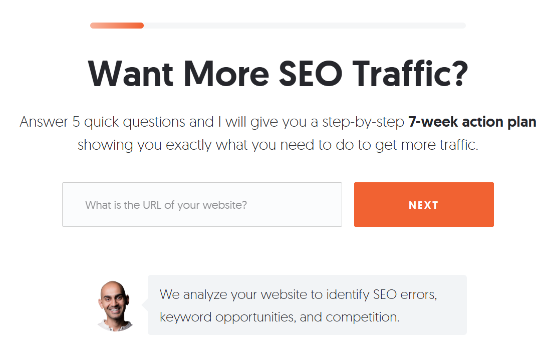
- Use case: Learn about your audience while offering value.
- Example: Neil Patel’s site audit quiz
- Key elements: Friendly copy, numbered steps, incentive at the end (e.g., free SEO audit).
- Why it works: Two-way value: You get insights, and they get a result or reward.
- Pro tip: Let users “skip” questions to reduce drop-off.
11. Video Explainer – Landing Page with Autoplay Video
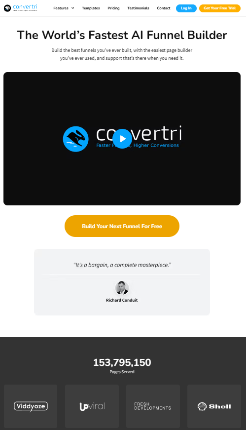
- Use case: Explain complex offers or digital products.
- Example: Convertri explainer page
- Key elements: Autoplay muted video, testimonial carousel, bold CTA repeated 3x down the page.
- Why it works: Video engages visual learners, and repetition ensures CTAs are always visible.
- Pro tip: Use captioned video for silent autoplay optimization.
12. Landing Page Teardown – Expert Breakdown Magnet
- Use case: Showcase your authority while educating.
- Example: Teardown blog series
- Key elements: Screenshot of the page, expert commentary bullets, opt-in for full PDF.
- Why it works: People love to learn from what’s working now, especially when it’s real.
- Pro tip: Turn teardowns into a lead magnet library or drip series.
13. ROI Calculator – Value-Based Lead Magnet
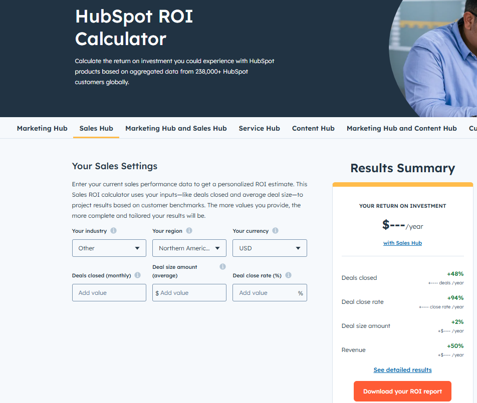
- Use case: Justify the price or investment.
- Example: HubSpot ROI Calculator
- Key elements: Input fields for key metrics, personalized output (e.g., “You could save $3,287/mo”), follow-up CTA.
- Why it works: Numbers don’t lie: quantifying value crushes skepticism.
- Pro tip: Combine with a free consultation offer.
14. Mini-Course Registration – Educational Funnel
- Use case: Generate interest for a premium course or program.
- Example: Free course pages
- Key elements: Module preview, instructor credibility, testimonials, “Start Free Course” CTA.
- Why it works: Promises transformation in bite-sized chunks – a no-risk way to get started.
- Pro tip: Include a progress bar or “course dashboard” preview.
10 Best Practices for High-Converting Landing Pages
The following best practices are consistently seen across the top-performing landing page examples. Use these proven principles to build or refine your own high-converting page:
1) Strong, Benefit-Driven Headlines
Capture attention instantly with a clear headline that communicates the main value, whether it’s a free trial, guide, or webinar. Set the right expectations from the start.
2) Simple, Focused Design
Avoid distractions. Eliminate unnecessary navigation or outbound links. Use layout, color, and directional cues to draw the visitor’s eye directly to the offer and call-to-action (CTA).
3) Prominent, Repeated CTAs
Your CTA (e.g., “Get Started,” “Claim Your Spot,” “Start Free Trial”) should be bold, easy to find, and repeated throughout the page. Many successful pages keep a sticky CTA button or repeat it after every section for quick access.
4) Concise, Persuasive Copy
Skip the fluff. Break your offer into bite-sized, benefit-driven bullet points or subheadlines. Speak directly to the visitor’s pain points and desires using clear, action-oriented language.
5) Use of Social Proof
Boost credibility by featuring testimonials, recognizable client logos, media mentions, star ratings, or influencer endorsements. These build trust and reduce hesitation.
6) Relevant, High-Quality Visuals
Use visuals that resonate with your audience. These include product screenshots, niche-specific photography, or short videos. Strong visuals help communicate your value faster than text alone.
7) Mobile Optimization
With over 90% of users browsing on mobile, responsiveness is non-negotiable. Ensure forms, buttons, and CTAs remain visible and easy to interact with on all devices.
8) A/B Testing and Iteration
The best landing pages are never “done.” Optimize through A/B testing by experimenting with headlines, button text, layouts, or even form lengths. Let data guide your design decisions.
9) Message-to-Market Match
Your landing page must reflect your traffic source and offer. If you’re promoting a webinar via paid ads, the page should immediately highlight the webinar topic. If you’re offering a free trial, showcase the immediate value.
10) Use Templates to Launch Faster
Speed matters. Platforms like Convertri offer ready-made sections and templates designed for conversion. Build pages quickly, run tests faster, and optimize without starting from scratch.
Why Use Convertri?
If you’re serious about building landing pages that convert, Convertri is one of the best tools out there, and here’s why:
- Blazing-fast page loads (speed improves conversion!)
- Drag and drop builder – no code required
- Built for digital marketers
- Supports A/B testing to improve your conversion rate
- Clean templates optimized for user experience and mobile devices
Get started with Convertri, and watch your pages load faster and convert better than ever.
FAQs
Q: What is a high-converting landing page?
A: A high-converting landing page is one that converts a higher-than-average percentage of its visitors into leads or customers. It typically features a clear value proposition, persuasive copy, engaging visuals, and a strong, above-the-fold call-to-action.
Elements like testimonials or social proof and a user-friendly, mobile-responsive design are also common. The key is that every part of the page (from headline to button) is focused on getting the visitor to take one specific action (download a guide, register, etc.).
Q: What’s a good conversion rate for a landing page?
A: According to recent data, the median landing page conversion rate is around 6.6% across industries. About 6–7 out of 100 visitors convert on the average landing page. Top performers can exceed 20% or more in very targeted campaigns.
The key is to continuously improve; with A/B testing and optimization, many pages achieve well above the median. Benchmarks vary by industry (for example, finance and education pages often convert higher), but the goal of any landing page should be to beat your previous best, not just the average.
Q: How to make my landing page convert better?
A: Start with the fundamentals: have a headline that clearly states the benefit of your offer. Place a visible, persuasive CTA button (e.g. “Get My Free Trial”) on the first screen. Use high-quality visuals and ensure your copy speaks directly to your target audience’s pain points or goals. Add social proof like testimonials or ratings so visitors trust you. Then use analytics and A/B testing to experiment. Finally, make sure the page loads fast and looks great on mobile devices, since speed and mobile-friendliness are critical to avoid losing impatient visitors.
Q: Do I need technical skills or a designer to create such pages?
A: Not necessarily. Tools like Convertri let you build landing pages with drag-and-drop ease. Convertri offers pre-built templates and content blocks, so even non-technical marketers can create polished, mobile-responsive landing pages quickly.
Convertri can even clone an existing page for you: you just input the URL, and it recreates the design in its editor. That way, you can focus on content and conversion, not coding. Many marketers use such landing page builders in conjunction with A/B testing tools and analytics to launch and optimize pages without writing code.
Q: What’s the role of a call-to-action (CTA) on a landing page?
A: The CTA is the focal point of your landing page. It is the action you want your visitors to take (download, register, buy, etc.). It needs to stand out visually (often with a bright button or large font) and use compelling text (“Get Started,” “Claim Your Seat,” “Start Free Trial,” etc.).
Your landing page’s design and copy should guide the visitor to that one CTA, making the desired action as clear and easy as possible.
Final Thoughts
Creating high-converting landing pages is all about using proven strategies, great design, and tools like Convertri to streamline your process.
Whether you’re launching a course, collecting leads, or building authority, landing pages are your most powerful tool to convert visitors into paying clients.
And with examples to inspire, best practices to follow, and the right tools at your side, your next landing page could be your highest-performing one yet.
Start building pages that convert, not just look pretty.