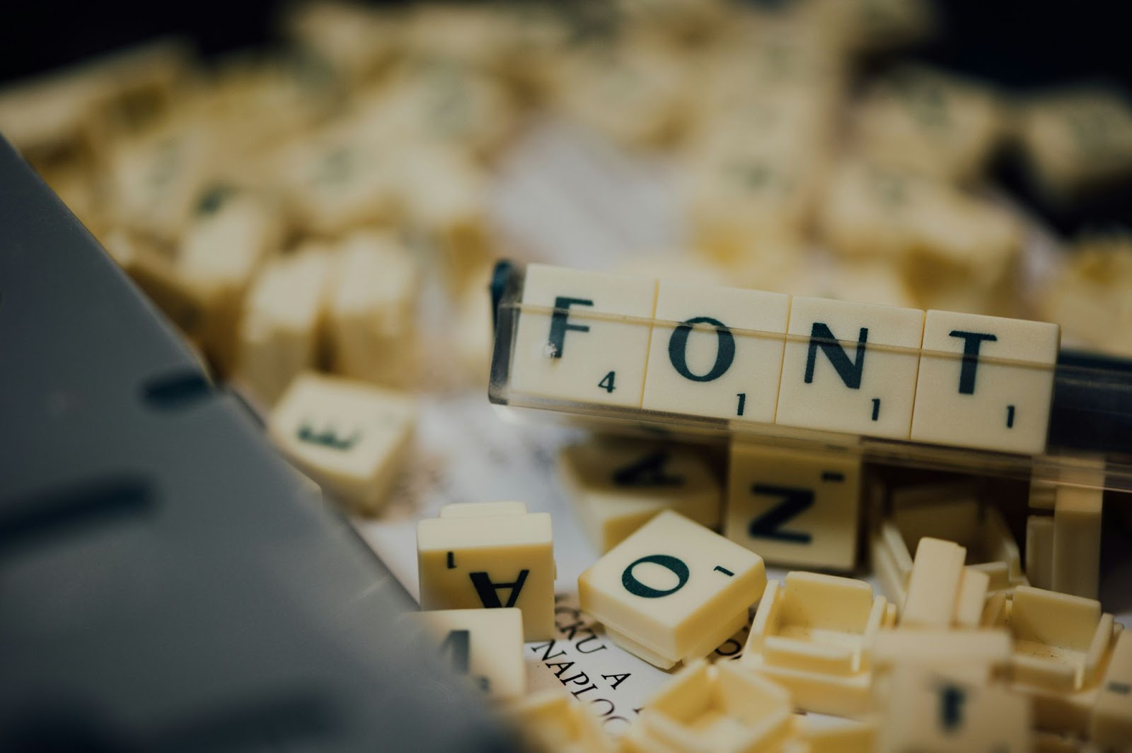
Google Font Pairings: 9 Beautiful Combinations for Your Web Pages
Fonts are the clothes of online words.
Sure, that opening line isn’t my best… but who cares, it looks gorgeous!
Certain fonts can elicit different emotions depending on who’s viewing them. Not only do you have to choose the right font for what you want your reader to feel, but also the image you want for your service or product… and those can be two different things.
For example, a fun and casual font is Comic Sans, so it would make sense for kids’ toys. But that font’s been overused to the point where, to people even slightly in the know, it looks like an embarrassing cliche.
Not the best choice for your classy, organic wood building blocks.
Go over our attractive and appropriate font pairing that you can use for your Convertri site.
Try every Convertri feature without spending anything!
Why Google Font Pairings Matter
Choosing the right font pairings can change how your website looks and feels. Fonts are your online identity that people will eventually associate with your brand. When people see a font similar to your brand, they think it’s your business.
Let’s say you’re running a website. Mixing a serif and a sans serif typeface creates a brand tone, enhances legibility, and keeps visitors engaged.
And don’t you want to see and read cleaner fonts?
How Fonts Influence Branding and Readability
Your font choices reflect how professional and trustworthy your business is. When font pairings work, they balance header fonts for emphasis and body fonts for body text and body copy, making your text more readable.
Use subtle variations to create contrast—italics, bold, or different weights to create a visual hierarchy.
Benefits of Using Google Fonts on Your Website
Here’s why Google Fonts would look good on your site or landing page:
- You have a library of free fonts. They’re easy to download and use.
- They’re already optimised for the web, loading faster and rendering consistently across browsers, mobile, print, and digital projects.
- You’ll get lots of inspiration and ready-to-use pairs if you need reliable combinations.
- The fonts are easy to reuse, save, or mix across many designs.
Popular and Effective Google Font Pairings
These font pairings are still sophisticated, timeless, suited for various styles, and have stood the test of time:
Classic and Elegant
Try these combos when you’re handling a sophisticated website and want an editorial and business look:
- Oswald and EB Garmond: Use this to contrast a bold sans serif header with a refined serif body font.
- Playfair Display and Karla: Looking for elegant headings? This style pairs up with a neutral sans serif font for the body copy.
- Crimson Text and Cardo: This serif font pairing looks timeless and suitable for long-term text.
Modern and Clean
Use these fonts for a modern business website or project with a minimal and polished style:
- Poppins and Libre Baskerville: This rounded sans serif header font has a readable serif for body text.
- Roboto Condensed and Roboto: This combo makes your site look cohesive. It offers enough weight variation for them to contrast.
- Lato and Raleway: This sharp and versatile font combination provides tech and modern brands with a fresh tone.
- Open Sans and Merriweather: This balanced combo is legible across devices.
Playful or Decorative
Add more personality and inspiration to your design with these fonts:
- Lobster and Open Sans: Bring a touch of calligraphy to the headline using a clean sans serif.
- Abril Fatface and Work Sans: These two have high contrast and variation, which is perfect for bold header fonts and easy reading.
How to Choose the Right Google Font Pairing
Get your font pairing right! Follow these steps:
Contrast and Readability
Draw a clear line between headings and body copy. Combine serif and sans serif fonts and use bold and italics to emphasise key points.
Establish Visual Hierarchy
This helps highlight the important stuff. Choose a striking header font for your headings and a clear body font for the text, especially when you’re posting long-form articles.
Match Fonts to Your Brand Tone
Each font exudes a certain tone. Serif fonts are classic and sophisticated, while sans serif fonts are modern, clean, and made for businesses.
Limiting Font Families for Cohesion
Too many fonts are an eyesore. Stick to two to three font families so readers can enjoy reading your content.
Best Practices for Using Google Fonts in Web Design
It’s exciting to try on a new font. But wait, take a break and see if the font pairing you want will work.
Take a look at these things first:
Performance Considerations (Page Load Speed)
Don’t load too many fonts or unnecessary weights on your websites. Use Google fonts well so your website is still optimised.
Testing Across Devices and Screen Sizes
You want to see how your font pairing works? Preview it on your mobile devices and desktop browsers to see if it displays correctly.
Testing your font lets you decide on the pair that works really well together.
Accessibility and Legibility Standards
Not everyone may like the font you’re using. Choose typefaces with strong features that still look clear even at small sizes for extended reading.
Final Thoughts
The right Google font pairings go beyond a design choice—you’re creating a design that reflects your brand and gives your website its distinctive tone. Combining the right serif and sans serif fonts and sticking to cohesive fonts while considering performance and accessibility makes your page visually appealing and useful for every reader.
For more font pairings, use font pairing inspiration tools like Canva and Scribd to learn how to switch fonts up a bit. Create your favourite combo now and see how the design impacts your brand!
And if you’re building your website in Convertri, try our platform for 14 days for free to create the landing page you want. Start your trial today!