Funnel #4 – the Quiz Funnel
Question: what was the New York Times’ most popular article of 2013?
Answer: a quiz.
(Ten points.)
And if you want a bonus question…
Why do quizzes make excellent sales funnels?
Here’s a hint: this one’s multiple choice.
See, there are a lot of reasons why quizzes make brilliant sales funnels. For example, Buzzfeed’s most popular quiz got over 20 million views, and 2 million shares on Facebook.
Also, 200 million quizzes are taken online each month, with the average quiz taking 64 seconds to complete. That means in one month, people are spending 405 collative years taking quizzes.
With prospects spending nearly half a millennium looking at pages, no wonder marketers are turning to quizzes to boost engagement and get more sales…
That’s exactly why we created our sister app, Quizitri, so you can make quizzes easily.
And it’s why we get pretty excited when we find a quiz funnel out in the wild.
So, when I couldn’t resist finding out what type of blogger I am, I knew I had to grab my notepad and sketch out the irresistibly simple yet oh-so-effective funnel from Kristen Poborsky.
The Funnel
This is a funnel from Kristen Poborsky, a marketing strategist and business expert who’s been helping entrepreneurs and small business owners to get more traffic, build lists, and sell more products and services since 2009.
The goal of this funnel is ultimately to sell a blogging mini course, as well as educate prospects about the courses and training on offer. Here’s a detailed artist’s impression: 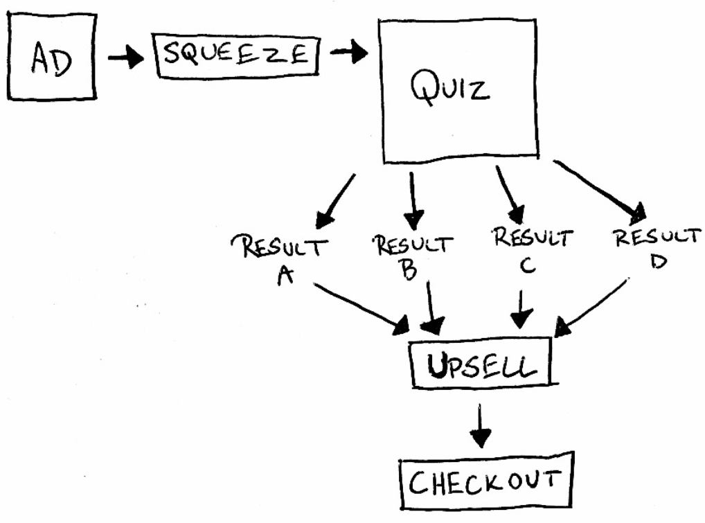
The lead comes in from Facebook, and sets out on a magical journey to discover what kind of blogger they are. So, let’s get started.
The Ad
This ad appeared on my feed, and it’s obvious why I was targeted as I’ve clicked to register interest in other business coaching and blogging products.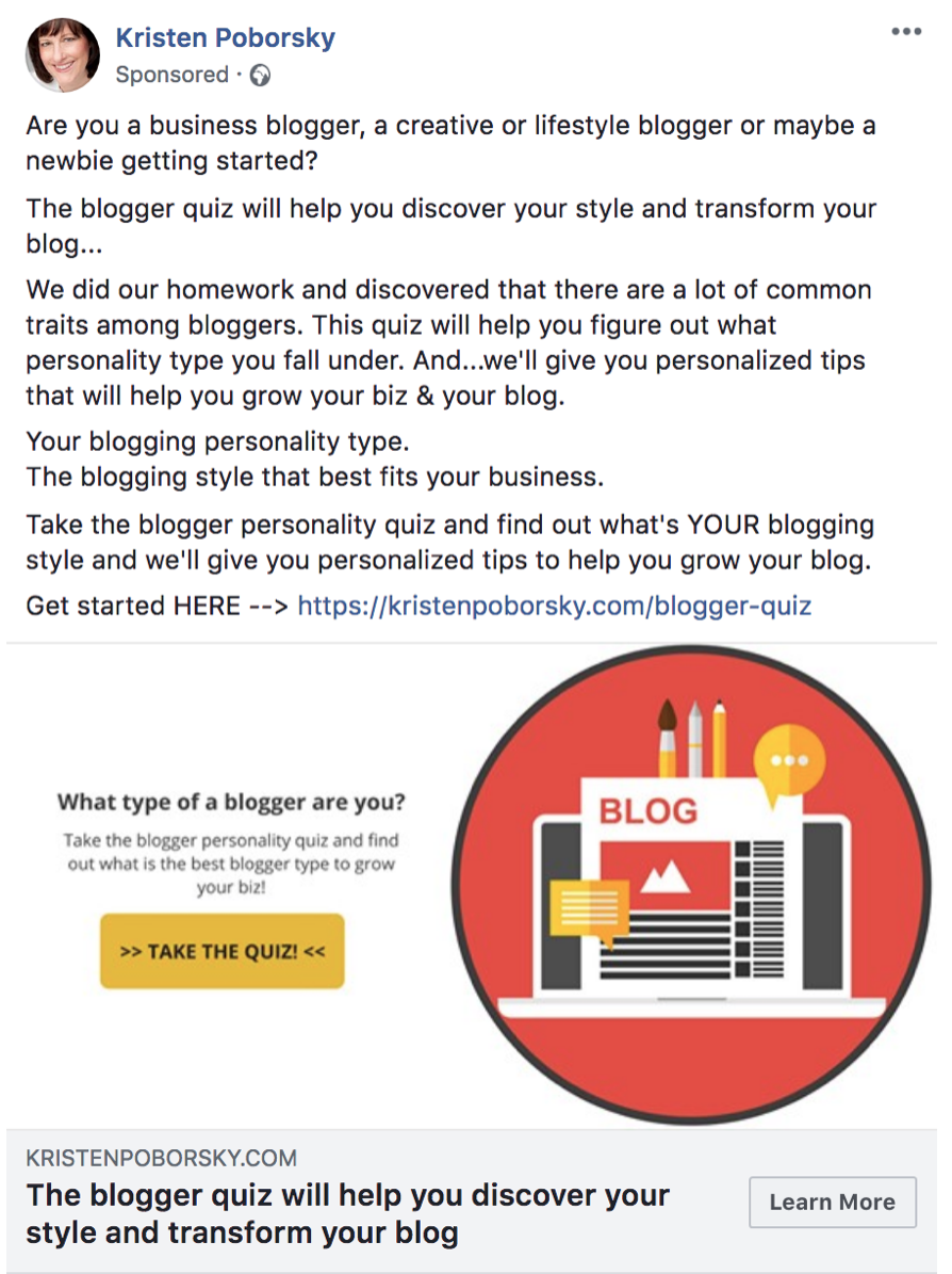
Kristen has a professional looking profile picture and her business page is under her name, which lends a feeling of humanity to the ad. Both her profile picture and the post image are bright, clear and high-contrast, drawing the eye in quite effectively. However, on closer inspection this post lacks polish.
The text of the ad is structured as a simple sales message rather than a personal post, using a question to qualify the audience: “are you a blogger?” Anyone who is or wants to be, hopefully reads further. Anyone who isn’t, scrolls on by. This ad has a few small mistakes and the copy needs reviewing. For example, “find out what’s YOUR blogging style” is grammatically incorrect, as is the use of ampersands and ellipses.
Grammar and spelling isn’t too important in most ads: hey, we’re all human. But Kristen’s profile picture and her ad image choice look very professional. She doesn’t look like the kind of person who would let copy to go print with errors, especially under her own brand, so we get the impression she just outsourced the work without proofreading. Not only that… but she’s targeting writers. Like me, they may be a little more fussy about spelling and grammar.
Next, we’re told we will discover our blogging “style” and this will help “transform” our blog, but in retrospect the results of the quiz are given away in the very first sentence… these are as wide-ranging as “business”, “creative” and “newbie”. It’s clear the funnel is aiming to get a wide range of participants, in order to segment down later.
This copy is also missing a touch of fear: no suggestion that using the ‘wrong’ blogging style could be damaging your business, no fear of lost business or missed chance of success. Fear isn’t essential to drum up here, but it’s a missed opportunity to add an extra dimension to this otherwise lacklustre copy.
(See those oddly cut-off sentences in the middle? Keep an eye out… they pop up again later!)
The image is also not an ideal choice, as it appears to be a low-quality screenshot. The text is small and hard to read, with a button CTA which reads “Take the Quiz!”. In contrast, the actual CTA of the ad reads “Learn More”, which isn’t as good: it isn’t clear whether the ad’s creator wants us to try and click the button in the image. Facebook only offers a predefined list of CTA’s – none of which really fit a quiz funnel apart from “Learn More” or “Get Offer” – but there is an option for not having a button, which, in this context, would have made more sense.
On first glance, you’d be forgiven to think it’s a preview of the squeeze page, its tiny text enticing the reader to click to read it in full view… it’s not. Spoiler alert: the squeeze page is completely different.
The Squeeze
We’re taken to a squeeze page, which looks fairly polished. No brand identity that ties it in to the ad save the Kristen Porborsky logo, and only the big yellow Take the Quiz button is the same as the version we saw in the ad image.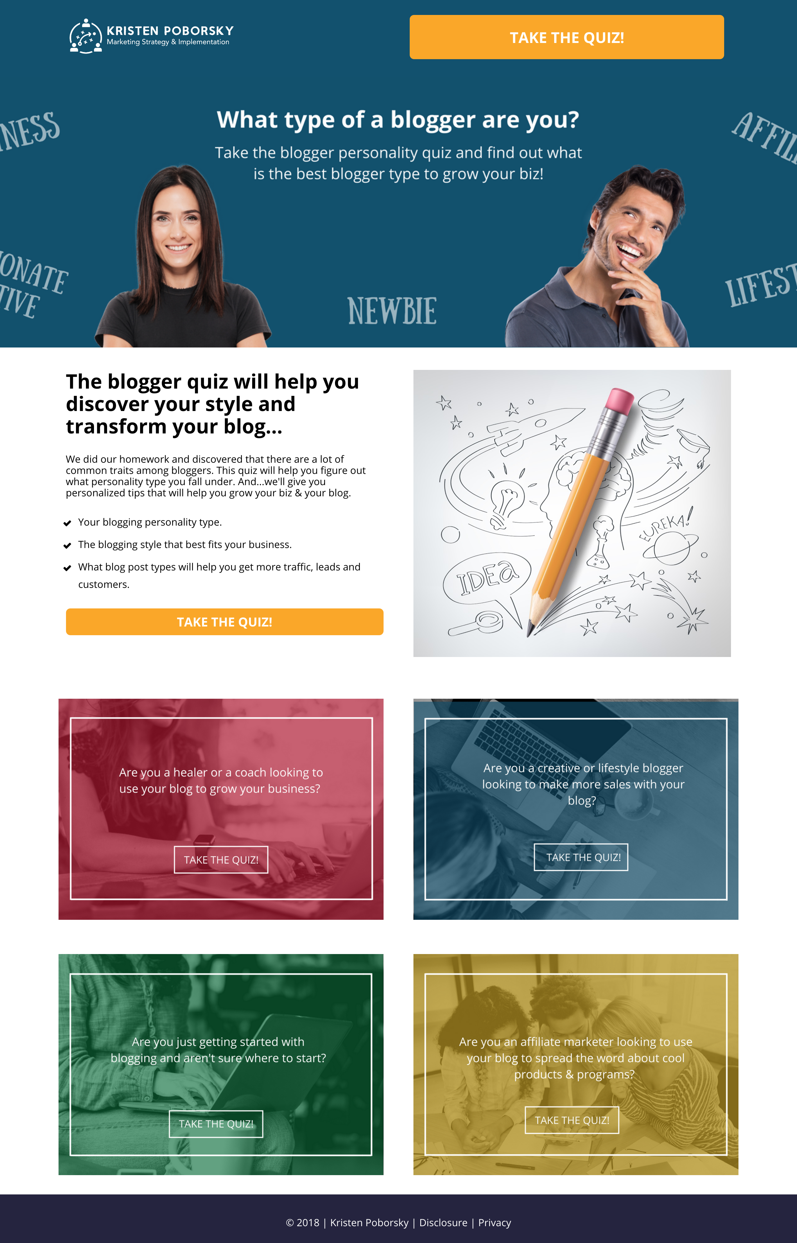
A large header once again reveals the possible results of the quiz. Only when we scroll do we see a paragraph of text introducing the quiz… and realise most of it was copied and pasted, not-so-expertly, from the Facebook ad.
Recognise anything?
Yep – those oddly cut-off sentences in the middle of the ad were actually bullets! Here, we get one more: but that doesn’t make up for the fact there’s no lead-in to these bullets.
A lead-in provides a frame for the bullets: like “here’s what you get”, or “inside you’ll learn”. It also provides a grammatical preamble, so the copy flows more effectively and makes more sense when scanned quickly.
Again, this is one of those writer niggles that doesn’t massively affect the copy as it stands, but it screams “amateur”: jarring with Kristen’s professional image and her attempt to attract blog writers.
Underneath this, four panels seem to allude to there being four different quizzes you can take depending on how you identify as a blogger. As the point of the quiz seems to be to find that out, this seems a little odd, and not without reason: each panel links to the same quiz. And yes, these are the four possible results you can get. Talk about spoiler alerts, am I right?
The Quiz
The first thing you notice is: this quiz is huge. It’s only got 6 questions, but you’ll have to zoom out to see them thanks to those big stock photo people hanging around from the squeeze page as well as a header for every question.
Each header image has two things in common: women, and laptops. Not much else. Nothing really relating to each question, or even the subject of blogging in general. The questions are fairly well thought out, and attempt to dive beneath the surface with asking how the taker feels about writing a blog as well as their specific goals.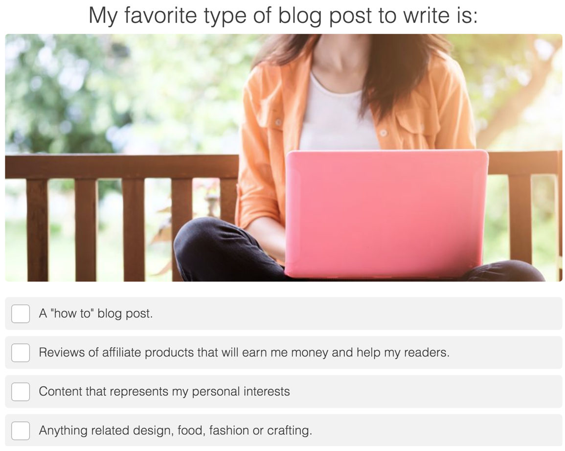
Each question has 5-7 possible answers, which feels right for this kind of personality test quiz. Strangely, the last question – “what best describes your personality” – has only “I’m a business person” or “I’m a creative artsy type” as possible answers. It’s unclear how much weight this question has when calculating results.
After submitting the results, a pop-up appears prompting the quiz taker to enter their email to see results, while also promising “fun and infrequent” updates. This is a good touch, as people want to read interesting, entertaining things, but they also don’t want their inboxes crammed with stuff they’ll never get round to reading.
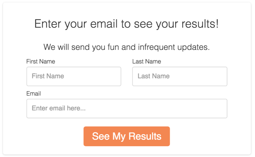 Despite this, the CTA is “See My Results”, which leads us to believe they are viewable on the next page. However, it’s impossible to view results without entering your email. This is a common technique because focusing the CTA on what the prospect will get in return (i.e. a benefits-driven CTA) is more effective for conversions than one that reminds them they’re handing over their email to yet another newsletter.
The Results
Hooray, I’m a… well, a bit of everything really, because for the purposes of this analysis I took the quiz about 37 times to get different results.
There are four possible outcomes: Newbie Blogger, Affiliate Blogger, Business Blogger and Lifestyle Blogger. A bold heading makes it clear which result you got, and underneath that are a few power words (such as “fearless”, “driven” and “ready to start”).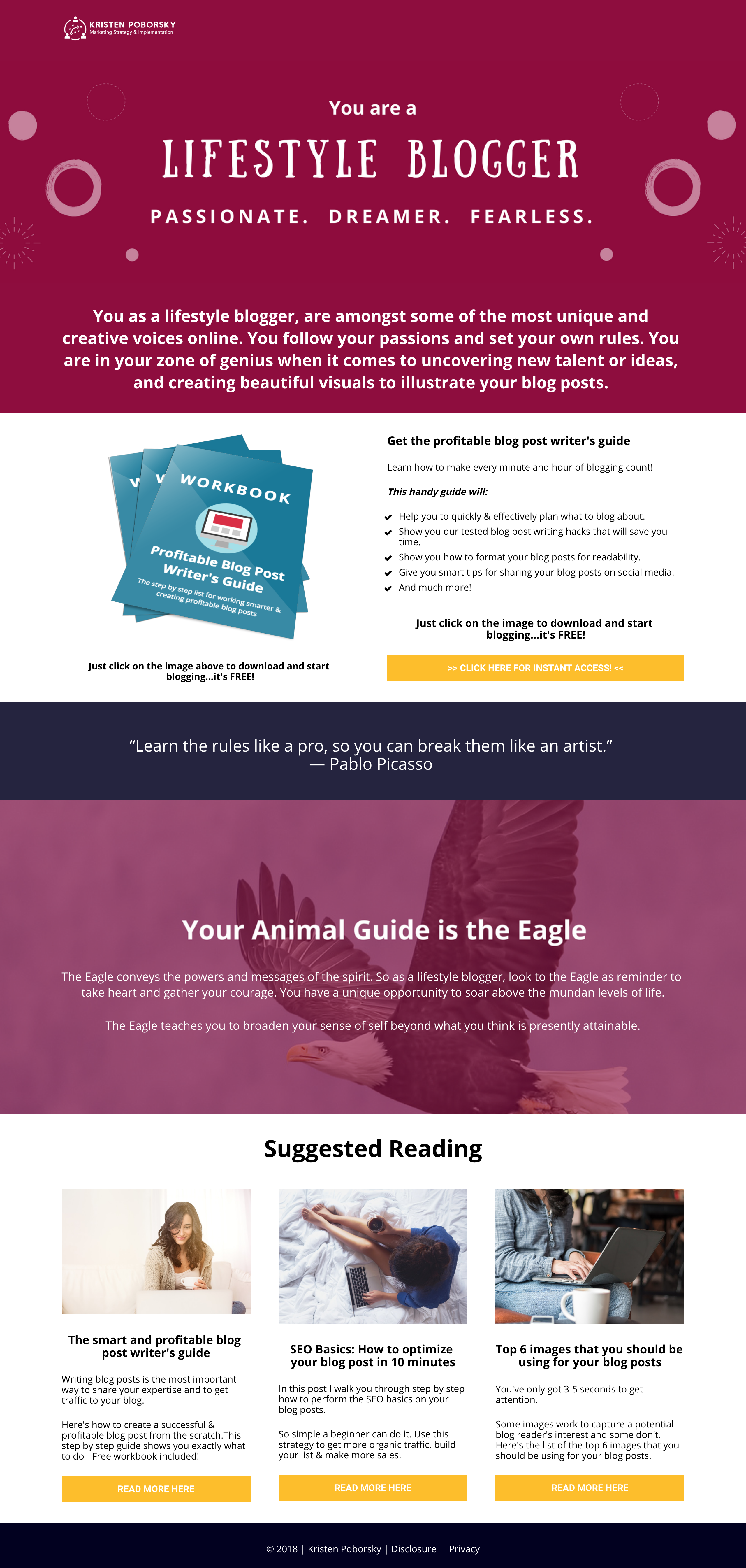
Complementary colours and Kristen’s logo contribute to brand recognition, so we know we’ve not been redirected to a third party. The nice, encouraging blurb below each heading gives an overview of your blogger type… despite, erm, some spelling and grammar errors (“having a beautiful blog what reflects your design esthetics”), and each type is designed to fit everybody who reads it. Each result is special, thoughtful, a leader – but in different ways. Who would disagree with that?
Next, we’re given the next offer. It has bullets – with a proper lead-in, this time – and we’re introduced to a handy guide that will give us tips and hacks for blog post writing. Nothing in the subheadline here alludes to it being free: that’s only revealed in the small text below the image, which seems like a wasted opportunity.
Pause here, for a quick quiz: do you think this offer is unique for each quiz result? Answer at the bottom of the section!
So before we click on that, we take a second to peek below the fold – and look, it’s a quote by Pablo Picasso. Or Ken Blanchard. Then, oddly enough, our animal guide.
Wait, what?
This quiz hasn’t shown us much of a brand so far, but even so… this is very off-brand. Our first impression of Kristen was her LinkedIn-esque profile picture, and beyond that her corporate logo and muted, tech-savvy colours.
But here, she’s recommending either a swan, eagle, alligator, or frog, which, being the animal guide for Newbie Bloggers, apparently teaches us to “take time to replenish the soul”.
(Did you know an alligator’s most marketable skill is its wisdom of waiting to pass judgment until all of the facts have been closely examined? Neither did I, until I found out I was an Affiliate Blogger!)
Moving on, next we see a few articles of suggested reading from Kristen’s blog. All of these, including the free workbook, are exactly the same on each result page.
So, if you scrolled here from the question above, there’s your answer. Now go back and read the rest of this section, skipper!
Before we get to the upsell, a technical hitch threatens to stop everything in its tracks – the workbook image is clickable, as the text promises… but the link does nothing but refresh the page. Only clicking the CTA gets us where we need to go, which in this age of UX improvement and link clickability, is surprisingly counter-intuitive.
The Upsell
We made it!
Here’s a thank you page for the workbook, which includes a direct download, and that’s nice as we’ve already entered our email once. There’s a direct link, plus a URL to copy and paste – and this time, clicking the image does work.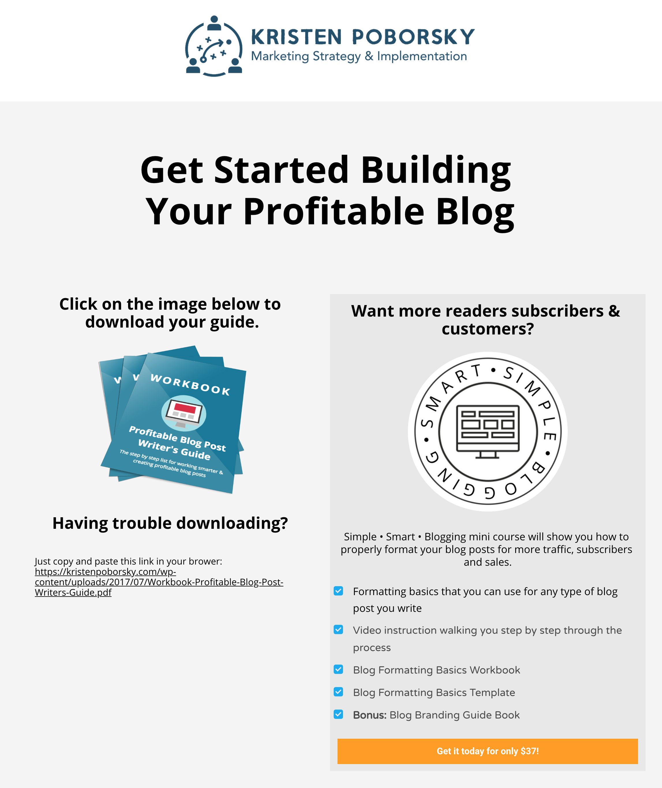
There’s also an upsell offer for a mini course on blogging, which seems to have been written by the same guy that did the first ones, before someone else (read: a better writer) had a go at the bullets for the workbook. There are more grammar errors here, no lead-in, and the stylisation of the name Simple * Smart * Blogging is a poor choice given the lack of formatting and other mistakes: it just looks like an error. There’s also no real selling here: I know I’ve just taken a quiz, so with several micro-commitments already made I should be interested… but there’s nothing else here. Why should I care?
But hey, for $37, and with Kristen’s credentials, let’s give it a go.
The Checkout
If we had any doubts here, they’re allayed by the professional layout of this checkout as well as a large guarantee shield logo, bullets of exactly what’s included in the course and some impressive testimonials – which, ironically, would have sold me more effectively on the upsell page. Why wait until now to use social proof? It makes no sense – the layout is nice, but there’s been no thought beyond it.
 But only in the next screen, when we’re prompted to enter a password, do we realise this is a membership site setup. Until now, it wasn’t clear if this was a digital download, physical product, or something else.
The Course
Once we’ve confirmed our password (I suggest Convertri!is!GR8) we’re taken to the course dashboard. Without wanting to give away too much of Kristen’s material, this is a well-organised mini course with workbooks and video guides, hosted by Teachable, which explains the familiar, easy to navigate layout.
From here, there’s no other offer, but that doesn’t mean there’s nowhere to go. Clicking the back arrow takes us to Kristen’s other course offerings, and we can always go back to her site to read blog articles or take the quiz again.
Final Thoughts
I like brand identity. It makes our visual voyaging around the internet a lot more pleasing to the eye, but in sales funnels it serves a vital purpose: reassuring prospects they are where they meant to be, and haven’t been sneakily redirected to any third party nonsense.
Kristen’s funnel could use some better brand identity, in particular across the images she uses, some of the fonts and by using her logo most often. But visuals are not the biggest problem here.
I won’t make you answer questions, I’ll tell you outright: it’s voice.
Kristen’s brand voice is all over the place. The ad looked corporate and polished enough, but the audience is unclear and amateurish copy throughout the funnel creates inconsistency.
And what – oh, what – is with those animal guides, Kristen?! Nowhere else in this funnel – or her entire site – alludes to spirituality or creativity with this kind of imagery in any way, shape or form. It’s totally out of place.
There is another significant problem with this funnel – namely, the offer. A 6-question quiz with 5-7 answers each is a big time investment: it seems like she could ask for more of successful quiz takers than a download of a free workbook. A split test would be interesting – free workbook on the results page leading to an upsell, versus selling the $37 mini course only directly from the results page.
But to add the last delicious slice to this compliment sandwich, it’s that this quiz funnel is engaging, and involving, focusing on the results rather than going for the hard sell.
Also, I am totally an eagle.
Key takeaways from this journey through Kristen’s funnel include:
- Quizzes are an excellent way to segment your audience
- Consistency is key, people!
- Make sure the tone of your copy matches your images
- Your audience doesn’t care if they’re a swan (and if they’re a frog they might not want to know)
Like This Funnel?
Want to use a funnel like this yourself?
We’ve created a version in Convertri. It’s not exactly the same, but we like to think we’ve made improvements where necessary. You can brand it for your own company, and use it to give away lead magnets or upsells just like Kirsten.
Click the link below to add it to your account:
https://app.convertri.com/import/54765af1-c32e-11e8-9c08-0602f87a6cd8
Let us know how it works for you! If we can get enough data, we’ll report back on how well this funnel type works.


