The Myth Of 3 Seconds: How Long Do You REALLY Have Before People Leave Your Page?
Page speed has been a hot topic on the internet for a long time, and it doesn’t look like that’s stopping any time soon.
Driven in part by the growth of mobile browsing – and the not always reliable networks people are now viewing our pages on – the impact of page speed on user experience has become painfully obvious.
Google consider it important enough that in July 2018, they made it a ranking factor in their search algorithm.
The common benchmark is 3 seconds. The stat often used is “40% of people abandon a website that takes more than 3 seconds to load”, originally from a 2011 study and made famous by Neil Patel on his blog.
These days, we don’t think that’s true. We don’t think it’s about 3 seconds.
You’ve got far less time than that.
“Even A 100ms Slowdown Is Reducing Conversions.”
Back when I was a kid, I was told the story of the Tortoise and the Hare.

The tortoise and the hare race, and naturally the hare speeds off while the tortoise plods along behind. The hare decides he’s so far ahead he can afford to take a nap, so falls asleep in the shade of the tree. While he sleeps, the tortoise keeps plodding along, passes the sleeping hare, and wins.
The moral being, of course, the slow guy only gets to win if the fast guy is an idiot.
But this isn’t a kids’ story. The internet is the land of the quick and the dead.
Your customers are not going to sit around patiently waiting. This is a world of 140-character boredom thresholds and endless distractions. If your web page isn’t going to load fast, they’ll just go to one that will.
All this means that the 40% stat was true in its day, but in 2018 the proportion is higher. A recent Google study found 53% of mobile users will abandon a page if they’re forced to wait more than 3 seconds.
If they’re forced to wait even longer, the bounce rate only gets higher:
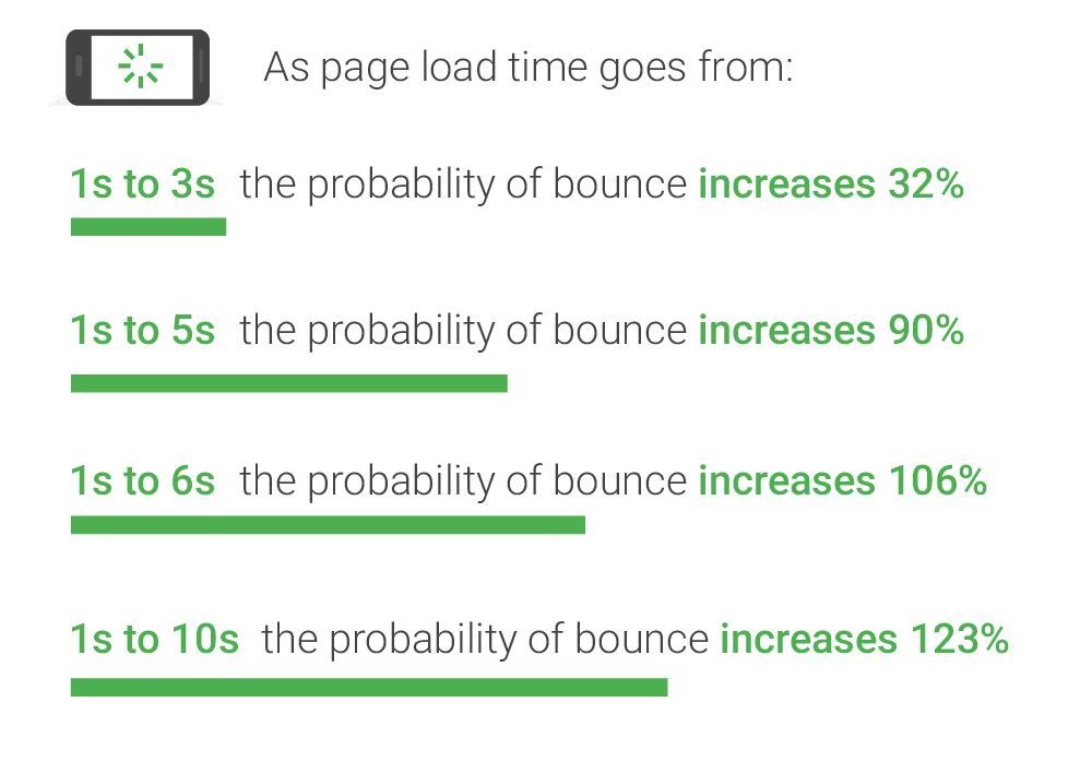
Why does this matter? Because a higher bounce rate means lower conversions.
It’s not hard to see why this is true. By definition, if someone’s bounced, they’ve not taken whatever action it is you want – whether that’s an opt-in, a sale, or even just a button click.
And mostly, these bounces aren’t people who didn’t like the look of your site. They’re people who got bored of looking at a white screen, waiting for your site to even appear.
So those beautiful designs you paid for? That headline you slaved over? The perfect product description that took your team five tries to get right?
It’s not that they’re not working. It’s that they don’t even get a chance to work. 53% of your traffic is leaving before they even see them.
This is particularly true on mobile devices. A 2017 study by Akamai found that even a 100ms slowdown in load time reduced mobile conversion rates by 7.1%.
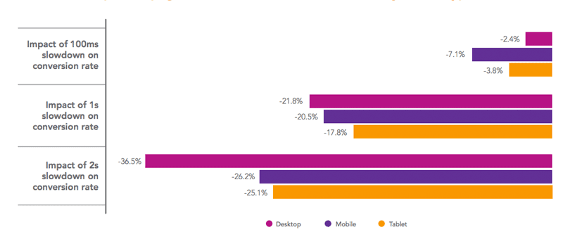
Now, 100ms is tiny. Literally a fraction of a second. For comparison, click your left mouse button. That simple action, just the click, probably took in the region of 250ms. Less than half that time spent waiting for a page to load is making a significant difference to mobile conversion.
Possibly this is why that same report found that while mobile accounted for almost half of all traffic, it only accounted for 21.87% of the conversions.
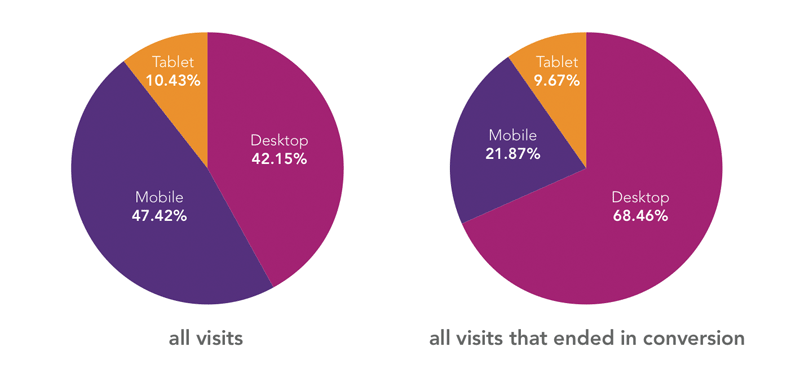
This means on a lot of sites, mobile traffic isn’t delivering anywhere near the results it should be. And a lot of the traffic you’re paying for is going to waste.
But what does this mean in terms of your page?
Essentially, there is no magic number.
It’s not three seconds, it’s not two seconds, it’s not one second.
That Akamai survey found the highest conversions on pages that loaded in 1.8 seconds – but not because this was an ‘ideal speed’. Because this was the fastest most people could achieve while still loading all the key elements you need to make the sale. You can make the page faster by dropping that heavy product image… but that won’t necessarily push your conversion rate up .
So it becomes a balancing act. Use the elements you need to use – but make sure you optimise the hell out of all of them.
Be More Hare: How To Make Your Pages Fast
There’s good news here.
The internet is getting faster.
More and more people are understanding the importance of page speed, and with tools like Google’s Pagespeed Insights freely available for anyone to use, it’s easy to check how well your pages perform.
Google’s speed test doesn’t tell you exactly how fast your website loads (realistically, that will depend on a lot of different factors, not all of which you can control), but it does provide a checklist for things you should do to make your page load as fast as possible in any circumstances.
As a rough guide, you can read your score like this:
0-60: Holy hell do something about this now
61-80: Still room for improvement
81-95: Solid. There’s still some bits you can fix, but your user experience is probably pretty good
96+: World class. You’ll find it very hard to make this page go faster
But while these tools are available, this is still an area which is very much a work-in-progress. The average page load time on mobile is still a yawn-inducing 15 seconds.

And this means speeding up your pages isn’t just a good way of improving your conversions – it’s a good way of stealing a march on your competition, too.
So how can you make your pages load faster and tap into the extra conversions this brings? There’s a lot of things you can do, some of it on the painful end of technical, but the four points below are where we’d start.
Optimise images
An image may be worth a thousand words, but in terms of load speed you can add a few zeroes on to that and still come up short.
Everyone wants their pages to beautiful, but the fact is – that gorgeous high-def background of a guy on top of a mountain is making your page move like it’s being dragged through a swamp.
And this time, it’s really not just about the ‘big’ picture. Every product shot, every testimonial headshot… all of them are adding to the load.
Fortunately, there’s two things you can do to make your images move a bit more like that soaring eagle and a bit less like a dead rhinoceros.
Use Lossless Optimisation
Images contain a whole load of data that you don’t really need. Yes, it gives a nice buzz to say there’s sixteen million pixels but the human eye simply can’t perceive that many.
This means it’s possible to strip out a lot of these ‘extra’ pixels and leave the image looking no different.
Obviously this isn’t a manual job, but there’s lots of tools available to do it for you.
Use Actual Dimensions
Browsers are not known for being smart.
You might think that even if you’re not doing any optimisation, your images won’t affect the page that much. Sure, they started as huge images, but on the page you’ve sized them to be tiny!
Sorry, Virginia. It doesn’t work like that.
The browser doesn’t work out how big the image should be until after it loads it.
So that 6MB image? Every time a prospect hits your page, it’s loading the whole thing, then scaling it to be a 250×250 paragraph illustration.
So instead, work out how big your images are going to be on your site. Scale them first – you can use Photoshop, or a cheaper program like PixelMator – then upload them to your server.
That way, the browser only loads what it needs, and your page moves faster.
Server Response Time
Server Response Time is how long it takes for your server to start delivering the HTML.
It’s the time between the browser turning up and banging on the door, and the server blearily appearing, cup of coffee in hand, saying “What?”
The ideal is less than 200ms – which is about the time it takes for your finger to lift from the mouse button after you’ve heard a click.
In a world where a 2-second SRT isn’t unusual – ten times slower than it should be – this is a pretty aggressive target.
There’s lots of things that could be slowing your server down. Slow application logic, slow database queries, slow routing, resource and memory starvation… the list goes on, and if you’re using commercial hosting, there’s not much you can do about it at your end.
You can contact your host and try to get them to speed things up, but the better route is to use a CDN.
A CDN is a content delivery network. A network of servers in multiple data centres, all across the world.
This means rather than being served from a single location, your page is served from a full network of servers – whichever one is closest to your customer will take the load.
And since CDNs are designed to deliver content quickly, their servers are specially designed for this purpose.
A CDN isn’t something you’ll be able to build yourself (unless you’ve got a truly top-notch tech team at your back), but there’s plenty of commercial providers available.
Caching
As anyone who’s ever let their partner look at their search history can tell you, browsers have a worryingly long memory.

And you can use that to your advantage.
Essentially, the browser can be told: “This bit of the website? That won’t change. Just remember it for next time.”
That means for things like background images that don’t change much, you can tell the browser to just remember them. When your viewer comes back, it won’t need to download that content all over again, because it’ll already have a copy in memory.
And this means when someone clicks on one of your retargeting ads, the page loads even faster than it did when they first arrived.
Which is a pretty slick impression to make.
You can set cache times for each resource in your site in the HTTP header. There’s an explanation of how to do it here, but be warned, it gets a bit technical.
Minify code
When good code gets written, it’ll look a bit like this:
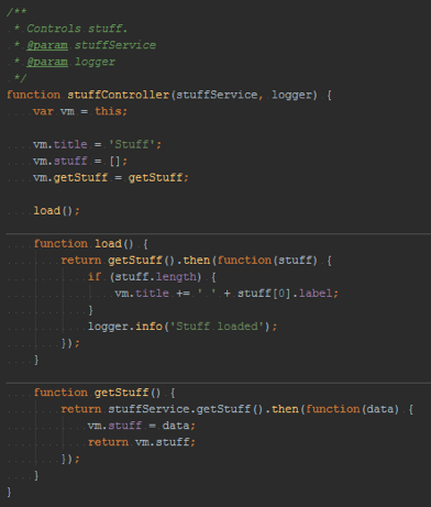
Just like any writing, code should be easy to read when you know the language. So you give your variables easily understood names. You separate your functions with whitespace. You put actions on new lines. When a human looks at code like that, they can read it.
Computers don’t care about any of that. They don’t need a function to be named ‘RevString’ when ‘a’ will do. ‘RevString’ has nine times as many characters, so the only difference it makes is that it takes them 9 times longer to read.
This means every unnecessary character, every line break, every bit of white space in your HTML – they’re all slowing the computer reading your page down.
When they eventually rise up to take control of humanity, maybe that’ll be a good thing. But today, you want to be generating more sales so you can build that bunker that’ll let you sit the war out in comfort, amirite?
(And let’s face it, making our future overlords lives a bit easier now can only be a good thing)
So to make sure your page can be read as fast as possible, your code needs to be minified, which basically means turn what you see above into something more like this:

That’s not much use to us, but a computer will tear through it faster than Arnie tears through a police station.
What’s Next: Accelerated Page Technology
Of course, it’s one thing reading about the technical details of getting better page speed (and the huge improvement in conversions it can deliver).
Actually doing it yourself is a whole different proposition.
But there are easier ways.
We developed the Accelerated Page Technology that powers Convertri’s pages precisely to make sure anyone could have lightning-fast load times, even if they don’t have a tech team stuffed in their back pocket.
As well as the four points covered above, it also uses page pre-generation, inline coding, cuts server requests down to the bare minimum, origin shielding and GZIP compression, as well as many more tweaks and optimisations to ensure your pages move faster than any other.
Compare our Pagespeed Insights results to those of our competitors, you can easily see the difference:


To try it for yourself, grab a Convertri account, clone one of your pages (try out our page importer, it’s ace), and see just how much difference it can make. Your page will load like it’s already there.
Join the internet quick, not the internet dead.


