Funnel #2 – The Two-Part Training Funnel
It’s all well and good having a super-fast loading website, and a library of good-lookin’ templates to put on it, but even we know that’s not enough to make a sale.
(Not always, in any case.)
Having a funnel is like mapping out the journey you want your hero, the customer, to take between “what is this?” and “I need this!”
But, they’re not always easy.
Google “sales funnel” and you’ll be inundated with thousands of ideas – most of which aren’t tested out in the real world. What you need is something that works. Something that is already in place, for someone else – and is bringing in money. Something which you can adapt, copy (ethically, natch), or just be inspired by.
Luckily, you’ve got the latest Convertri funnel analysis on your screen.
Our method, as always, is to click on the Facebook ads that catch our eye and see where they take us. Scribbling meticulous notes along the way, we scout out the path, assess the terrain and return with a blueprint you can use in your very own business.
In this instalment, we found a funnel that looked fairly normal – until we got inside.
The Funnel
This is a funnel by Mike Kabbani. He’s great at lead generation, and offers training and coaching about getting more B2B clients and getting more clients for your clients.
In this funnel, he’s promoting the Avi Plan, a high-ticket approach to lead generation that one of his students used to generate a hefty profit. He uses an interesting split sales letter approach which intrigued us, as well as some nifty copywriting. Here’s what the funnel looks like on paper:
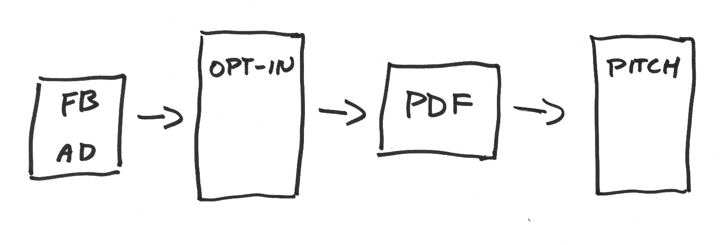
The lead comes in from Facebook, downloads a lead magnet, and clicks on a link within it to be taken to the second half of the sale.
What’s interesting here is that the mood – and the mode – of the sale changes dramatically halfway through, but the intensity of the copy doesn’t change beyond the ramping up to the close you’d expect. In fact, Mike even recommends an epic song to accompany our journey.
So, let’s set off and have a look.
The Ad

Clearly, we were targeted because my profile matched the set of criteria he was targeting. This ad uses classic AIDA structure, and it does it well. This headline is straight from the copywriting manuals of old – calling out an audience, and their biggest pain. Take a closer look:
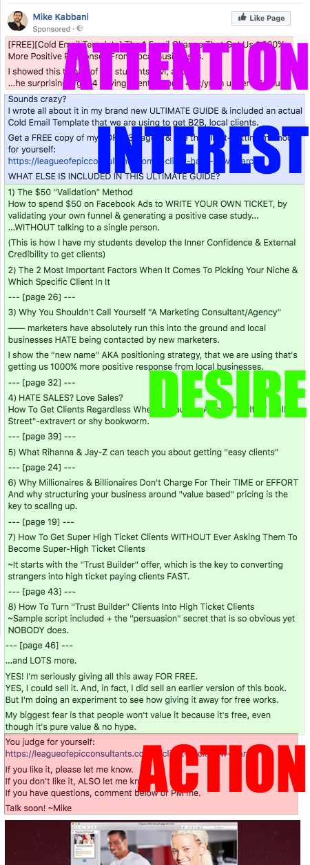
The hook is a classic case of social proof plus specificity. Social proof is based on the idea of normative social influence, which means people will probably conform in order to be liked by, similar to or accepted by the influencer or society at large. Specificity is reporting on exact measurements, usually numbers, which helps to show how effective the product or service is and quash any objections about not knowing enough to proceed.
Mike adds social proof for himself by mentioning Avi is one of his students, and the number – 1000% more positive results – is so large it’s almost staggering. He also uses an overwhelming shock-and-awe list of bulletpoints of what you can expect to find in his lead magnet, the Ultimate Guide, which serves two purposes: it’s likely only interested prospects will fully read a crazy long bullet list (which is good), and for skim readers it still looks impressive from a distance (that’s good, too).
The numerical bullets don’t really tell you anything of value: they’re feather dusters: lighter than air and designed to tickle your fancy. Their sole purpose is to get you curious about the content of the lead magnet, and they do this by hinting at what’s inside… but not too much. In fact, the target audience may know most of the original information in these bullets – for example, “Millionaires Don’t Charge for their Time or Effort” – but referencing stuff you already know but want to know more about makes you think there has to be more inside.
Mike also uses page numbers, which acts both as a handy reference but also as a more tangible peek inside the Guide, as if you were holding it in your hands – always good for visualisation, which is great for conversions.
53 pages is also a good number: it’s large enough so that you’re sure it’s comprehensive and great value for free, but not so overwhelming that you don’t even want to read it. (This is important: no matter how much you loved the movie, you’d need to be able to curl a sofa to pick up a copy of Stephen King’s It.)
Mike closes the ad by increasing the perceived value of the lead magnet in saying that he sold an earlier version, and implies urgency with the phrase ‘doing an experiment’. Experiments aren’t infinite, it’s necessary to come to an end: so our curiosity is piqued. Mike adds vulnerability (and reminds us of his Facebook friend persona) with the phrase ‘my biggest fear is that people won’t value it’.
Is it any value? We want to judge for ourselves.
The Squeeze
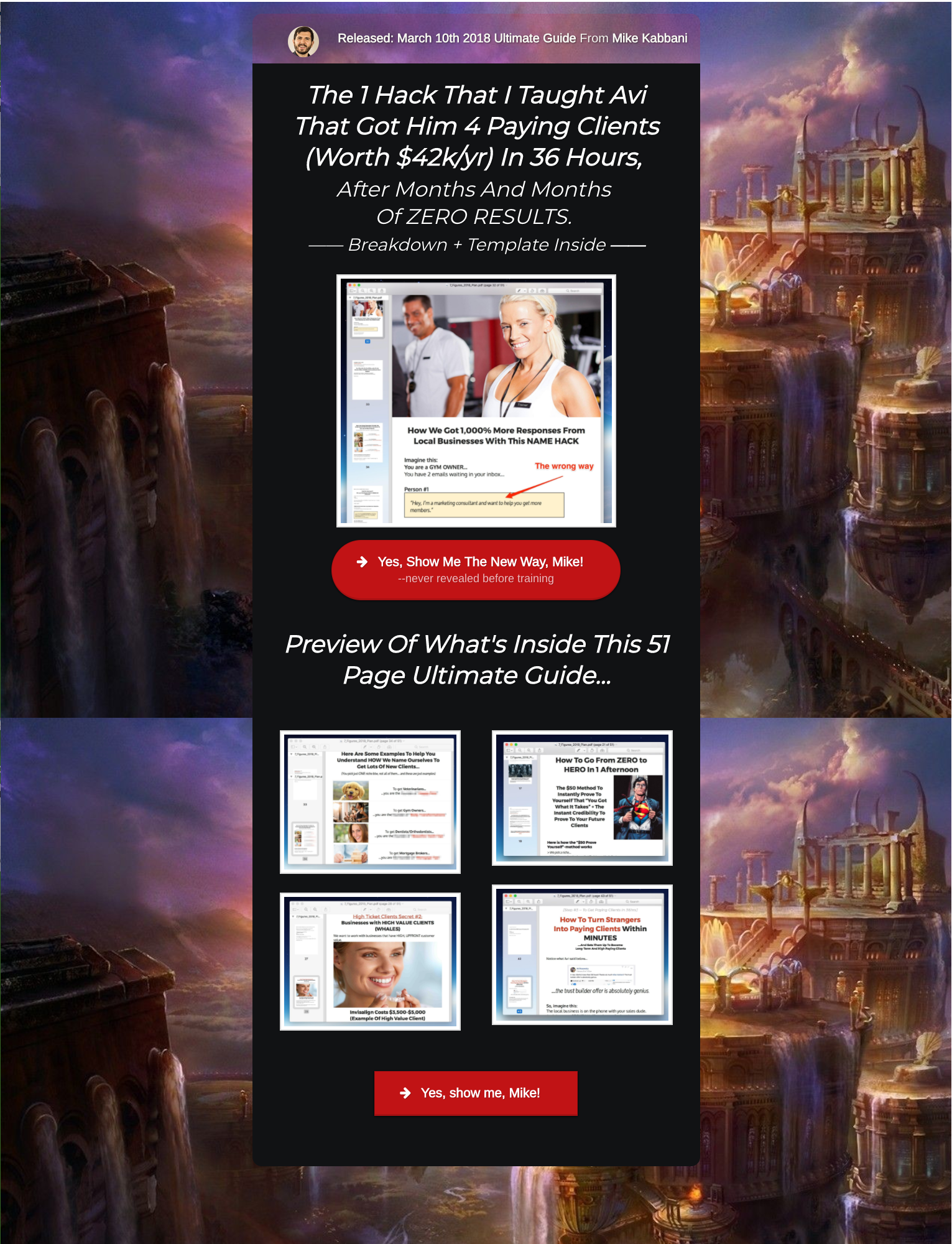
The first thing you notice is the same picture used in the Facebook ad, so you know you landed where you expected to be. This image uses a red arrow to draw attention to a problem or ‘wrong way’: in this case, it’s the line “hey, I’m a marketing consultant”, which is how most crappy marketing consultants start their spiel. It’s a classic clickbait technique, but here it works.
And it’s a good thing we know we landed in the right place, because if it wasn’t for this image – plus Mike’s headshot at the top of the page – we’d have no idea. The background is an epic fantasy landscape, which is possibly tailored for Mike’s League of Epic Consultants branding. He revisits this theme later on, in the second half of the sale.
In the headline, Mike gives a shoutout to his student Avi and those amazing results, which is a repetition that reinforces the illusory truth effect: the idea that people are more inclined to
believe you if you repeat yourself, especially in the absence of any other proof. Politicians and rap stars use it, but it works: it’s how maybe-true-but-who-knows myths like Robin Hood come to life.
Then, we’re treated to a preview of what’s inside the guide to reassure us further. I’ve never seen screenshots of a PDF used on a squeeze before: but it’s surprisingly effective. It’s a visual document, with lots of formatting and images. Even at 51 pages, it’s going to be an easy – and fun – read.
The CTA on this page sparks a conversation: it’s us, talking to Mike himself. Following on from the vulnerability in the ad and his Facebook profile picture at the top of the page, it’s clear this isn’t a hard sale – it’s a chat between friends who love marketing. It’s also the first step of a two-step opt-in, which tends to be better for conversions.
Delivery Page
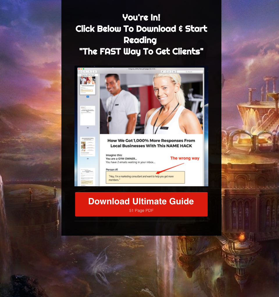
The same picture is here, so we’re seeing consistency with the message. No nasty surprises here. The CTA is interesting as it contains the page count, but now we’ve seen a preview of what’s inside it serves to squash any objections along the lines of ‘it sounds too long and hard to read’.
Lead Magnet
The lead magnet is bright, it’s bold, and it delivers what the ad promises. So far, so sweet. However, there’s something different – and really rather awesome – about it. Check the preview of it on the squeeze page:
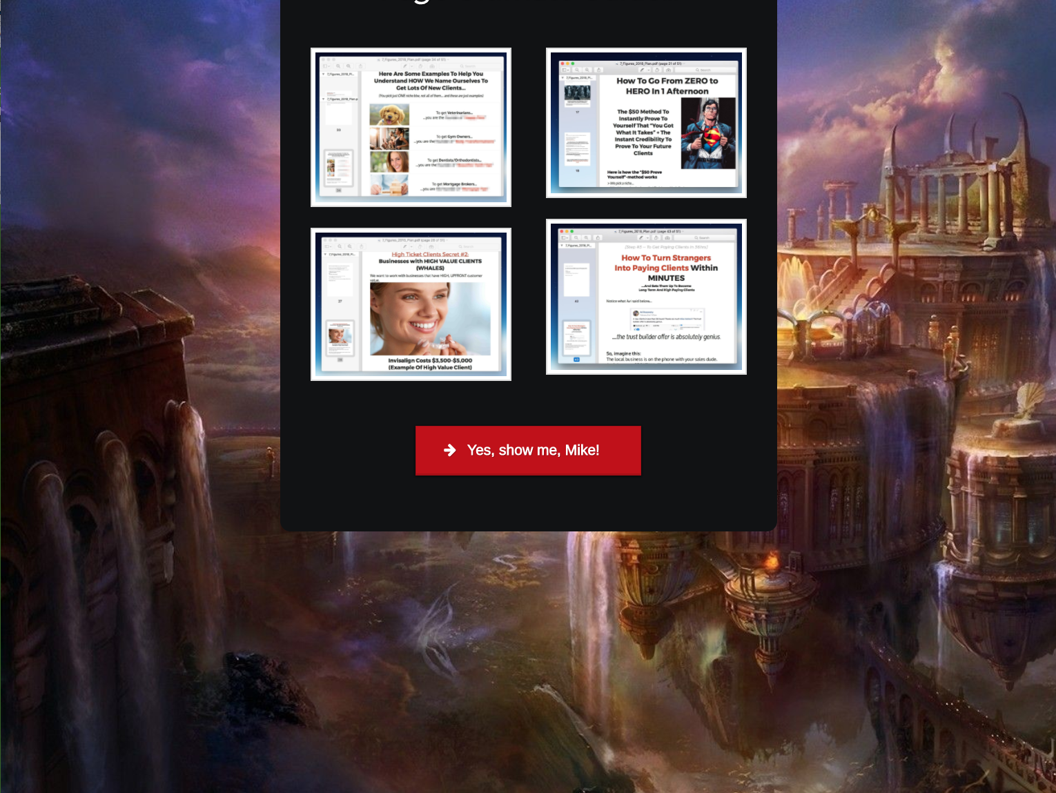
It’s a sales letter. Or, more accurately, it’s one half of one.
The PDF itself delivers on all of Mike’s promises, but it also primes them for the follow-up sale. The headline is almost exactly the same as the ad, recalling it to our minds – we remember that giant list of bulletpoints, and know we’re about to get some relevant and high-quality information.
That picture at the top isn’t of Mike, though. That’s his client, Avi – and by the looks of things, his happy, smiling family are delighted with the results of his cold emails. Mike uses people and faces as pattern interrupts throughout, which serves to remind us that these are real results, affecting real people – putting us in their shoes.
The PDF contains a ton of valuable information on its own, like the guide we were promised, but it’s got bold, red text, italics for emphasis and a ton of pictures – mostly of people and faces, such as the Invisalign lady – it’s almost like a transcript of a webinar.
This is a hybrid lead magnet: a good amount of quality advice, but not too much, tied together in a way a lot of people will be able to digest. But, it also contains ‘aha’ moments and revelations, and a good amount of objection squashing. It feels like we’re on a defined journey, and not just through a table of contents.
Why did Mike split up his sales letter and put one half in the lead magnet? We can theorise. One explanation is that he sat down to write, found himself spilling a ton more value in his sales letter than he intended, and instead of removing anything he split it and offered the first half in a format where most people would expect – and therefore retain and value – good, solid advice. Lead magnets don’t typically contain a sale: when reading it, people’s defences would be down.
A lead magnet also primes people for reading a longer text – 53 pages, to be precise, as Mike has reminded us. It’s a good way to filter out people who don’t want to put in the effort, or who aren’t interested enough to stick around that long.
And finally, Mike will be able to remind people to read via the opt-in email. How many times have you abandoned a sales letter halfway through, even though it was interesting, simply because it was too long? Mike’s not gonna take that chance.
At the end of the PDF, we find a hint of more to come, and a conversation-style CTA. By this point, we’ve got a lot of valuable information already and we’re ready for more.
The Sales Page
Wow. Was not expecting this.
A dark background and plain formatted text signals a change in gear. Unlike the lead magnet, gone is the easy-to-read red text and images: as the second half of the sales letter, this stage is radically different, but similar in that it plays with the format.
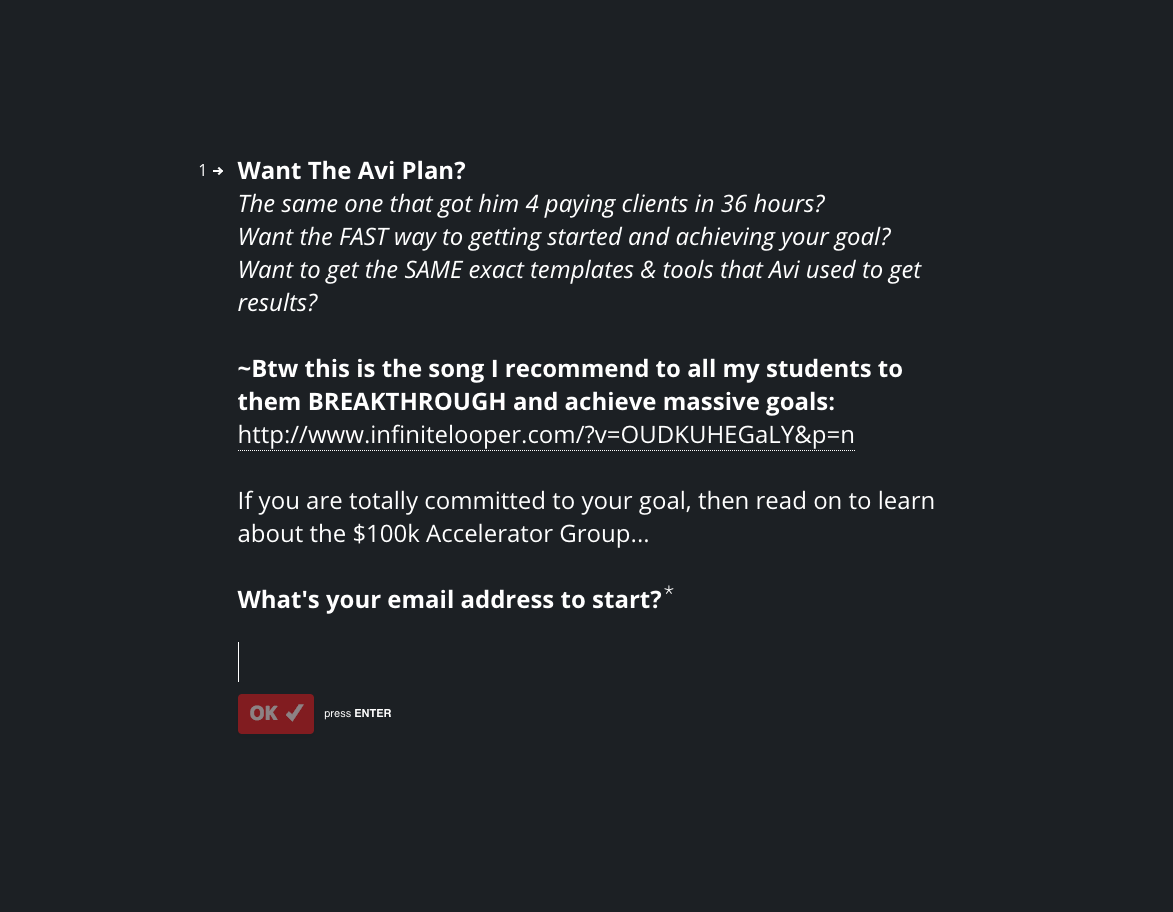
At first it reads like a quick opt-in: which, after reading the lead magnet, feels like a quick
last step. We still know where we are, because Mike mentions the Avi Plan in the very first line. The bright red button – the only color on the page – encourages us to click OK, a microcommitment that sets the tone for the last stage in the journey.
By the way, this is where Mike makes the final reference to his League of Epic Consultants branding. He recommends a song, which is a final nod at humanising the sale as from this point on, we see no more images at all, let alone human faces or people. It’s an epic pirate song. You should listen.
Look familiar? This is actually a Typeform quiz, embedded in the page. Each ‘question’ is a quick-read segment of text from Mike, and there’s only ever one ‘answer’ – a conversation-style button which prompts you to make microcommitment after microcommitment after microcommitment, just to see what’s next.
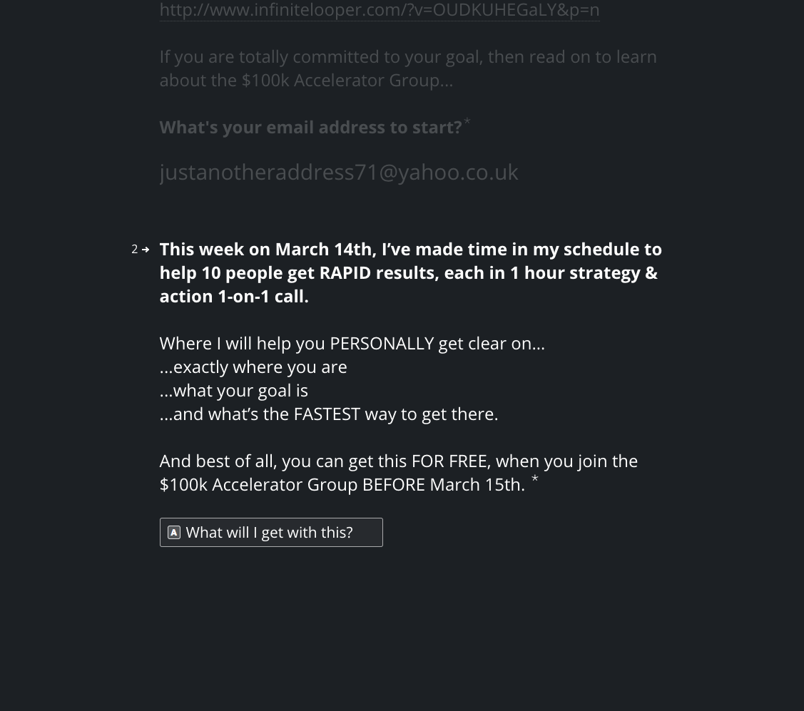
It’s very effective. The short bursts of text are easy to read, and engaging. Split up like this and with deliberate action to move forward, it feels very quick: which is exactly how you want your close to feel. It stops feeling like an opt-in, and becomes interactive.
Mike begins to stack the value, adding more and more to the offer. It’s a lot. And each CTA is unique: sometimes questions to prompt us to find out more, peppered with enthusiastic confirmations. This makes us think that while Mike is talking, we’re giving him actual responses which gives the illusion of control and that we’re guiding the conversation. We aren’t being sold to – we want this.
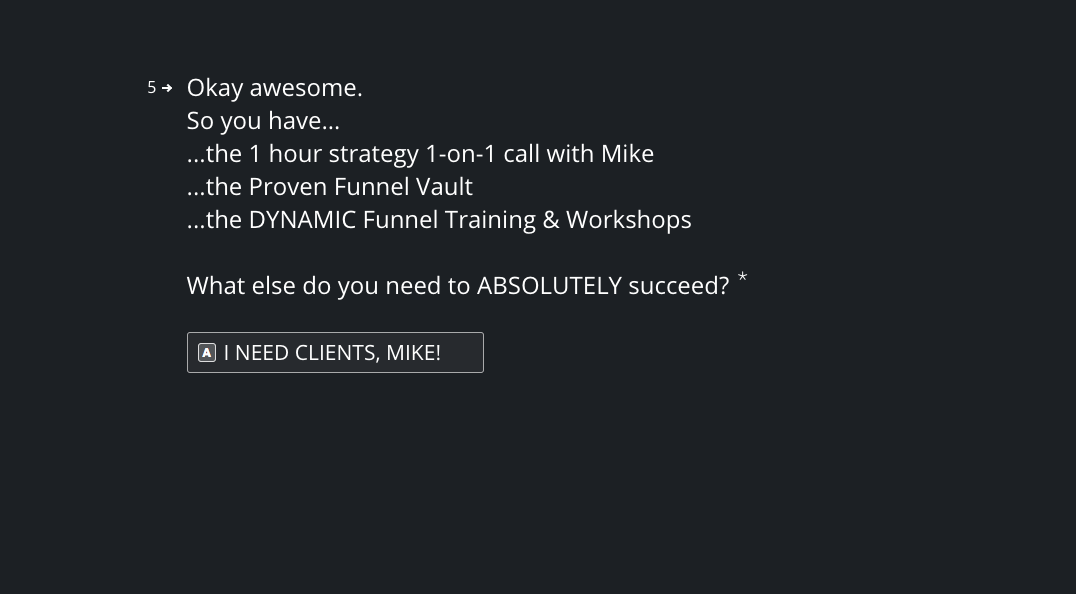
A great example is when we actually give Mike an answer to a question that isn’t rhetorical: he asks us, “What else do you need?” The answer, right in front of us, is “I need clients, Mike!” This isn’t his advice: it’s ours. Repeating his name might even serve to conjure his Facebook photo in our heads, reminding us this is a guy we’re really talking to.
Mike continues to stack value and bonuses like nobody’s business, and we’re lost: with no way of scrolling back up the page, we don’t have a chance to double-check and sprout doubts. After squashing objections like bugs with a comprehensive FAQ, he talks about pricing. Here he uses a classic example of breaking down the offer, stating what it’s worth, and reassuring the customer they won’t even pay half of that.
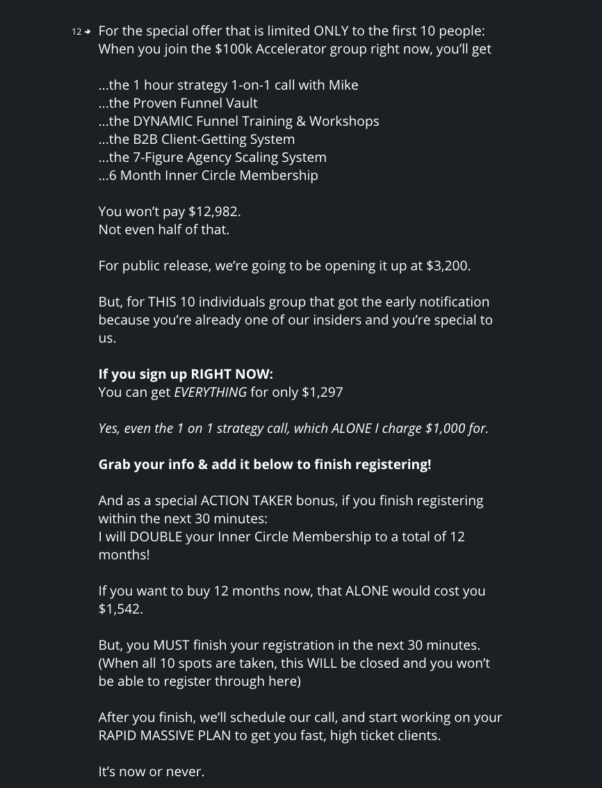
When he finally reveals the price, it’s ridiculously small for all the value we’ve seen. Mike even manages to squeeze in a bit of urgency – he tells us we only have 30 minutes to complete registration, which neatly rounds off the idea that we’ve already committed – and he also states that refreshing the page might cause us to lose our spot: which is a neat idea, and very believable on this Typeform platform.
There is no final, big bold CTA: only a payment form. It’s set within the main body of the text and looks exactly the same, reinforcing the idea that this is an inevitable final step: the deed is done, no going back.
Final Thoughts
Sales letters don’t need to look like sales letters. Nor do they have to shy away from revealing too much upfront: Mike gave us clever and actionable advice in the lead magnet, which would have been enough if he hadn’t so effectively got us thinking about the possibility of more.
Also, sales letters don’t have to be in one piece. They can be split up, as long as you make it worthwhile for the reader to make it through the first part and do a good job of making them want more.
The branding in this funnel is interesting because of its inconsistencies: with classic sales letter red headlines and stock images all the way to modern, minimalist type on a dark background via a fantasy landscape and pirate music, it would be interesting to see if a more cohesive approach would affect conversions. However, the differences in looks did bring attention to the select elements Mike ensured were the same throughout: his profile picture, humanising pictures and sounds, his ‘everyman’ persona, and the feeling of having a conversation.
If anything, this funnel makes us tempted to experiment with different formats. The Typeform quiz worked very well – but what if you also included ‘no’ answers? Could you tailor the prospect’s experience further, or even use it to customise the offers they received?
Here’s some key ideas from this funnel you can apply to your own funnel-building:
- Classic copywriting techniques work no matter what the format, and they are powerful.
- Squash objections creatively: use a FAQ, describe use cases, call out real people in your headline and describe proven results.
- Experiment with format, and keep your eye open for new tools you can use. How about a slideshow sales letter? Or an interactive game?
- Start a conversation. Humanise by showing prospects your real self (or, at least, create a persona): add your profile picture, informal CTA’s, and maybe even your favourite song.
Like This Funnel?
Want to use a funnel like this yourself?
We’ve created a version in Convertri. It’s not exactly the same style, but it’s doing all the same things in all the same order. You will need to make your own Typeform, though!
Click the link below to add it to your account:
Let us know how it works for you! If we can get enough data, we’ll report back on how well this funnel type works.


