There And Back Again – Better Product Development In 8 Films
Billy Liar
In June 1822 – the exact day is hard to say, after weeks in the Antarctic Ocean all days look much the same – Captain Benjamin Morrell discovered a vast new land. Rich with plant and animal life, he charted 300 miles of coastline and called it New South Greenland.
New South Greenland was the biggest, but not the first of Morrell’s discoveries. Hungry for the fame that came with being an explorer, he detailed island chains and isolated lands that had never been seen before. He found (and named) Morrell’s Island, south of Hawaii. He provided detailed descriptions of the flora and fauna. From his notes, the atlas of the south Pacific was redrawn, all of which would have been a huge boost to science if not for the fact that none of it existed.
Because Morrell had realised something. People believe maps.
And while discovering new islands was a distinctly non-trivial task, drawing a map that made it look like he had was not.
This isn’t entirely dissimilar to how SaaS companies work with roadmaps.
Building an impressive range of features is hard.
Saying you’re going to build them, not so much.
Days Of Future Past
As a company, we’ve never been much good at roadmaps. It took us ages to publish one – and when we finally did, in October last year, 15 months after Convertri originally went live, we proceeded to mostly ignore it.
It’s not like we’re the only SaaS company that does this. Seeing features mapped but never delivered is a near-endless source of customer frustration.
And that’s because putting together a good roadmap is a lot harder than it should be.
When people think of maps, they think of representations of the real world. Circuit-diagrams of real, tangible landscapes. If something’s on a map, they expect it to exist.
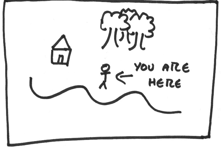
But a roadmap for your SaaS company isn’t like that. It’s not trying to map a place, it’s trying to map the future. It’s trying to map something that doesn’t exist yet.

Maybe, if we called it something like a plan or an outline, we wouldn’t have this problem.
But we don’t. We call it a roadmap. And that implies that… well, that it’s a map. It’s something fixed.
And when those features you’ve put on your roadmap end up not getting delivered, your customers get annoyed. Much like Ernest Shackleton, who sailed to New South Greenland only to find it wasn’t there.
The common problem with roadmaps is things being put on the map, and then nothing being delivered.
That’s not our problem.
We are – and while I’m talking as a company founder, I’m also saying something I believe to be objectively true – absolutely fucking awesome at delivering new features and updates. We’ve been live 18 months and we just pushed update 75. They go out every Tuesday, like clockwork.
Turns out, that is our problem.
Zombieland
Most of your customers will, at some point, wonder if your app is a zombie.
A zombie app still works. It still does what it was sold to do – if maybe a bit slower and a bit more frayed around the edges than it once was. It’s probably still being sold.
But it’s not alive. It’s not getting updates. The development team, if it still has one, at most do a bit of maintenance and a bit of support.
No-one likes using a zombie app, because eventually that zombie’s going to realise it’s dead.
And that means if your customers think that your app is a zombie, they’re going to be looking for alternatives.
This is sub-optimal.
Traditionally, that’s what a roadmap is for. You publish one to give your customers – and prospective customers – confidence that the app is live. They’ve bought an investment. You’re not going to vanish.
And we should have nothing to fear from that. We’re a dev-focused company, and we’re really good at that bit.
But there’s a flip side to being a dev-focused company.
Devs hate roadmaps. They hate them with a passion usually reserved for child molesters and people who talk in the theatre.
Because a good developer isn’t just a coder. They’re an architect. More than that, they’re a perfectionist. Software, just like the future or A Song Of Ice And Fire, is never done. There’s always more you can do to it, you can always make it better.
And when you publish a roadmap, even one date-free, you’re making a terrible, terrible commitment: that one day, you’re going to ship something. More to the point, you’re going to ship something specific.
La La Land
I’m not trying to say that roadmaps should be perfect projections. Even I know development doesn’t work that way. As long as we can show some progress, we’re showing our customers that we are delivering as promised. If 2 out of 3 was good enough for Meat Loaf, it’s good enough for us.
But even given this, we did our last roadmap wrong.
To understand why, let’s have a look at it, published early October last year and meant to run up to the end of 2017. This is what we said we’d do, and what we actually did.
Affiliate system: NOT DONE. We put some effort in here, but this turned out to be rather more effort than we thought. And while we want an affiliate system so people can promote us without using JVZoo, based on a survey we conducted (more on that later, sports fans) it’s not a high priority for a lot of our users.
PayPal integration: NOT DONE. We did some work on assessing Payum, a pre-written abstraction layer that would, if successful, let us integrate with a whole range of payment processors easily. Alas, the proof-of-concept only proved it wasn’t the right concept for us, and we didn’t get around to a custom integration.
Mobile system:
- Updating the algorithm – DONE. While it’s still not perfect, the algorithm now gives a far nicer out-of-the-box result. Designers will tell you a little whitespace can do wonders – listen to them, they be smart.
- Warning indicator – DONE. Now you get told when the mobile view has changed, and we get to wonder how we didn’t think of adding something like this in the first place.
- Mobilise individual sections – NOT DONE
- Add elements directly to mobile view – NOT DONE
Infrastructure: NOT DONE, but we got pretty close. Most of CDN 2.0 is good to go, and with it the ability to force SSL and use Geo IP checking to deliver different pages to visitors from different locations. What’s not yet done is the interface that lets you actually do any of this stuff, but hey, the engine’s there.
Webhooks: DONE
Hover styles: DONE
Sticky footers: DONE
Drop-down lists and radio buttons for forms: NOT DONE
Ability to save colours: NOT DONE
So, if we call the infrastructure work that did happen and the bits of mobile that got done a collective 1, we score 4/9. That’s not great. Meat Loaf would never do a song about that.
So why didn’t we get the rest done?
Mostly, a bit of overambition and a lot of shifting priorities. Sticky footers took a lot longer than expected; we thought it’d be a relatively easy job, but turned out to react to our snapping subsystem much the same way a tank of petrol reacts to a match. We’ve put a lot of work into the Page Importer (which, just saying, is fucking badass) and also added better onboarding, integrations with new services like WebinarJam, and more.
We built a lot of things, and they were things that delivered a lot of improvements for Convertri and its user experience.
But they weren’t the things that were on the map. And – let’s be honest – that kinda defeats the whole point of a map.
A map is there to show you the way from A to B. And normally, there’s lots of different possible routes you can take. If there was only one, you wouldn’t need the map.
Your dev progress can be thought of as a map with possible features scattered all over it. What we call a roadmap works like a routeplan, showing your users where you’re going to go and what features you expect to pick up.
We told our users what path we were going to take, and promptly left it to get lost in the woods.
Final Destination
When we made the last roadmap, point B wasn’t really a place. We didn’t have a specific idea of how Convertri would be improved at the end of it, beyond ‘more stuff’.
And it’s pretty easy to build things and leave Convertri having more stuff at the end of it. If we managed to build things and leave Convertri with less stuff, we’d have achieved some kind of miracle and probably been hired by Apple’s hardware department.
Product development is a balancing act. You’ve got to balance a set of priorities that look something like this:
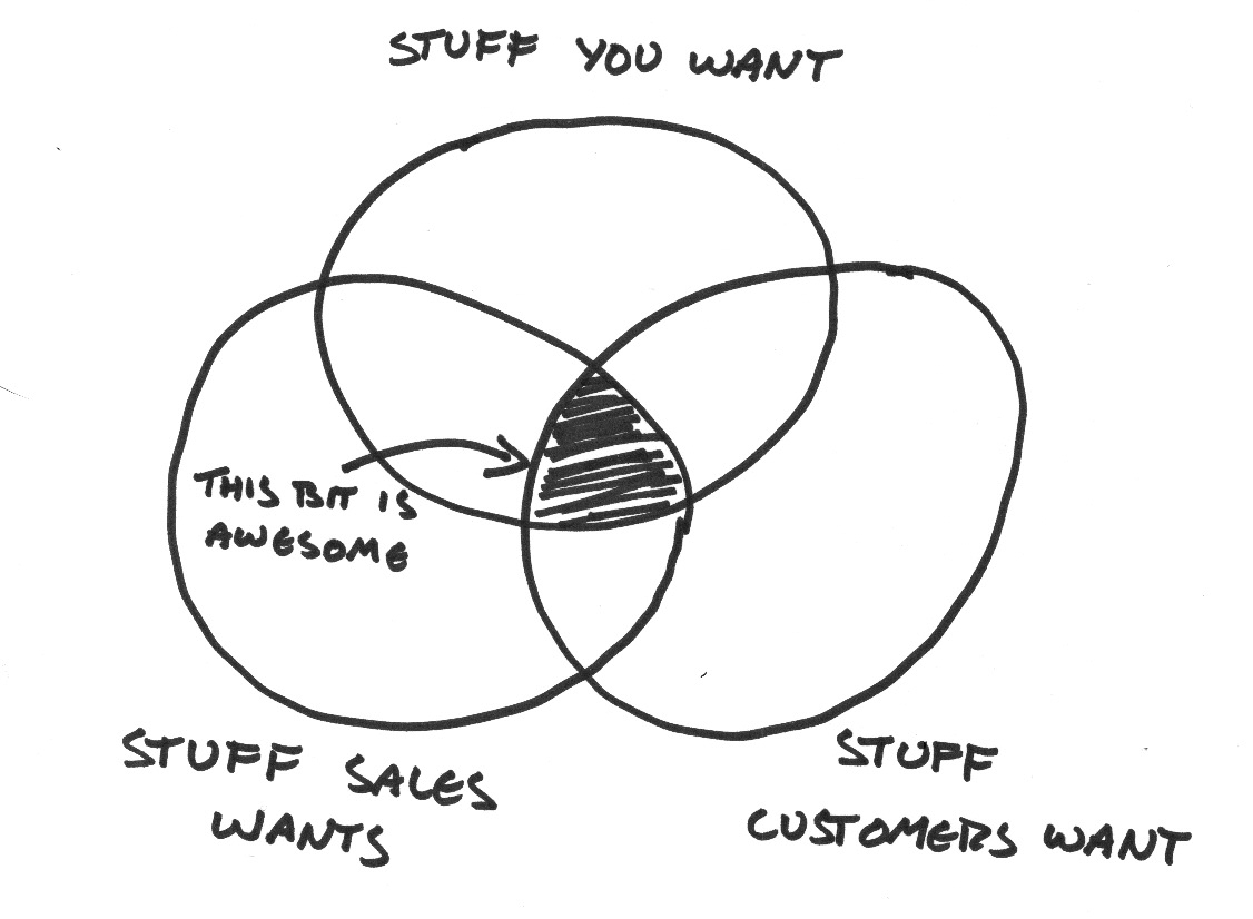
There’s the stuff that you want. This is everything you as a company want to build – maybe because you want to use it yourself, or just because it’s an interesting problem.
There’s the stuff that Sales wants. This is the stuff that the guys in marketing think will help them shift more units.
And then there’s the stuff your users want. This is the stuff you’re being asked for by people using your app right now. It may or may not make it easier to actually sell the app to new people, but it’ll make their lives easier and quite honestly, that’s all they care about.
And of course, there’s overlap between these groups, and the lines are a bit blurred on all of it.
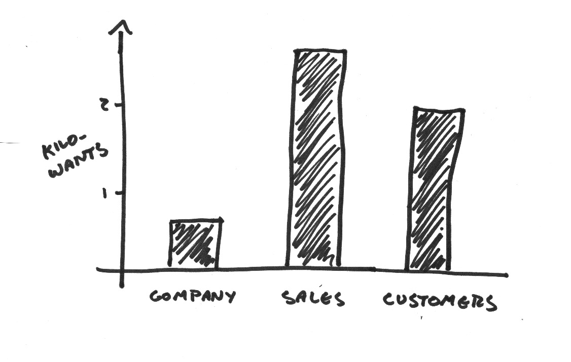
Possibly, rather than thinking about a possible feature as ‘for the company’ or ‘for sales’, it’s better to think of it as having a score for each column, like your barbarian warrior Draegun in your Thursday D&D game.

(Don’t look like that, Jocky McJockface. We know you game.)
When working out a product development plan, your job is balance the scores for your brave party of improvements in a way that makes sense for your next adventure.
And you can’t know what makes sense without having a destination in mind.
Sounds obvious, right? If you’re going to draw a map, if you’re going to plan a route from here to there, you need to know where you’re going.
Yeah, well, we didn’t work that out last time so shut up.
The Wanderers
Last time, we didn’t have a plan for what we were going to do with the new stuff we built. We planned to build an affiliate system, but we didn’t have any ideas for how to incentivise our customers to become affiliates, and ‘turn more of our customers into affiliates’ wasn’t part of an actual marketing plan. It just sounded like something it’d be neat to do.
So we weren’t particularly invested in it. And when you’re not so invested in your destination, all the other paths start to look more enticing.
Which is how we started out planning an affiliate system and ended up improving the Page Importer – and it’s great, but we didn’t have a plan to turn that into money either. That’s not to say it doesn’t have value: it’s a big important feature, and the better it works the more likely our customers are to stay with us. But any benefit we get from it is basically by accident. We had no line drawn between ‘The Page Importer works better’ and ‘Convertri becomes more successful’.
The result is that we’ve done a lot of wandering. We’ve looked at the pretty butterflies, we sat in the sun-dappled shade of the oak trees and we’ve checked the moss on the trunks to find out which way’s north. All great fun. But after all that, we’re not really any further forward than we were when we started.
Paths Of Glory
How do you create a development plan that makes you actually want to stick to the path and not get distracted?
Well, there’s a few things you need to know before you start.
You need to know where you are.
You need to know where you want to go.
You need to know why you want to go there.
Y’know, all those things that, if you were planning an actual journey, would make a map or a route plan literally any use.
And this means you need to know what your priorities are. You need to find the balance between sales, customers and company.
I can’t tell you where that balance is for you. For us, it looks something like this:
So this time, we’re doing our roadmap differently.
This time, we didn’t start out with a list of features.
We started out with research. We reviewed the market, we looked at our competition, we surveyed our customers.
From our research, we developed a marketing strategy.
From the marketing strategy, we put together a development plan.
And now we’ve got a roadmap we’re genuinely excited about.
eCom. You can technically use us for eCom right now. In practice, it’s a ballache. But this is not just a huge market, it’s business for a lot of our users – so we’ve put together a list of improvements that we think will make Convertri the eCom funnel builder.
- Ability for a buyer to select product variants on the sales page, e.g. small/medium/large t-shirts.
- CSV export for orders
- Ability to add and account for sales tax and VAT
- Automatic receipt e-mails
- PayPal integration. Bonus points for extra payment processors.
- 2-step checkout
- Coupons
- Zapier integration
- Shipping integrations: ShipStation and FBA are the two on the shortlist
- Modal checkout
- Opening the numeric keypad on mobile for entering credit card numbers, which we’re told gives a big boost to checkout conversions
Combining these features with Convertri’s blistering page speed will give us a top-level platform for eCom funnels, all under one roof.
Improved Infrastructure. Admittedly this is a bit of a cheat since it was also on our last roadmap, so a lot of the work has been done. But with Google’s increased emphasis on security, our customers have been asking for forced SSL for some time, and we’d like to deliver.
- Improved stability (not that we expect anyone to notice, since Convertri pages already have the best uptime rate out there)
- Ability to force SSL
- Ability to geo-target pages (allowing you to show a different page to viewers depending on what country they’re in, letting you stick within differing optin regulations or showing different offers to different prospects)
Mobile. Back in the day, 320px was the standard size for a phone screen, so that’s how wide we made our mobile editor. Times have changed. These days, phones are large and getting larger, and our customers want mobile display that looks good regardless of screen size. So we’ll be changing the mobile editing system to both increase the size of the editor, and employ scaling factors to ensure the page displays well on all devices.
Updated UI. This is based both on customer comments that the dashboard can be hard to navigate, and our desire as a company to make the app more intuitive for new users and more easily expandable with future modules.
- Updated, more professional look
- Funnels made into first-class citizens
- Improved template selector
- Improved template selection
Dynamic Text Replacement. This is an incredibly useful feature for anyone running paid traffic, highly desired by our users and will fill a big hole in our feature offering compared to high-level competitors Unbounce and Instapage.
GDPR. This regulation comes into force at the end of May 2018, and using a platform that isn’t compliant is a risk to your business. That’s clearly not something we want for our users, so we’re making sure we’re fully GDPR compliant by the time the regulations roll out. We’re almost there already, but we still need:
- A way for people to search what information is held on them in Convertri
- An option for us to forget anything we’re not legally required to keep
Back To The Future
Timescales in development are always dodgy, but we think we’re going to have this done by about the beginning of May.
So around the beginning of June, we’ll make another post about this, making public how well we managed to stay on track.
Because another thing roadmaps should be for is accountability.
If we say we’re going to build something, we should build it. Maybe there will be problems. Maybe things will take longer than we expect.
But when I’m doing that June update, talking about the new stuff we’ve built between then and now, the list should look kinda like that one above.
If you’re running a SaaS company, your challenge is to do the same. Don’t just say what you’re going to do. Say what you’ve done.
Because we’re not Benjamin Morrell.
Our job isn’t to draw maps. Our job is to BUILD. We show people the future and then make it real. We raise islands from the sea. And it will be glorious.


