Convertri Updates – 1/8/17
“Good things come in small packages,” or so they say.
(I’m 5’4, so I can confirm this is indeed true.)
So it’s a bit of a short update this week, but let me tell you right off the bat, it’s an AWESOME one. (Talk about a heck of a lot of bang for your buck.)
This week, there’s no new features – BUT, but we’ve already overhauled one of our freshest newcomers…
Plus, the dev team are hard at work with major renovations happening in our Page Builder.
(Dust everywhere. Walls knocked through, fresh coats of paint – you won’t recognise the ol’ girl soon enough.)
We just couldn’t wait another week or two for the big reveal, so consider this email your exclusive behind-the-scenes sneak peek.
Just don’t trip over the floor sander.
And don’t forget, if you’re currently convertin’ those customers in Convertri, you’ll need to force-refresh (CTRL + SHIFT + R, or CMD + SHIFT + R if you’re on a Mac) your browser to see the changes:
FEATURES
Analytics – following last week’s analytics reveal, we’ve taken the viewer to a whole new level. You can now see how your site, page and funnels perform by comparing the last 30 days, and we have two brand new tabs: Prospects and Revenue. The Prospects view is based on individual prospects from autoresponder/webinar integrations, and Revenue lets you see your earnings over the last 30 days rounded up to a lovely plump total figure.
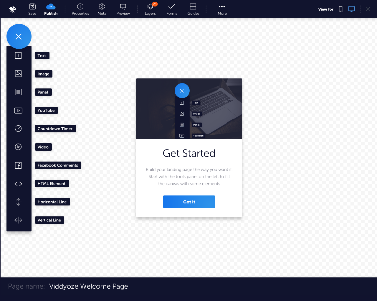
UI (work in progress) – yes, we’re overhauling the look of the Page Builder! The shiny new interface is coming soon, but don’t worry: it will only affect the UI, so all your favourite tools and elements are still here (with a new lick of paint). Here’s the latest mockup, hot off the press:

We’ve taken on board a load of comments from you, our incredible users, since we first floated to idea of changing things up back in January. We’d like to take this chance to thank you all for your suggestions. Here’s the laundry list of updates:
– Reorganising the Properties Panel to make it less wackadoo
– Embracing the minimalism trend by decluttering: placing commonly used features in full view and tucking others away into menus, to give you as much editing space as possible
– More text labels! More tooltips! No more wondering what weird little icons mean!
– Improving usability, especially at lower resolutions
– General shininess including buffing, polishing, elbow-greasing, massaging, a bit of holistic purification and jasmine-scented beautifying
New templates [PRO] –
Event Box – a parallax-tastic shiny template to get your clients excited about their next event.
Tattoo – bold, graphic, richly coloured and lasts a lifetime: for tattoo artists and enthusiasts.
Bluff – bright, simple and modern for general businesses.
Take a visual tour of the updates here:
BUGS
Page Preview – previewing sometimes wasn’t actually showing you all the latest changes to your page, which really rather missed the point. We’ve fixed it so now it doesn’t suck.
As always, if you spy a bug or two, please let us know us on Facebook:
https://www.facebook.com/groups/convertri/
What do you think of the coming makeover? Let us know what you think, and have an awesome week!
Beth
Executive Word Arranger at Convertri

