25 Proven Landing Page Tips for Higher Sales and Sign-Ups
The most effective landing page tips focus on three core pillars: removing friction, establishing trust, and aligning every element with a single conversion goal. Data shows that focused landing pages without external navigation increased conversions by 100%. This guide outlines the specific, high-impact changes you need to make, whether you’re optimizing a current campaign or building a new page from scratch, to maximize your ROI.

Struggling to turn clicks into customers? You’re not alone.
Landing pages typically convert at an average rate of 6.6%. But the good news? You can absolutely do better and much faster than you think.
At Convertri, we’ve tested, tweaked, and tracked what really works. Over the years, we’ve collected numerous tried-and-tested methods to boost landing page conversions. Some are fairly simple, while others are so commonplace that they’re easy to overlook. Some might not work in just a few months, and others are evergreen.
Whether you’re just learning how to create landing pages from scratch or optimizing existing ones, these landing page design tips will help you turn every visitor into a paying customer.
Key Takeaways:
- Removing navigation from a landing page is one of the single highest-impact changes you can make. Every additional link reduces the chance that a visitor completes your goal action.
- Landing page load time directly affects conversion rate: pages that load in 1 second convert up to 3x better than pages that take 5 seconds, according to Google’s research.
- A/B testing a single element at a time (headline, CTA text, or form length) is the most reliable way to improve landing page performance without guessing.
Create landing pages that actually convert. Try Convertri free and experience the difference yourself!
Strategy & messaging for creating high-converting landing pages
1. Eliminate navigation leaks
Where do you want your visitor to go after a landing page? Straight to the Buy button, of course — and you won’t find that in your main site’s navigation.
Removing the navigation menu from a landing page increases conversions by 100% by eliminating distraction-driven bounce. Every external link acts as a “leak” that provides visitors an exit ramp before they reach the call to action; removing these menus ensures a single, linear path toward the offer.
2. Synchronize message match
High-converting landing pages must achieve a 1:1 ratio between the ad’s promise and the page’s headline. When the copy and visuals reflect the specific intent that triggered the initial click, whether it’s a discount or a solution, you reduce cognitive load and verify the visitor is in the right place.
3. Above-the-fold promise
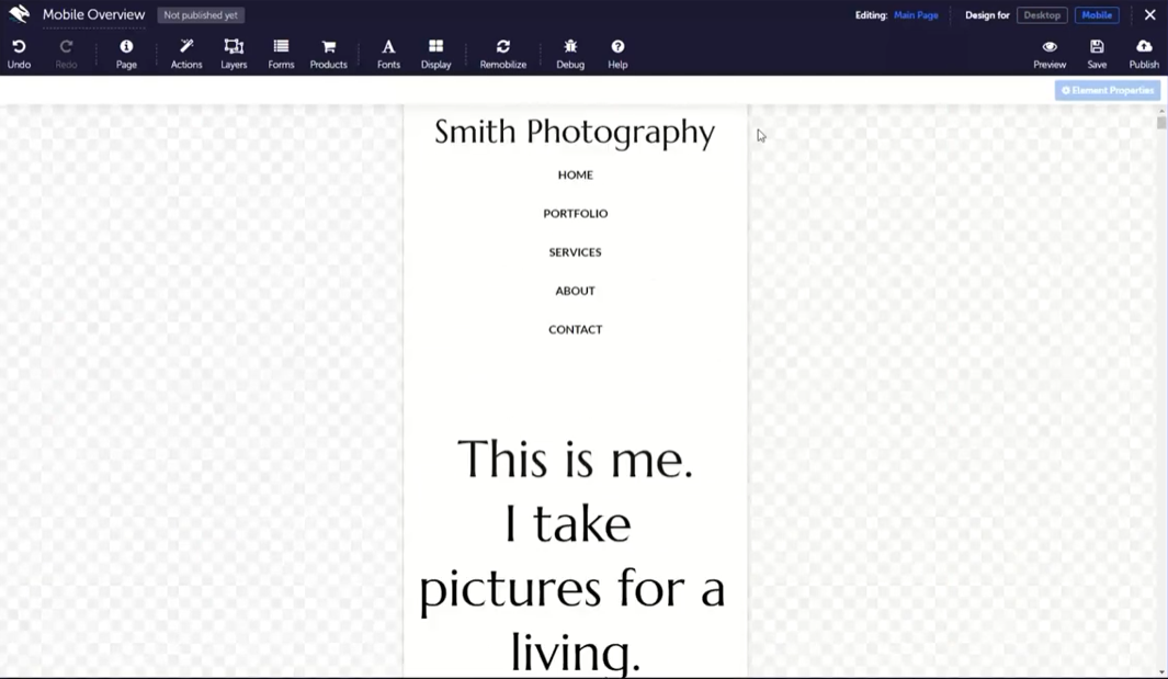
The hero section must communicate a complete value proposition within the first 3 seconds of page load. By placing the primary headline, subhead, and “Buy” button above the fold, you capture the 80% of users who rarely scroll, ensuring the core “why” is never hidden.
Here’s an example from Convertri’s landing page template:

Test variations of your headline, subhead, and hero image to ensure your promise is both clear and emotionally engaging. Remember, clarity always beats cleverness in landing page design.
4. Friction mapping
Identifying “drop-off moments” through friction mapping allows you to systematically remove psychological barriers to conversion. By auditing elements like long form fields or vague jargon, you can replace points of hesitation with clarity, smoothing the user’s transition from prospect to lead.
5. Deploy desire-based CTAs
The call-to-action is arguably one of the most important – if not THE most important – landing page elements. Therefore, it’s the number one thing you need to consider when optimizing your own landing pages.
Replace generic “Submit” labels with high-intent, “I want” phrasing to significantly boost click-through rates. Instead of using a passive command, use buttons that mirror the visitor’s specific goal, such as “Start My Growth” or “Claim My Discount”, to tap into the emotional driver behind the click, and see your conversion rate skyrocket.
Copywriting
6. Benefit-first headline
Make your value crystal clear. Instead of “Welcome to our site,” focus on what your visitor gains. Example: “Double Your Email List in 30 Days — Without Paid Ads.” Keep it short, emotional, and direct.

7. Only ask for information you need…
The fewer fields you have in a form, the higher the conversion rate. TrueNorth published a fascinating study on why this is – as well as a couple of niche cases where it isn’t – and why it’s an excellent general rule to follow.
Each new field you add to a form creates more work for the visitor. And that’s… way boring, and makes people suspicious. On the other hand, the more fields you require, the better quality the leads, because they are likely to be more interested in your offer. It really depends on what they’re signing up for – are you offering a free checklist, or an in-depth consultation call? In any case, reducing the form fields to the bare essentials should boost your conversion rate.
8. Use microcopy near forms
Microcopy — those little bits of text near your form — can reassure users, reduce hesitation, and explain what happens next. Think: “We’ll never spam you,” or “Takes only 30 seconds.” These simple lines can increase form completions dramatically.
9. Use a bulleted list
Bullets let people digest an impressive amount of information at once. They focus people’s attention on the essentials of your offer, while quickly moving them closer to the sale. This is not the time to explain the product or service you are offering– bullets need to be up front, short, sweet, snappy, and salesy.
Afterwards, then you can dive into your story when the reader is invested. But by using bullets, you help their brains separate and digest information much faster. Think of bullets as the fibre cereal of your landing page – a healthy dose of those little nuggets will keep things moving.
10. Check your spelling and grammar
It’s 2026. And your landing page is still written in grade school English, despite the existence of Grammarly, Hemingway, and millions of people on the internet ready to tear you a new one over your “theirs” versus “theres”. Marketers like to argue fiercely over this: Do spelling errors really affect landing page conversion? Is everyone really so pernickety?
To that, we’d like to say: if it’s this simple of a little fix, why wouldn’t you?
(Oh – and besides, yes: it does. Spelling mistakes can ruin your conversion rate.)
As it turns out, bad spelling offends more than your English professor. Misspelled keywords will tank your SEO and harm your site’s usefulness for text-to-speech programs that read your site’s snippets for people with sight problems, as well as assistants like Google Home and Alexa.
You’ve seen what doesn’t work, now discover what does. Get your free Convertri trial and start winning online.
Design & visual hierarchy
11. Include eye-catching shiny objects
Video! GIFs! Interactive sliders! We’re not trying to tell you it’s a good idea to go crazy and create a landing page filled with flashing buttons and music from nowhere. Instead, try adding a demo or explainer video, one or two GIFs, or an interactive element to explain information.

Here’s an awesome example from Cal Newport. Catch the toggle about halfway down the landing page, which lets users view their productivity from a standard approach vs his time-blocking system. It’s simple, but satisfying.
Failing that, a cat GIF is always good.
12. Prioritize visual flow
Guide the eye using size, contrast, and directional cues. Use arrows, gaze direction in photos, or color contrast to pull attention toward your CTA. Don’t let visual clutter distract from your goal.
13. Use whitespace and contrast
Whitespace gives your landing page layout room to breathe. Paired with strong contrast, it helps your message pop and makes scanning easier — especially on mobile. Remember: simplicity converts.
14. Highlight trust badges
Logos, certifications, secure payment icons, and partner brands reduce anxiety. Place them near your forms or CTAs to reinforce confidence at the moment of decision.
15. Keep accessibility in mind
Design for everyone. Use readable fonts, large enough buttons, and color contrast that meets accessibility standards. Your most inclusive landing pages are often your highest converting ones.

Forms & offers
16. …Or, make the form look shorter
But what if you really do need all that information, but it’s putting your prospects off? Consider splitting it up into multiple pages. This had the added bonus of making each piece of information your prospect submits into a microcommitment: if they only have to fill out a couple of fields at a time, it’s easier for them to think “I’ve already filled out half, let’s keep going”.
You can also try merging form fields (such as “Full Name” instead of “First Name” and “Last Name”) or even aligning the titles to the left of each field instead of above it so that the form appears shorter. If the landing page form covers less space on the page, it may seem as if you are asking for less information.
17. Offer a valuable lead magnet
Provide something irresistible on your web page in exchange for an email — a checklist, calculator, video series, or report. The perceived value of your offer should far outweigh the “cost” of sharing personal info.
Here’s a sample landing page template from Convertri:

18. Use progressive profiling
Don’t ask everything up front. Collect essential data first, and then gather more details in follow-ups. It builds trust and keeps the user journey smooth and lightweight.
19. Align the offer with intent
Ensure the offer aligns with where the landing page visitor is in their decision-making process. Someone downloading a free guide might not be ready to buy — so nurture, don’t sell too soon.
See how fast your landing pages can load. Try Convertri free and experience the difference in minutes.
Speed & mobile optimization
20. Make your landing pages mobile-friendly
Mobile ads are truly effective because they appeal to consumers’ desire to buy right now, wherever they are, whatever they’re doing (we don’t like to think about it that much). That means your landing pages – and their forms – need to make it as easy as possible for them to convert while they’re on the go.
Optimize your landing page by ruthlessly editing the mobile version, ensuring the form is effortless to fill out. It’s all to do with the less time the user has between decisions, the better. Get them from stage to stage as fast as possible, and you’ll increase your landing page conversions.
21. Prioritize loading speed
Keep your Largest Contentful Paint (LCP) under 2.5 seconds. Compress images, limit heavy scripts, and use lightweight landing page templates. Slower load times often lead to significant drops in conversions.
22. Use thumb-friendly layouts
On mobile, design with the thumb in mind. Keep CTAs large and centered, forms simple, and avoid forcing users to zoom or scroll sideways.
Social proof & credibility
23. Add social proof
According to BrightLocal, 85% of consumers trust online reviews as much as personal recommendations. Social proof is hardwired into our primal brains as an essential mechanism of survival. If our cave pal ate a purple berry and said ‘mmm’, the purple berry is good. Spread the word to others, and the tribe grows strong. The other cave mate ate a red berry. He dead. Not good – warn others.
Another aspect of social proof is the appeal to our aspirations – this is where celebrity endorsements come in. Maybe if we buy this lipstick that Kim Kardashian wears, we’ll look as rich and fancy as her. Maybe if we buy the microphone our favourite podcaster uses, our podcast will be as successful, etc.
Celebrity endorsements might not be easy to get – but try to include a personal anecdote, a friend’s experience (with permission), or a well-known story to highlight an element of your offer. Alternatively, just embed positive reviews you have from Amazon, TripAdvisor, or past happy clients.
24. Show Recognizable Logos
Feature recognizable client logos, media mentions, or trust seals to immediately raise credibility. The more familiar your visitors feel with your brand, the faster they’ll buy.

Experimentation & analytics
25. Test, Test, Test!
It’s all in the split. Any good landing page optimization starts with A/B testing or split testing – to determine the cause of the issue, and nail down an increase in conversions. Only test one element of the page at once, so you get a better idea of what’s going on, and more importantly… have fun with it!
Increasing conversions doesn’t have to be a pain or a hassle. Try these great landing page tips out for yourselves and let us know how you get on!
You’ve seen what others achieve with Convertri. Now it’s your turn—claim your free trial and start building smarter.
FAQS
What is the best landing page strategy?
The best landing page strategy is to focus on one clear offer, remove distractions, and guide visitors toward a single call-to-action. Simplicity and clarity always convert better.
How can I make a perfect landing page?
Start by knowing your audience, writing benefit-driven copy, and using a clean, mobile-friendly design. Then, test your CTAs, visuals, and forms to find what drives the most conversions.
What should a landing page include?
A strong headline, clear value proposition, persuasive CTA, trust badges, and social proof are must-haves. Each element should guide visitors toward taking action.
How does a good landing page look?
A good landing page has a clean layout, plenty of whitespace, and a logical flow. It draws the eye naturally toward the main offer and looks great on both desktop and mobile.
How to improve my landing page performance?
Run A/B tests, optimize loading speed, and keep your design simple. Even small changes to headlines, CTAs, or images can significantly boost conversion rates.
What tool can I use to build high-converting landing pages?
Try Convertri — it’s built for speed, flexibility, and conversion optimization. With proven templates, drag-and-drop design, and split testing, you can create landing pages that convert.
Launch your page
You’ve got the landing page best practices. Now you just need the right platform to bring them to life. That’s where Convertri comes in.
Our ultra-fast, high-converting landing pages are built to help you make every click count. From smart design tools to proven landing page templates and seamless A/B testing, Convertri gives you the flexibility and power to apply these 25 strategies effortlessly.
Don’t settle for average conversion rates. Build smarter, faster, and higher-converting pages with Convertri today.