Funnel #3 – the Circular Funnel
Mapping sales funnels is probably the kind of thing you like to do if you’re DM of your neighbourhood Dungeons & Dragons guild, a screenwriter, or always wanted A Beautiful Mind-esque wall decor.

Sometimes, the best sales funnels are simply A to C, via B. And that’s fine.
Often, those work great.
But other products or services may benefit from a more complicated funnel… and those can be a lot of fun to plan.
So you read books, articles, consult the “gurus” – and immediately stumble into a world of possibilities.
Suddenly, there’s lots more options between A and C.
An opt-in here, or at the end? Lead magnet first, or after? Throw in a webinar? What about a video? How about them microcommitments?
It’s easy to fall down your own rabbit hole.
Never fear – our funnel analysis series is here. Intrepid Convertri explorers will click on ads and hack into the jungle, so you don’t have to. Nothing scares us – not ancient ruins, ironic boulders, or even man-eating retargeting cookies – and we’ll go as far in as we can in order to make the map.
Our method, as always, is to click on the Facebook ads that catch our eye and make notes on where we go. Then we offer a breakdown, our personal opinion, and how you can use the funnel in your own business.
This week, I discovered a funnel that redefines the word ‘rabbit hole’.
The Funnel
This is a funnel by Brandwatch, a consumer insights company that provides analytics and reporting to companies interested in how customers react to their product or service online. They do this by watching social media conversations, image detection (to find snaps people take of what you sell), and via other eclectic wizardry.
Their end goal is to get people to schedule a free demo of their services, obviously with the aim of getting them on a plan. Here’s an adorable doodle of the funnel:
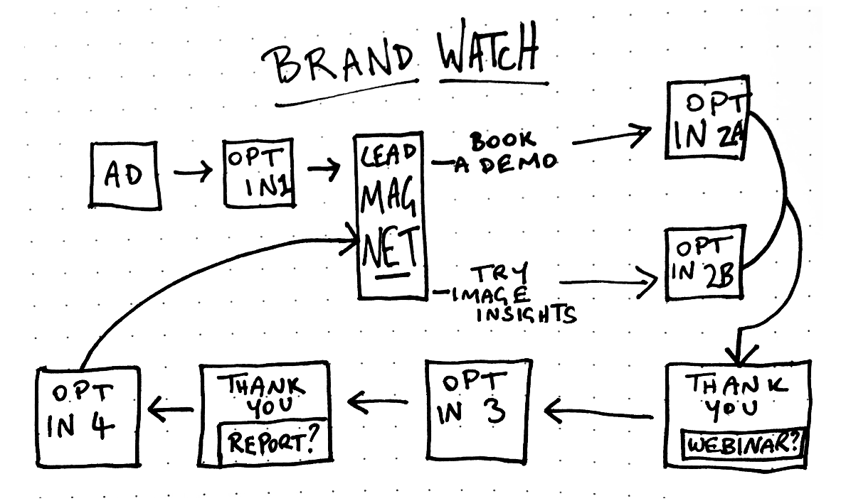
The lead comes in from Facebook, opts-in to get a lead magnet, and is immediately taken to said lead magnet – it’s not a PDF. That’s only the first of a few interesting points in this funnel, so let’s dive in.
The Ad
This ad appeared on my feed, and it’s obvious why I was targeted as I’ve clicked to register interest in other audience insight services.
The ad is crisp and clean, with a ton of whitespace. Bursts of bright colours in their logo are complemented by the custom image they used (no stock business types here) even so far as to make sure the most common color in the map – orange – is the same as in the logo.
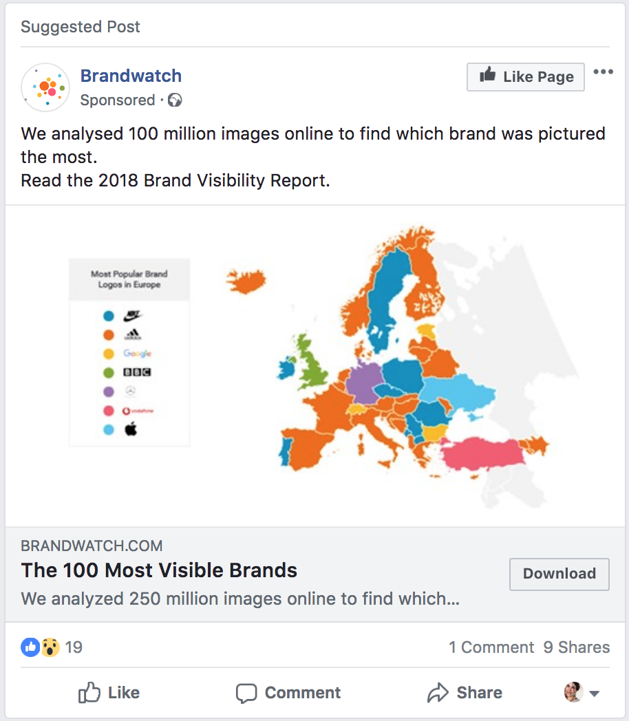
The map itself is smaller than the frame, increasing the amount of space – despite its size, and the relative illegibility of the map key, everything is clearly understood, like a textbook illustration.
The condensed image may serve another purpose, as we realise the map key contains familiar shapes. Those are the logos of huge corporations such as the BBC, Vodafone and Apple. Going by the title, “Most Popular Brand Logos in Europe”, Brandwatch may not have actually worked for these companies – we don’t know – but these logos add subtle social proof.
As for the message, it’s straight to the point, and it works. It states that they’ve already finished a huge amount of work towards a specific end goal, and it tells you to read the results immediately. It also repeats words to clarify the concept for newcomers: we’re talking about images, brands and visibility. Whose brand is “everywhere”?
Also, 100 million is a huge number. We have to figure either they’ve got a large team working for them, or they’ve devised useful software that can analyse that much. 100 Most Visible Brands sounds a bit more like a Buzzfeed listicle – not too demanding, with an interesting spin on the subject – and with the description matching the message, we know what we’re in for. But “Download” hints at a more substantial piece of work than, say, “Read Now”: this work is going to be measured in MB. With 100 million images, just how in-depth is this report?
Opt-in 1
Behind the curtain, the squeeze page is super simple: all the info is above the fold, bullet points on the left, form on the right. There’s only one color on the page – blue – if you don’t count the tiny, mostly orange logo. This is strong brand identity.
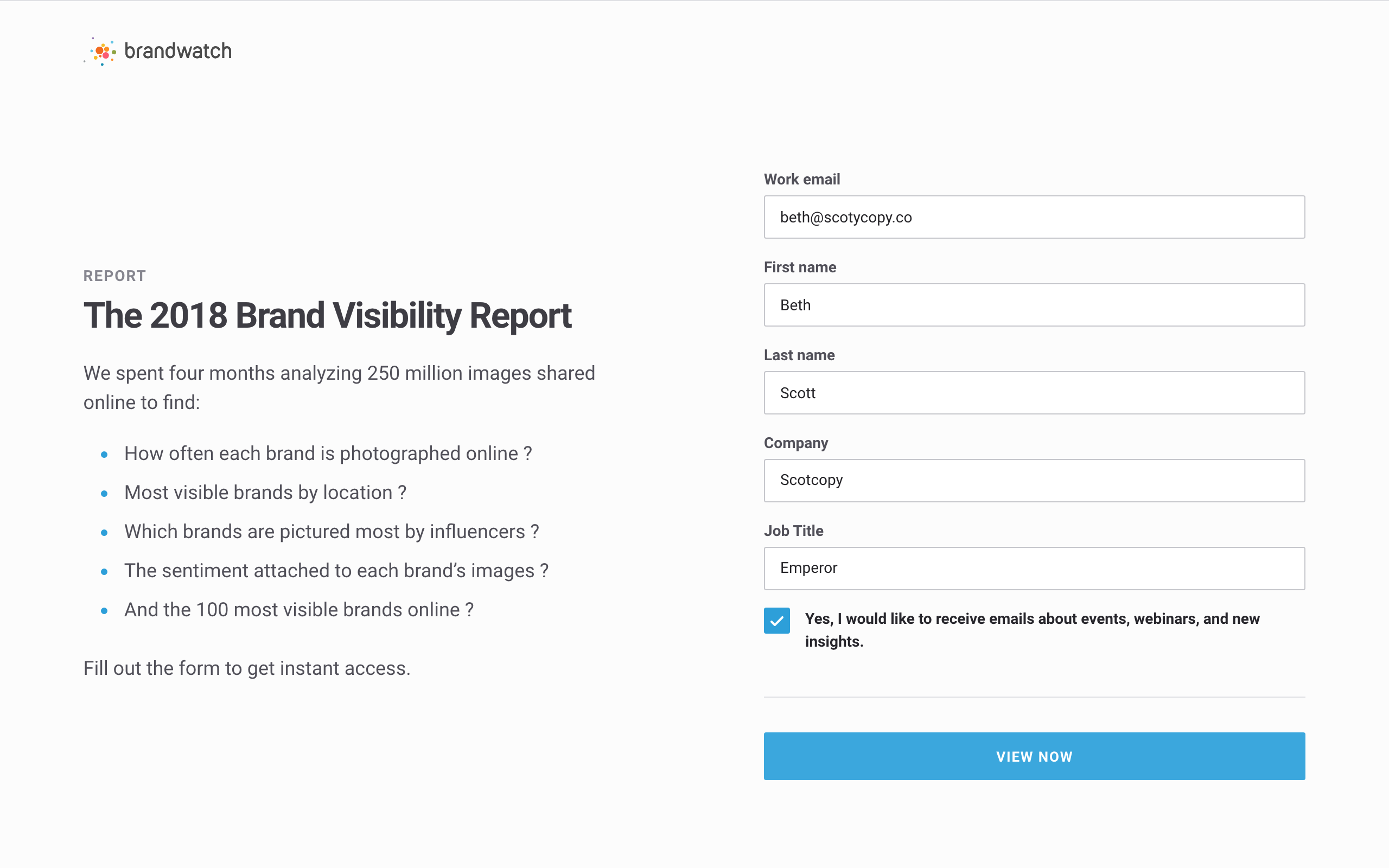
We get a little more info about the 100 million images: it took them four months to analyse, which is no mean feat. They’ve invested in it.
The bullet points are presented as questions, which increases curiosity while promising an answer to each. Yet, read as a whole, the syntax breaks down a little: not each question is a logical run-on from the introductory sentence, and the question marks come after weird spaces. This copywriter might infer that they’re expecting (or hoping?) most readers will skim this part.
Meanwhile, the form makes it clear who they’re aiming for: business people. Email is clearly defined as a “work” address – and when I initially entered my personal Outlook, it popped up with a message that said “Please enter your work email.”
Yes, it’s been designed to reject anything that looks like a personal email. Also, the fields Company and Job Title make the form quite large, and a substantial commitment to fill out. All of this communicates one message: serious folks only, please.
The CTA here is View Now, implying that the report is here – immediately – for us to see. A nice touch, but after the ad we’re still wondering if we should delete episodes of Futurama off our disks to accommodate this vast, four-month, 100 million image magnum opus of a listicle… should we?
Delivery Page
Oh, wow. Apparently not.
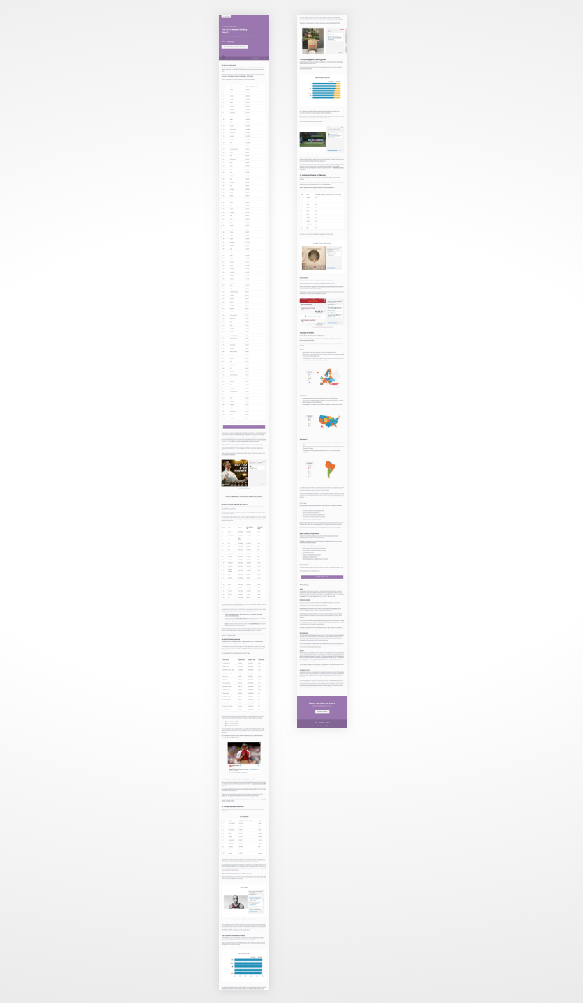
The entire delivery page IS the lead magnet. After submitting our form, we’re taken immediately to the 2018 Brand Visibility Report – and it’s huge.
At least, that’s the way it looks.
There’s a large, plain header that takes up all the space above the fold, like the cover of a PDF. In it is the title, a call to action to demo the technology that made this research possible, and reading time – only 10 minutes.
But, if we have a quick scroll, the way the information is laid out is so minutely presented, we have more than what we need. There’s no summaries here. Included is a massive table of brand image information with unique images per month, example images, a few more tables of numbers, cost breakdowns… and more.
No wonder it took four months.
The information is overwhelming, despite there only being 3,430 words in total for the page. None of those words are wasted. This is a lot of very clever stuff, well laid out.
There’s two CTA’s on the page: Try Image Insights, and Book a Demo (which is repeated in the header, but I’m counting it as one because Image Insights is a specific software they offer). Let’s see where they lead.
Opt-in 2A
Clicking either of the Book a Demo buttons leads you to an opt-in page, different than the first but ultimately almost the same: bullets on the left, and a large form on the right. There’s a darker background image, but that’s the main difference: even the blue is the same.
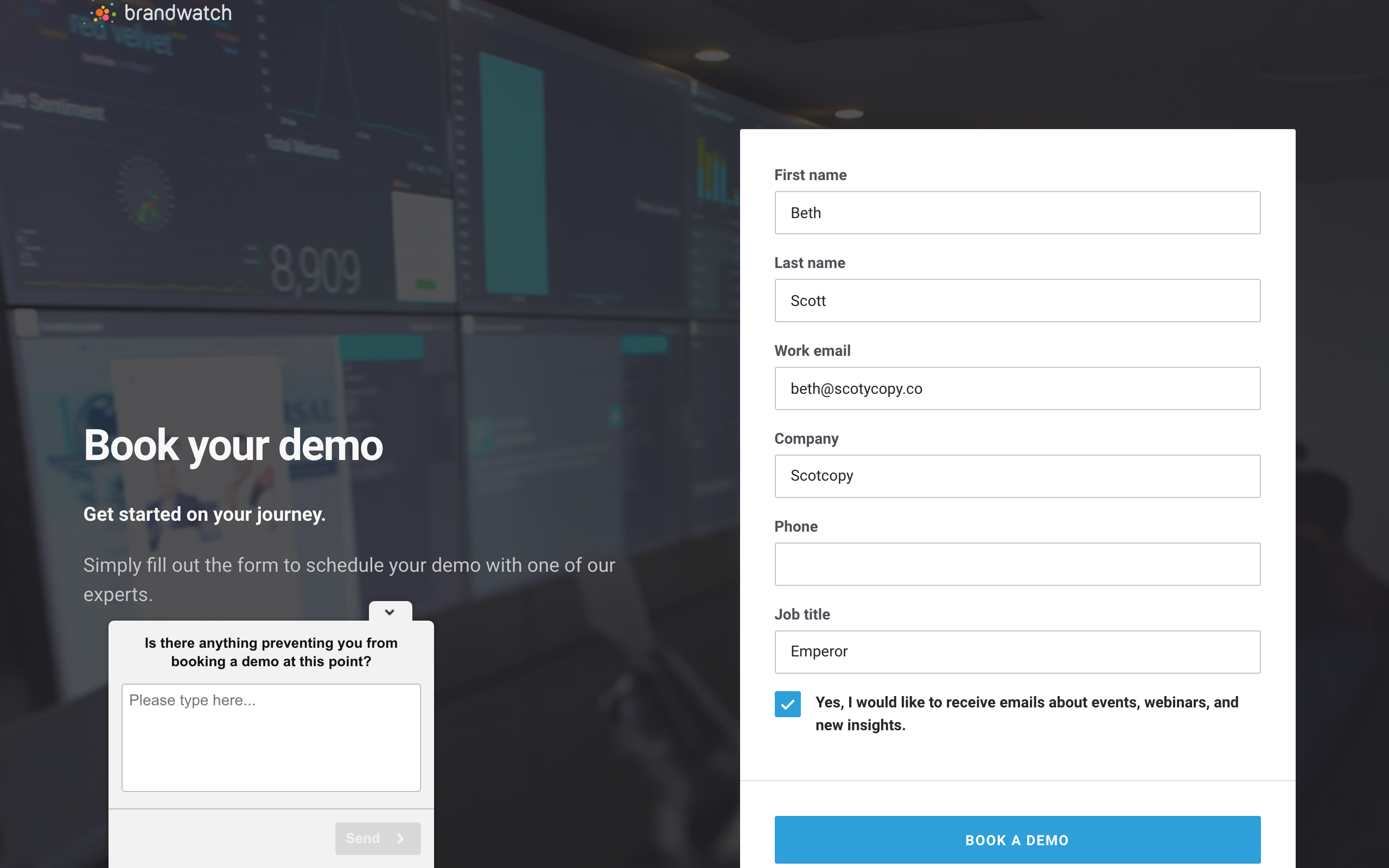
This kind of brand cohesiveness plays in well with Brandwatch’s services: after working with so many great brands, it’s fitting they should have a great idea of what makes a brand work.
The form is exactly the same as the previous opt-in, and even auto-fills your details for you. Except, this opt-in adds a Phone field, which is a bit of a larger microcommitment, as even business people will be generally more protective of their phone number than their email. This implies the demo will be personal – a real call, as opposed to a webinar – which increases its value.
At this point, I decided to go and get a coffee. When I came back, the page had something to say:
“Is there anything preventing you from booking a demo at this point?”
Of course, I had to reply. I typed in that I’d just popped out for a cup of coffee, but thanks anyway, and hit Send. It gave me a polite success message, revealing that this objection-squasher was a simple support chatbot – a way of letting Brandwatch know how they could improve their funnel with real feedback. This was neat (and now someone at Brandwatch now knows I like two shots with oat milk).
Opt-in 2B
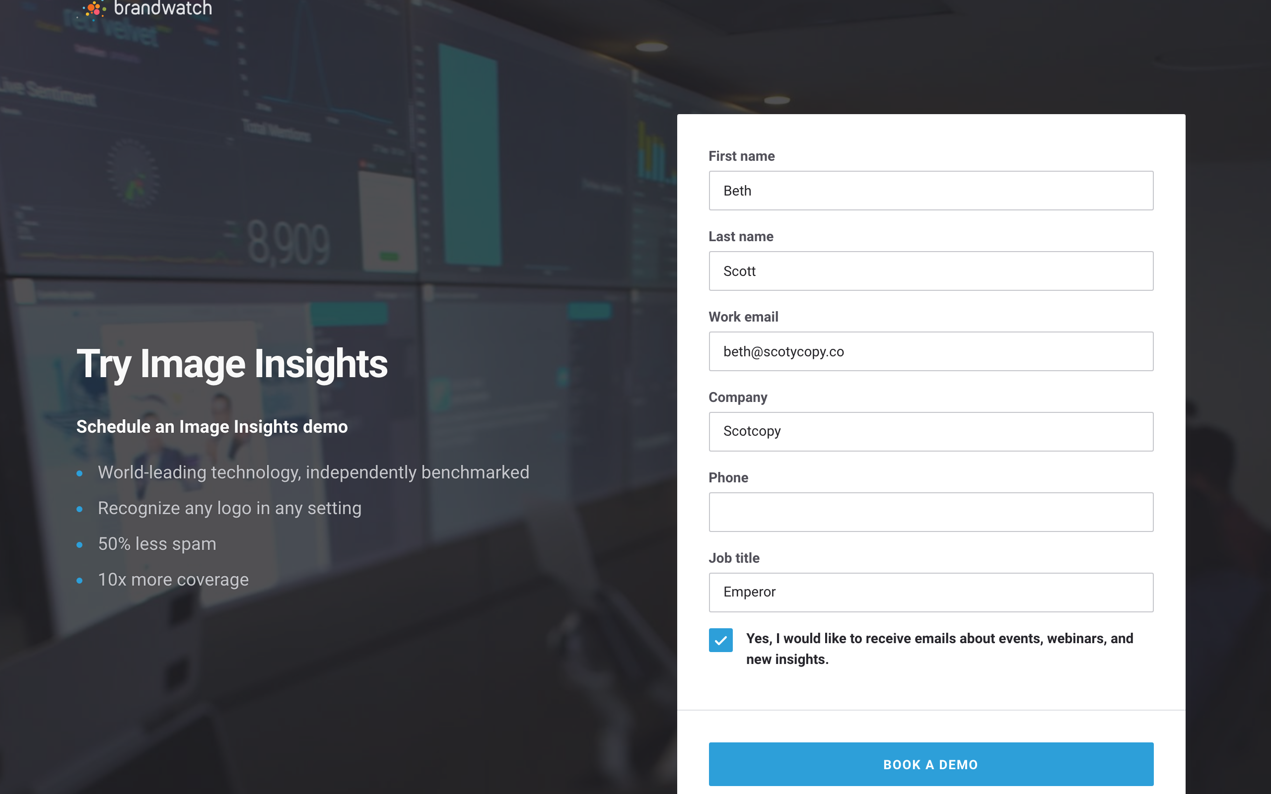
Meanwhile, if we instead click on the Try Image Insights CTA, it takes us to a near-identical looking page as Book a Demo. However, the text is clearly aimed at people interested in this particular software. The form is identical, and leads to the exact same thank you page.
Thank You 1
After submitting the information, we’re taken to the thank you page: a few simple, centre-aligned paragraphs under a bold header. Brandwatch’s brand identity is once again coming across as strong, and there’s a sense of satisfaction about knowing we’re in the right place, and have what we came for.
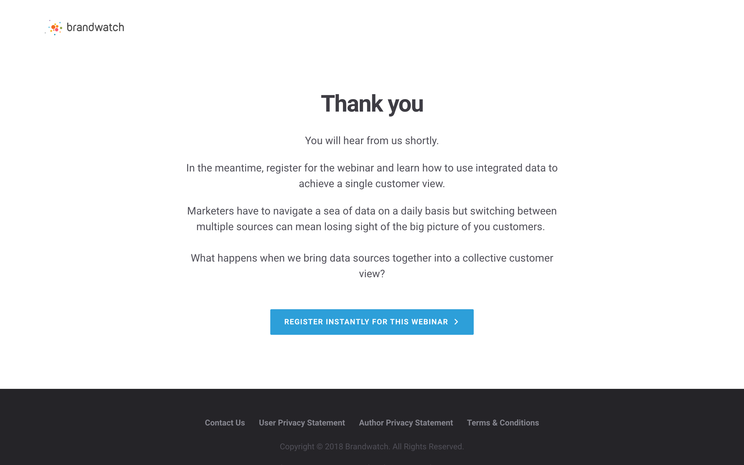
Looking closer, each paragraph – with only one sentence – has a clearly defined purpose. Firstly, they reassure us that we will hear from them shortly. Then, they offer a seemingly instant fix at best, relevant distraction at worst: registering for the webinar, which will teach us how to use integrated data to achieve a single customer view (a delightfully corporate phrase, which here means “look at nice charts to see who your users are”). In the next paragraph, they call out these pain points, and instead of solving them in the next, they ask a tantalising question: what happens?
The (still blue) CTA reiterates the “instant” factor – perfect if we’re suddenly regretful about booking a demo and we don’t know how long it will be before they call.
At this point we trust Brandwatch. This content, like the lead magnet, will be meticulously researched, comprehensive and interesting. Yes – one webinar, please.
Opt-in 3
A different opt-in style here, with a type of image Brandwatch hasn’t included yet outside of its lead magnet content: human faces. We’re presented with more social proof in the form of featured presenters, complete with impressive corporate logos. This goes further to reassure us this content is trusted, comprehensive and valuable – Brandwatch isn’t the only one who believes in this webinar, it’s Walmart and Datametrics, too.
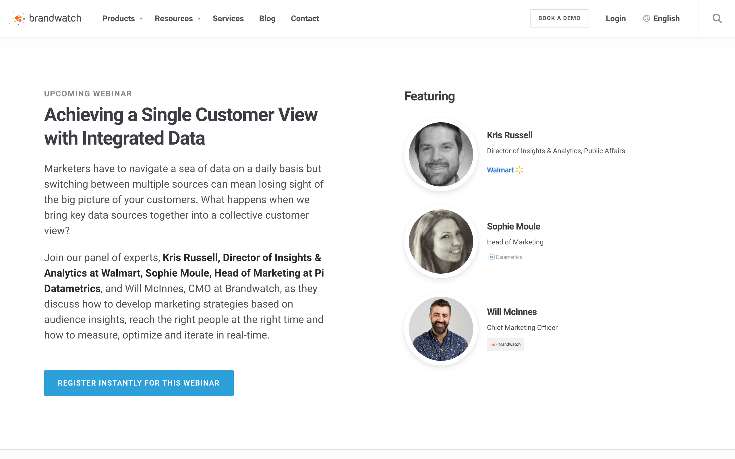
The introduction is a copy and paste of the message on the thank you page: what happens when we bring key data sources together into a collective customer view? This smartly tells us we’re in exactly the right place and this isn’t a spammy third-party offer… but the same effect could be achieved with key phrases or words. Copying an entire paragraph seems, dare I say it… economical?
We’re asked to click the same CTA we clicked a moment earlier – Register Instantly for the Webinar. This scrolls us down the page, to a form below the fold.
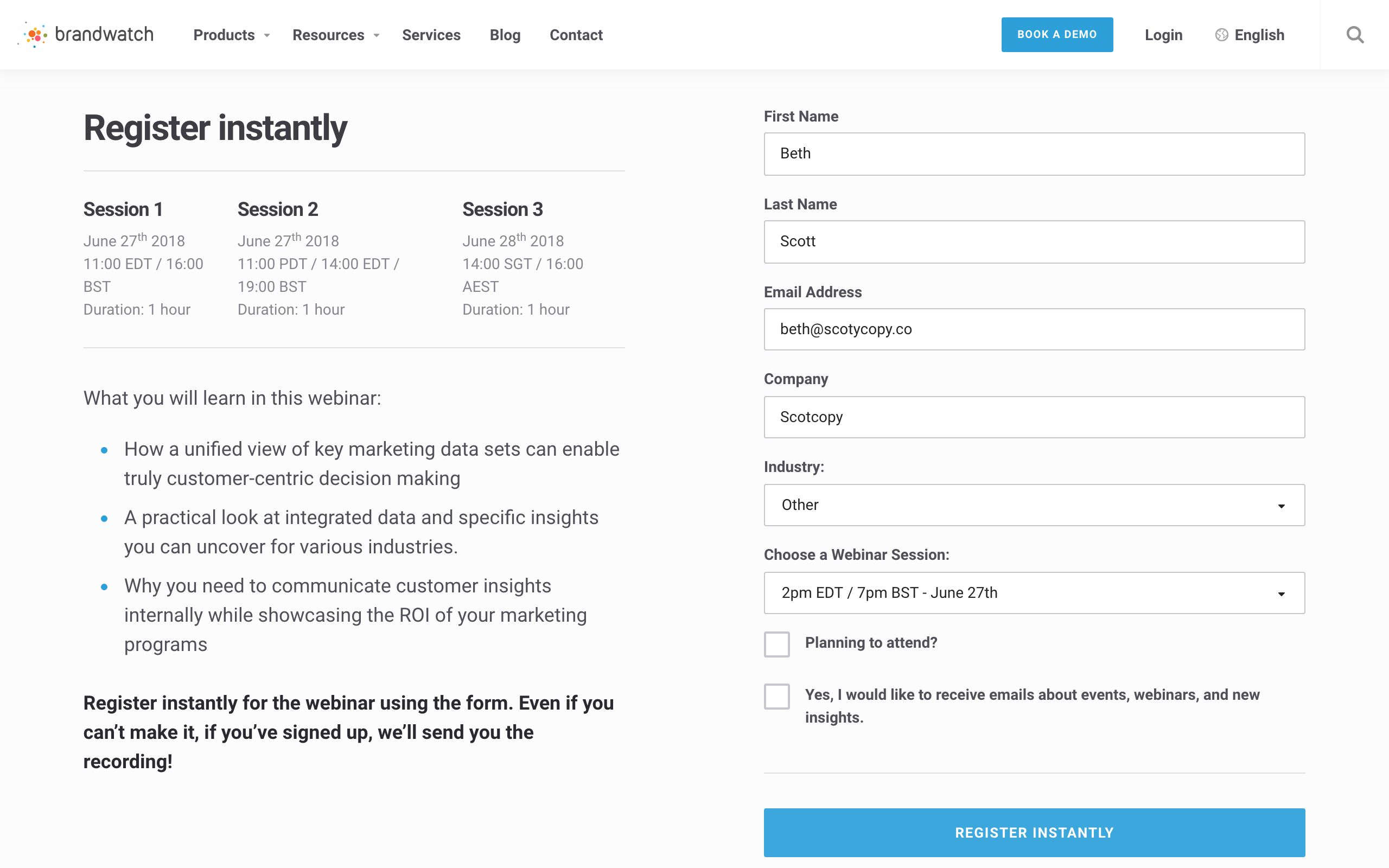
It’s the exact same form we’ve now submitted – granted, auto-filled for us – in two previous instances. Some information is here, but they’ve also added Industry, and a dropdown to choose the webinar session we wish to attend.
Even though it takes two seconds, asking us to submit the same details over and over is an interesting approach to microcommitments. You have to wonder if it would be better if they asked for only new information each time, or whether this approach turns off all but the most invested in finding out more – after all, for the repetition of the word, submitting a form three times isn’t exactly “instant”.
There’s information to the left, including bullets (what else?) that happily squashes some objections: they’ll send us a recording, the webinar’s only an hour long, multiple time zones are explained and what we will learn. We are nothing if not 100% sure of what we’re getting.
But, in case doubt lingers, scrolling down reveals some testimonials, not for Brandwatch’s services, but rather the webinars themselves. These are gleaned from Brandwatch’s Twitter account, likely saving them time tracking down and asking for “proper” testimonials from previous attendees – it looks viral, it’s hyper-focused, and it really works.
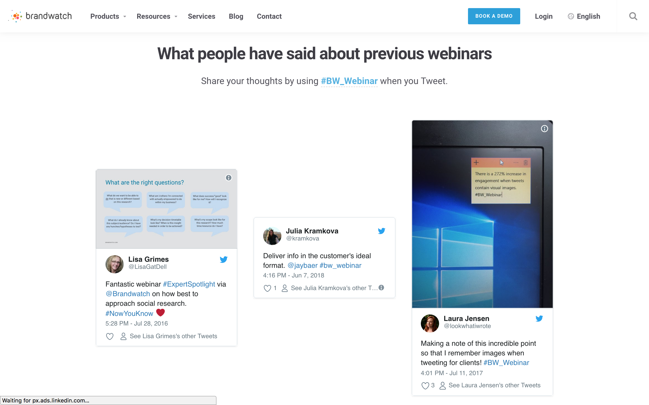
One last note: it’s clear this page is clearly a next step in the signup journey, as it’s hosted on Brandwatch’s main site. The nav bar is here, complete with a Book a Demo CTA. It’s likely the traffic this page sees isn’t exclusively coming from the lead magnet opt-in: they’re creating multiple paths here, with pages fit for purpose in concurrent and future funnels.
Thank You 2
We’ve submitted our details, we’re off to the webinar, we’ve booked a demo and now Brandwatch has our phone, company, industry, email and beverage preference.
What’s next?
A plain, on-brand (love that blue) thank you looks the same as the first one, but the message is once again different. Brandwatch are reusing pages for different stages in the funnel, but when it comes to moving people to the next step, the message is tailored to make us click further.
This time, the message is shorter than the paragraphs they took to make us interested in the webinar. Again, they offer us an instant fix while we’re waiting for the webinar… but it seems a little familiar.
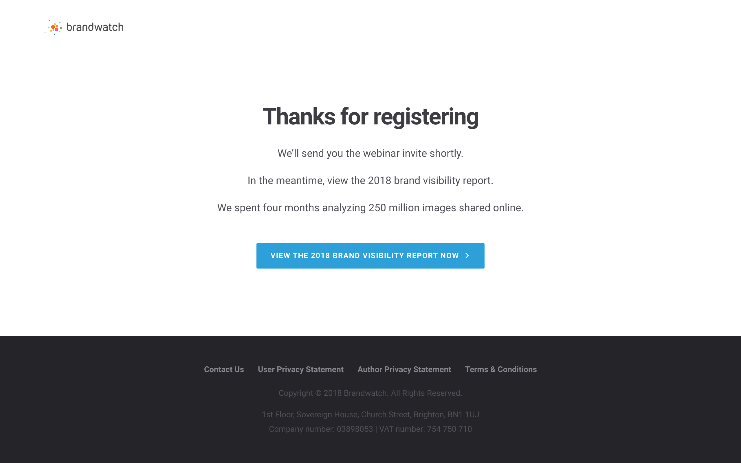
Surely it hasn’t been another four months. Haven’t we already seen the 2018 Brand Visibility Report?
Is it 2019 already?!
WHO’S THE PRESIDENT?!
That funnel seemed like it took a while, but no, this isn’t something else: we’re being offered the same lead magnet.
Here, Brandwatch’s clever reuse of pages falls down. Traffic is clearly landing on the webinar page via other sources than Facebook and from other places than the lead magnet… but this thank you can’t tell the difference.
Clicking the CTA takes you to (counts on fingers), yes, Opt-in 4. Or, rather, opt-in 1 – it’s exactly the same page. Identical URL, same content, no customisation, no tracking – we’re literally signing up for the report, again, and when we do, we’re taken to the entire 2018 Brand Visibility Report page.
We’re back to a very polished, very well-executed, but nonetheless repetitive square one.
Final Thoughts
Having a funnel with upsells, multiple CTA’s and evergreen offers designed to work with different traffic sources is great… if it works.
The more you add, the more potential leaks. And if you don’t plug those holes, it could spoil all your hard work.
Brandwatch have obviously invested a great deal of time and money into a really polished, awesome lead magnet. Thanks to beautiful branding and a cohesive voice, they could spend time and energy making lead magnets – and recording new webinars – like you see here on a semi-regular basis, without having to create a whole new funnel every time.
Not only that, but because of the multiple offers here, they obviously want to maximise their use of the funnel by having traffic enter at different points… a great idea, until it starts to fall apart at the webinar.
Seeing the Book a Demo button isn’t too bad; the nav bar gives us a pretty heavy clue we’ve just been redirected to the website. But when that thank you page tries to offer us something we’ve already been offered before… especially with a strangely rushed message compared to all other copy… that’s when you probably need to look into solutions.
Above all, this funnel is gorgeous. A solid 9.7/10. The map has been crafted with not only pure owner-side functionality, reusability and on-brand design in mind, but also user experience. A great deal of thought has gone into the copy, and making sure objections were met and squashed and social proof was injected where needed.
It’s a pure shame everything went a bit wobbly, but also quite lovely: even the great Renaissance masters smush cat hair into their paintings now and again. And it’s great to look at that, and remind ourselves that even the gurus of marketing are human.
Here’s some key ideas from this funnel you can apply to your own funnel-building:
- Copy is essential. If you can condense your message without loss of clarity, do so.
- Find a way of automating testimonials – hyper-relevance is key.
- Consistent brand colours, fonts and layouts create a familiar “space” to reassure users they’re in the right place.
- Don’t go for a fancy funnel if you don’t need to – concentrate on user experience first and always, then reusability for your own purposes.
Like This Funnel?
Want to use a funnel like this yourself?
We’ve created a version in Convertri. It’s not exactly the same style, but it’s doing all the same things in all the same order, and we’ve added logo spots so you can easily brand it for your own company.
Click the link below to add it to your account:
https://app.convertri.com/import/c7d294de-9594-11e8-9c08-0602f87a6cd8
Let us know how it works for you! If we can get enough data, we’ll report back on how well this funnel type works.


