Top Responsive Website Design Mistakes That Kill Your Conversions
These design mistakes can bring down your conversions as you build your website from scratch.

Now that a part of our modern-day living revolves around browsing on our mobile phones, responsive web design is already essential. Your website visitors browse for everything, from desktop monitors to sunscreens.
If your website isn’t viewable on all screen sizes, you could lose a huge chunk of sales and user engagement. Even a well-designed website can fail if it doesn’t follow the basics of mobile responsiveness and search engine optimization.
Statista says mobile devices make up more than 58% of global web traffic. However, many sites may still have difficulties delivering a user-friendly experience. A report by Think with Google also states that a single-second delay in mobile load time decreases conversions by up to 20%.
Here, we will explore the top responsive website design mistakes that may hinder your online success. Learn how to fix them and understand why mobile conversion optimization is essential.
Key Takeaways:
- A responsive, well-designed website should be visible on smartphones, tablets, desktops, and personal computers without getting distorted.
- Since most people are on their phones when browsing the internet, any kind of conversion happening on small screens helps your business grow.
- Slow-loading websites can be irritating for users, especially when browsing on mobile devices.
Ready to bring your campaigns to the next level? Try Convertri now!
Why Responsive Design Still Matters
A responsive website adjusts to the different layouts and elements of various screen sizes, allowing mobile users and desktop users to enjoy a smooth browsing experience. There’s no need to zoom, pinch, or scroll horizontally.
A good responsive design leads to:
- Improved user experience on all devices.
- Higher search engine rankings—mobile friendliness is a direct ranking factor in Google.
- Increased conversion rates and user engagement.
- Consistent visual appeal and brand identity.
Setting website responsiveness aside affects the site’s performance and search visibility, making potential customers have second thoughts about trying your brand.
Common Responsive Design Mistakes You Need to Avoid
Some businesses create websites that still suffer from these common responsive design mistakes:
1. Ignoring Mobile-First Principles
A mobile-first design makes sure your website is made for mobile devices. Failing to consider mobile-first rules can result in unreadable font sizes, poor navigation on smaller screens, and cramped layouts.
Avoid the following:
- Don’t design a desktop-first website and shrink it for mobile later.
- Don’t use too many elements that can overwhelm users.
- Don’t forget to test buttons, calls to action (CTAs), and forms on mobile.
2. Using Complex Layouts
Flashy interactive elements can look impressive, but a complicated web design can frustrate users. Keep your web page structured and clean, bearing only important key elements.
Remember these rules when designing your website layout:
- Use white space well to give the design and content some breathing room.
- Align and space your content and design elements for visual clarity.
- Don’t layer multiple slides or columns, as they may slow down mobile site rendering.
3. Slow Page Load Times on Mobile
Speed is a crucial factor for search results and user experience. Your slow-loading website keeps visitors off, even if you have high-quality content.
Improve it by:
- Testing your website with Google PageSpeed Insights.
- Compress and optimize all images.
- Lessen the use of large scripts or unnecessary website media.
4. Poor Image Optimization
Generic stock photos can affect loading speed and visual appeal. Resize and compress your images and use modern formats like WebP for faster rendering. Test your images in various orientations and screen sizes to see how they look.
5. Hidden or Hard-to-Tap CTAs
CTAs are the entryway for conversions. But they can often get lost on mobile phones with poor design.
Common CTA mistakes include:
- Using small tap areas.
- Hiding CTAs in hamburger menus.
- Placing buttons too close together or below the page.
Creating bold, visible, and easy-to-tap CTAs makes it easy for users to purchase your product or avail your service.
Try Convertri for free to see how you can run your campaigns with us!
How to Fix Responsive Website Design Errors

Correcting website design mistakes doesn’t need to be taxing. Follow these strategies to improve user experience and search rankings.
1. Prioritize Mobile User Experience
Put yourself in the user’s shoes. You need to fix issues on the smaller screens before proceeding.
To improve user experience, use readable font sizes and clear headings. Limit pop-ups that block content. Make sure the key details of your website and CTAs are easily accessible.
2. Test Across Devices and Screen Sizes
Not every device renders your web design well. It may look great on a tablet, but break apart on a small smartphone.
Test the layout on different screen resolutions and browsers. Fix any overlapping text, misplaced buttons, or cropped images. You can use tools like BrowserStack to check if your website renders well on simulated devices.
3. Use Smart Page Builders
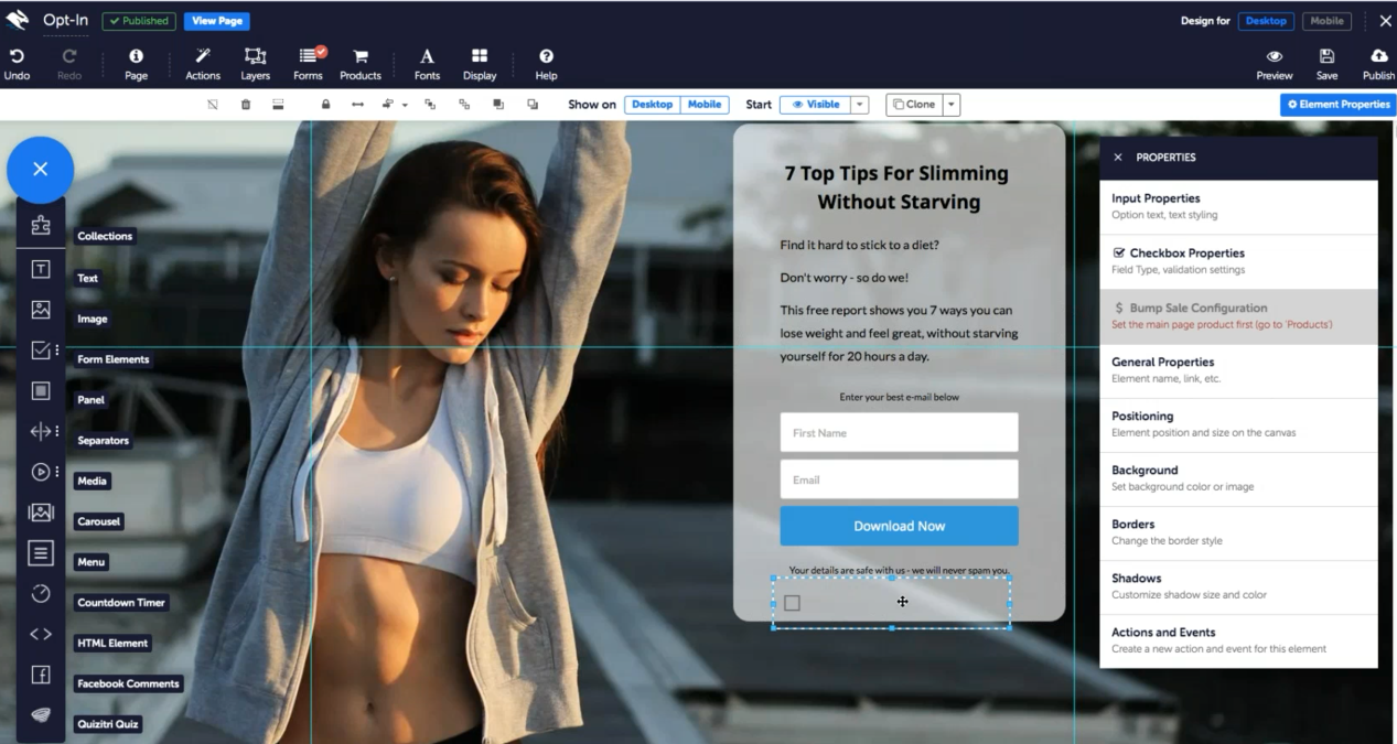
Web development and page builders like Convertri make it easy to create a responsive website and maintain consistent branding across all platforms. Their fast, mobile-friendly templates are built for conversion funnels. They also have drag-and-drop editors and automatic resizing for easier customization and updating.
Why Mobile Conversion Optimization Matters More Than Ever
Conversions can happen on mobile devices. In turn, search engines prioritize mobile-friendly websites, and search engine rankings can greatly depend on mobile site performance.
Optimizing for mobile lessens bounce rates, drives potential customers down to your sales funnel, and makes the ultimate decision to act on your CTA or not.
Build Better, Faster, Mobile-Friendly Funnels
Avoiding these website design mistakes helps you drive measurable business results and grow your brand. A well-designed website should load quickly and adapt to screen devices in seconds. It can provide a seamless experience as you read content or shop for essentials on your phone.
Adapting a mobile-first design approach, testing layouts, and utilizing smart page builders like Convertri enable you to improve user experience and search rankings, ultimately supporting your business growth. Try Convertri now!


