SaaS Landing Page Guide: Best Practices, Tools, and Real Teardowns
If your SaaS landing page isn’t converting, you’re losing money by the second. Those visitors could be signing up or requesting demos, but instead, they bounce, and your competitors might be scooping them up. Fortunately, there’s a better way. Here’s how to create SaaS landing pages that convert, using top tools, proven templates, and best practices.

You’ve got a brilliant SaaS product. It solves a real problem, your features are polished, and you’re ready to scale. But when visitors land on your page, they don’t click the “Start Free Trial” or “Request Demo” button. Instead, they bounce.
This can be very frustrating and expensive. Every click from your ads, every minute you’ve invested in SEO, and every glowing testimonial go to waste if your SaaS landing page doesn’t guide users toward that single goal. And worse, you’re competing with dozens of other tools shouting for the same audience’s attention.
Fortunately, building a high-converting SaaS landing page is not as complicated as it seems. With the right tools, templates, and best practices, you can create a page that stops visitors mid-scroll, wins their trust, and drives them to take action.
Key Takeaways:
- Focus on one goal. A SaaS landing page must have a single clear objective, such as getting sign-ups or demo requests, with minimal distractions.
- Speed matters. Slow pages kill conversions. Convertri’s fast-loading framework helps keep users engaged.
- Test and refine. Headlines, CTAs, and layouts are worth A/B testing for measurable gains.
- Use the right tools. Pick a fast, flexible funnel builder (Convertri is a top choice) and templates to save time and improve conversions.
What Is a SaaS Landing Page?
A SaaS landing page is a focused web page designed for a specific campaign or offer. Unlike a general homepage, a landing page has one goal: to get the visitor to take a single action. It’s not a homepage or a site with multiple sections – it’s a targeted page for conversion.
For SaaS products, this might be signing up for a free trial, requesting a demo, or downloading a guide. The content and design are tightly aligned to that goal.
In other words, a SaaS landing page is the “surgical tool” of your marketing. It should have one clear call-to-action (CTA), minimal navigation, and messaging that exactly matches the ad or link that brought the visitor here. This focus helps keep people on task: for example, a project management software landing page might skip all other links and simply pitch its free trial with a big “Start Free Trial” button.
The #1 Goal of a SaaS Landing Page
On a SaaS landing page, the ultimate goal is always a conversion: typically a sign-up, demo request, or account creation. That means every element – from headline to button – should guide visitors to one action. Keep the action above the fold, remove any link or navigation that could distract them, and focus the whole page on one offer.
Think of it as a funnel: at the top of the funnel (awareness), you promise a solution, then you shepherd the user toward trying the software. Digital marketers often see the goal as generating leads or sign-ups. In fact, 43.6% use landing pages to generate leads. So, make your landing page about that – e.g., “Free 14-day trial”, “Request a demo”, or “Download our guide” – and let nothing else compete for attention.
If conversions are your goal, Convertri is your launchpad.
7 Key Elements of a SaaS Landing Page That Converts

A high-converting SaaS landing page combines persuasive copy with a clear, user-friendly design. Here are the essential elements, each backed by conversion science and data:
1. Headline & Subheadline (Value Proposition)
- Your main headline should be crystal clear and benefit-driven. E.g., “Manage Your Team 2x Faster.
- Follow with a short subheadline explaining how or why it matters.
- Place a concise value statement above the fold so visitors immediately see the purpose.
- Avoid jargon. Use language your customer understands.
2. Single, Prominent CTA
Use one primary call-to-action (CTA) button or form. It should contrast in color and say exactly what happens (“Start Free Trial”, “Request Demo”).
Focus the entire page on one offer, one CTA. Place it above the fold and again after you’ve explained key points; then again at the bottom if the page is long.
3. Social Proof (Testimonials/Logos)
B2B SaaS buyers trust peer validation. Include testimonials, customer logos, case-study snippets, or data points to build trust.
Studies show pages with social proof convert better – for example, 37% of top landing pages include testimonials. Use real names and photos if possible to make testimonials authentic.
4. Hero Image or Explainer Video
Visually demonstrate your product or show happy customers. A product screenshot or short demo video can be very persuasive. In fact, adding an explainer video can increase conversions by 86%.
Make sure visuals support the headline. For SaaS, consider a short demo or animated overview in the hero section.
5. Feature/Benefit Bullets
List the key features in terms of benefits. Don’t just say “feature X”. Instead, say what problem it solves. Use bullet points for scannability.
6. Lead Capture Form
Keep it simple. Only ask for what you really need. For example, asking just for name and email can maximize sign-ups. More fields = more friction. If you need more info, such as company size and role, do it in a separate step.
7. Risk Reversal
Remove doubt. Offer free trials, money-back guarantees, or no-credit-card-required signups. Phrasing, such as “Start your 30-day free trial – no credit card needed,” gives people the confidence to try without risk.
By combining these elements, create a landing page focused on conversion, not exploration. It should answer the user’s question – “What’s in it for me?” – and then immediately give them a way to say “Yes, sign me up!”
Tools to Build High-Converting SaaS Landing Pages
You need a fast, flexible landing page builder to execute all these ideas.
Convertri is one standout choice for SaaS teams. It’s advertised as the “World’s Fastest Funnel Builder”: pages load in under 2 seconds, which is critical because even 1-second delays hurt conversions.
Convertri includes dozens of professional, ready-made templates for opt-in pages, sales pages, checkout pages, thank-you pages, and more.

It also has a drag-and-drop editor and built-in A/B split testing and real-time analytics, so you can build and tweak pages quickly.

Other popular builders include Unbounce, Instapage, and Webflow. Drag-and-drop builders have the advantages of speed and convenience—you can iterate on designs without a developer.
But whichever you choose, ensure it offers A/B testing and mobile optimization. Convertri, for example, auto-generates a mobile version of each page while still giving you full control. Remember, any page builder can have slow code; always optimize images and use features sparingly.
Stop settling for slow load times and clunky builders – Convertri changes the game.
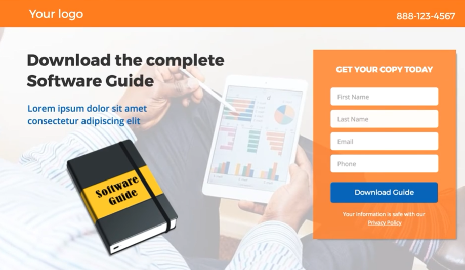
Best SaaS Landing Page Templates
Instead of starting from scratch, use a proven template. Convertri’s library has 200+ pre-designed pages for every purpose. For SaaS, look for templates tailored to your goal:
Free Trial Signup Page
A page that invites visitors to start a trial. These usually have a persuasive headline (“See [Product] in action – Free 30-day Trial”), a short form (email only), and a bullet list of benefits. They often include trust badges (media logos or testimonials) to reduce risk.
Demo Request Page
Focus on value. Use client logos or quotes and explain what the demo covers. Include a form or scheduling widget.
Product Launch / Coming Soon Page
Generate interest for a new feature or app. Use countdown timers or email capture forms to build your list before launch.
Feature Showcase Page
Highlight a key new feature of your SaaS tool, like “New AI Dashboard.” Show a large screenshot or video of that feature in action.
Convertri offers templates for all these (and more). Here are examples:
The “Float” template gives a video-friendly layout with sections to highlight what to expect

The “Performance” has a dynamic design perfect for fitness or tech sign-ups

The “Pitch” is a corporate demo-thank-you template for B2B audiences.

With such templates, you simply plug in your brand colors, swap the text to your own value propositions, and have a professional page in minutes. This jumpstart helps you focus on optimizing copy and offers, not design.
Real-Life SaaS Landing Page Examples
Seeing high-converting landing page examples is inspiring. Below are actual SaaS landing pages that illustrate these principles. Notice how they use one main CTA, compelling headers, and visual focus.
1. Netflix (Streaming service) sign-up page

Netflix is famous for simplicity. Notice the big banner with a powerful offer “Unlimited movies and TV… watch anywhere”. It immediately asks only for your email – a one-field form to reduce friction. The rest of the page has under 200 words: each benefit is just a short line. This minimal copy means visitors can sign up in seconds.
Netflix uses “short-form content” and an ultra-simple sign-up (“just enter your email”) to appeal to everyone. The result? One of the highest-converting signup pages out there.
2. LinkedIn (Professional social network) Premium page
LinkedIn’s premium page zeroes in on job-seekers. It opens with a photo of a smiling person (people over product) and overlays key features of Premium in 3D graphics. This “best of both worlds” approach – mixing human imagery with product screenshots – grabs attention.

These real SaaS landing pages share traits: single CTAs, concise persuasive copy, and trust signals. They each answer “What do I get?” quickly and then make signing up obvious. Use them as design inspiration for your own pages.
3. Slack (Team communication platform) Sign-up page
“Where work happens” is three words. It states an outcome, not a capability.
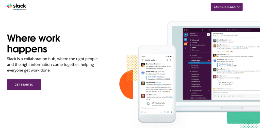
Slack puts “LAUNCH SLACK” in the top right for existing users and “GET STARTED” in the hero for new ones. One page serves both without conflict. Neither group is confused or distracted by the other’s path.
Keep your hero headline under 10 words. If your product works across devices, show both in one hero image; it answers a common question without needing a separate feature section.
4. Notion (All-in-one workspace) Homepage
The page handles two audiences cleanly. Individuals go to the free plan. Teams go to the paid plan. Enterprises click “Request a Demo.” Each path is clear.
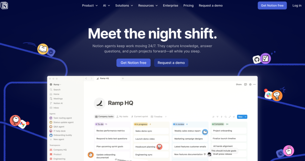
If you have multiple buyer types, use pills or a persona toggle rather than building separate pages. One page with smart segmentation keeps authority intact.
The looping GIF in the hero acts as a micro-demo. It shows the product in action in five seconds, before anyone clicks “Watch Video.” For complex tools, a GIF often outperforms a static screenshot.
5. HubSpot (CRM and marketing platform) Free demo landing page
“Free” appears everywhere: headlines, subheadlines, bullets, and buttons. The repetition reduces price hesitation before it forms. The three-column grid maps to specific roles: Sales, Marketing, Service. Each buyer sees themselves immediately.
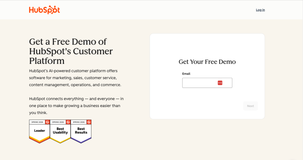
If your product covers multiple use cases, name them all in one tight subheadline. HubSpot fits six into two lines. It signals breadth without losing focus.
A single email field at step one lowers commitment to almost zero. HubSpot collects company size, role, and phone number. But in step two, after the visitor has already said yes. This progressive qualification consistently outperforms, showing all fields upfront.
6. ClickUp (Project management software) Sign-up page
The headline is a direct competitive attack. “Software to replace all software” tells the visitor exactly who this is for: people tired of juggling multiple tools. It names the pain without naming a competitor. The CTA label “Get Started. It’s FREE!” removes the cost objection.
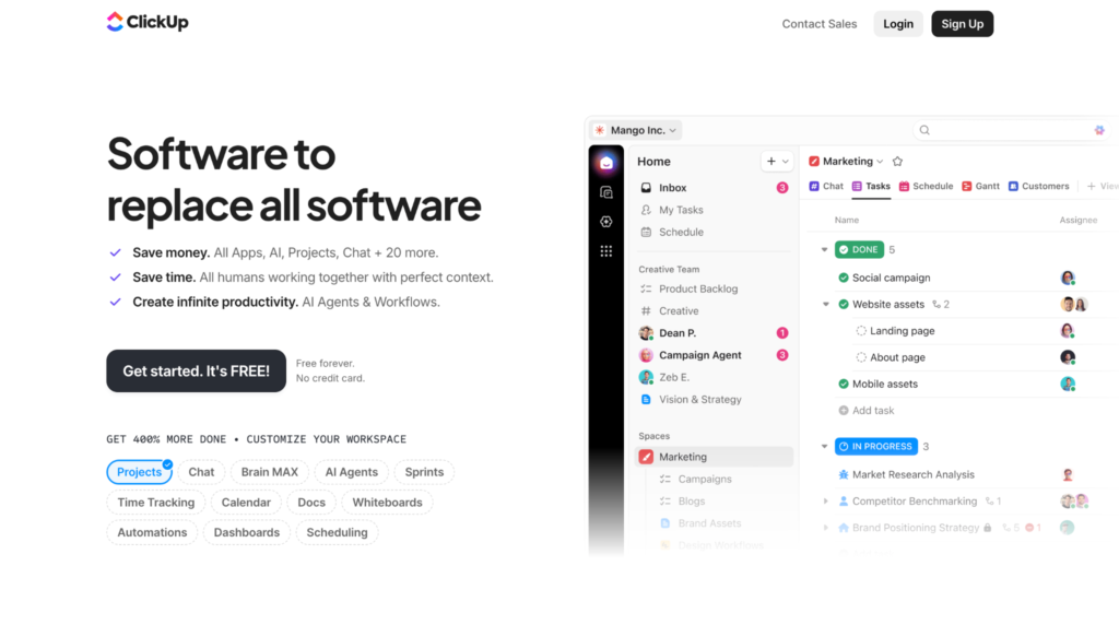
If your product consolidates multiple tools, say it in the headline. Consolidation is a strong buying trigger. It means fewer subscriptions, less context-switching, and a simpler contact sales stack. Also, put your review score in the hero. Do not hide it in a customer success stories section halfway down the page.
7. Salesforce (Enterprise CRM platform) Demo request page
“Welcome to the Agentic Enterprise” does not compete. It names a new category and invites the visitor into it. Four product cards below the fold (Slack, Agentforce, Customer 360, Data 360) show ecosystem breadth in a single visual row. No long bullet lists to explain features needed.
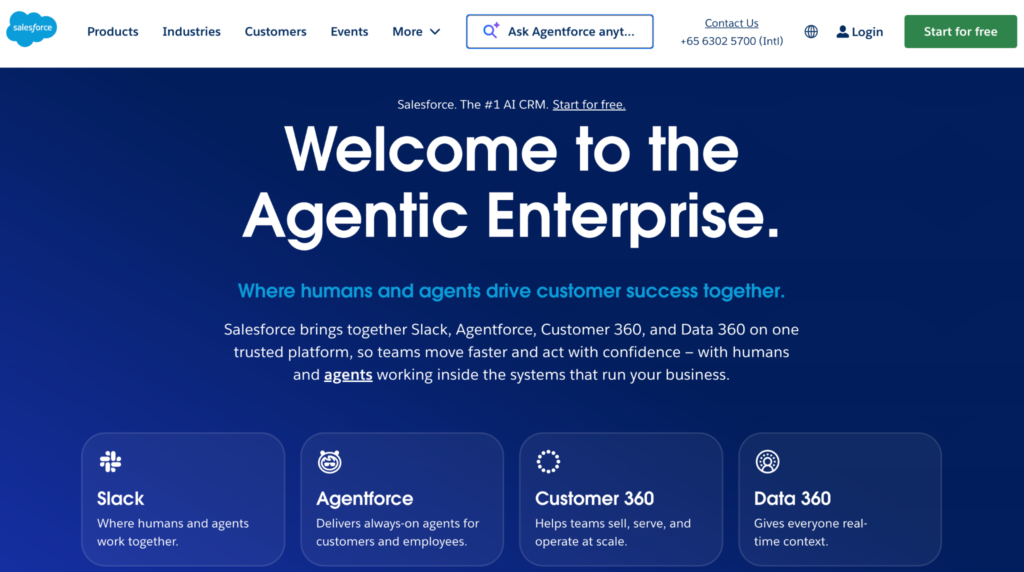
If your product is entering or defining a new market, frame the headline as an invitation to a category, not a comparison to existing tools. If your tool has an AI or search feature, putting it in the header is a powerful way to demonstrate value before the user scrolls.
“Start for free” stays pinned in the top-right nav across the entire page. Persistent CTAs in the nav consistently lift conversions on long-scroll enterprise pages where the decision happens mid-page, not at the bottom.
All seven pages share the same four traits: one dominant CTA, a risk-reversal line near that CTA, and a visual that shows the product rather than describing it.
Use them as design inspiration, and see the sales funnels vs landing pages guide to choose the right format for each funnel stage.
Mobile-First Design: Best Practices for SaaS Business

Design mobile-first. Many visitors will find your page on their phone, so make that experience flawless:
- Short and sweet
- Large touch targets
- Simplify navigation
- Mobile-specific tweaks. Convertri auto-creates a mobile version, but lets you move or hide elements as needed.
- Avoid hover-reliant features.
- Test on actual devices.
A drag-and-drop landing page builder that generates a mobile version is a non-negotiable here. If you have to hand-code the mobile layout, the whole velocity advantage of a landing page builder collapses.
Remember, mobile optimization ties back to speed and simplicity. If your page is sluggish or cramped on phones, you’ll lose conversions. Keep it lean and user-friendly.
Take your SaaS landing pages from theory to reality in minutes.
Optimizing for Each Funnel Stage
Different visitors are at different stages of the buying funnel. Tailor your landing page accordingly:
Top of Funnel (Awareness)
These pages present the problem and solution. Content is more educational.
Headline: “Struggling with X? Here’s a better way.” Offer something valuable like a lead magnet or explainer and a soft CTA: “Learn how it works”. The focus is on capturing interest.
Middle of Funnel (Consideration)
Now highlight why your SaaS is the best solution. Show benefits, customer quotes, and short walkthroughs. CTA: “Start Free Trial” or “Book a Demo.” This is where feature-benefit bullets and trials shine.
Bottom of Funnel (Decision)
Visitors here just need a nudge. Show pricing, security badges, and detailed comparisons if needed. Address objections. CTA: “Subscribe Now” or “Schedule Your Demo.” This page can be longer, but always tied to sign-up.
A SaaS might drive cold traffic to a problem-focused page, then retarget warm leads with a benefits-oriented page, and finally send ready prospects to a pricing page. Use distinct landing pages for each, with content tuned for that stage. Throughout, ensure each page’s one goal is crystal clear.
FAQs
Q: What is a SaaS landing page?
A: A SaaS landing page is a single-goal web page that converts visitors into free trials, demos, or sign-ups. It has one CTA, one offer, and minimal navigation, unlike a full SaaS website that covers all products and company information.
Q: How is a SaaS landing page different from a SaaS homepage?
A: A homepage is a hub. A landing page is a closer. The homepage covers everything your company does. The landing page sells one thing to one target audience arriving from one source.
Q: How long should a SaaS landing page be?
A: As long as it takes to answer every objection and not one line longer. For a self-serve free trial, short usually wins. For a high-ticket demo, long-form with detailed proof usually wins.
Q: What should I A/B test first on a SaaS landing page?
A: Headline, then primary CTA copy, then hero visual. These three account for the majority of CTR and conversion variance. Form fields are the fourth test.
Q: What is a good conversion rate for a SaaS landing page?
A: Benchmarks vary, but 2 to 5% on cold paid traffic is average, 5 to 10% is good, and 10% plus is elite. Warm traffic should convert much higher.
Q: Which is the best funnel builder for a SaaS landing page?
A: The best funnel builder ships a sub-2-second load time, a SaaS-ready template library, native A/B testing, and integrations to your CRM and email tool. Convertri is built around those criteria and is widely regarded as the best sales funnel builder for SaaS teams that prioritize speed.
Q: What is the best marketing funnel software for SaaS companies?
A: The best marketing funnel software for SaaS companies combines fast-loading page delivery, funnel-stage targeting, A/B testing, and CRM integrations. Convertri, Unbounce, and Instapage are consistently top-rated, with Convertri leading in page speed.
Q: Do I need a paid or a free plan to start?
A: Most leading landing page builders offer a free plan for testing and a paid plan for full access to A/B testing, custom domains, and analytics. For serious SaaS conversion work, especially with paid traffic, a paid one is essential.
Parting Thoughts
A great SaaS landing page is a finely tuned conversion machine. When you combine a single, crystal-clear goal with fast loading, persuasive copy, and strategic design, you turn casual visitors into engaged leads and paying customers.
With a platform like Convertri, you can skip the heavy lifting, launch lightning-fast pages using proven templates, and focus on what really matters: refining your message and scaling your results.
In the world of SaaS, every click counts. Make sure yours leads somewhere worth landing.